A fast-fashion, ecommerce, shoe retailer reached out to Swanky with a challenge. They found that if a product didn’t sell out in two days—it sold for less.
Much less.
Anything that didn’t leave the shelf in the first two days, finally sold at a 38% discount.
So Swanky swooped in, to save the day (and the margins). Their goal was to increase sales, and sell the discounted stock at a lower discount.
Two principles made their testing a success—one based on consumer psychology, one based on design.
Hypothesis
How are you communicating the value to your customers?
Or sometimes, more importantly: when are you?
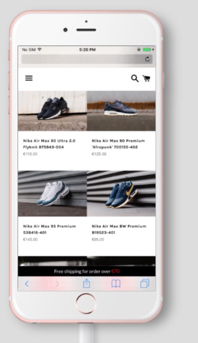
Swanky thought that on mobile, there was a better way to make a customer’s savings immediately apparent. Currently, discounted items in the store were marked with a “sale” icon—and both the prior price, and the new price were displayed.

Mobile View of Original Collections Page
The new idea was to communicate the value of a discount using a percentage—giving customers a tangible value proposition, and boosting click through rates to product pages.
Methodology:
| Spread: 33/33/33 a control, and two challengers. | Visitors: 5,000 |
| Confidence Score: 97.5% | Time: 12 days encompassing 4 typical new release windows. |
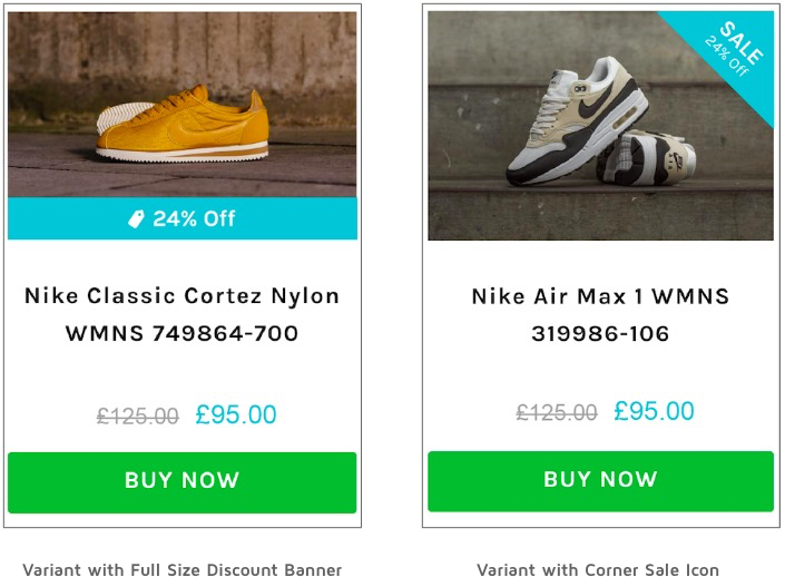
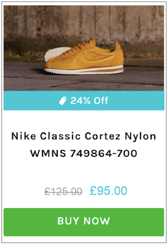
Swanky tested two different layout against the control. One featured a corner sale icon with a percentage. The other had a full width sale banner.

Tests ran to all traffic sources, over 12 days. Due to a large volume of traffic from paid search ads—54% of visitors were new. The test ran for 12 days to encompass 4 product new releases, and to ensure a large enough sample for statistical significance.
In addition to a large enough sample, Swanky wanted a good cross-section of the month to reduce seasonal impact and the multiple buying cycles to make sure they weren’t factoring in a single product trend.
The store was hosted on Shopify Plus —but which they integrated with Google Analytics, HotJar, and Convert for testing and reporting.
We often work with relatively small retailers who have grown rapidly with low technology costs. The fact that we can integrate Convert with Shopify Plus and test in such a short space of time, with relatively low capital outlay, is SUPER attractive to our core audience base.
Sean – Swanky
Results:
It came as no surprise to Swanky the new variations outperformed the control. What was surprising, was the margin by which one variation outperformed the other.
Both variations featured the percentage discount overlaid on the items. Both challengers increased product page visits 5% over the control. But one – specifically the one with the full size discount banner – went so far as to increase purchase conversion rate by 19% (at over 95% confidence).

Design made the difference.
Mobile testing can be fickle, as designers are prone to tests that look good on desktop.
Our winner had a full-width sale banner on the product image—with a larger and more easily legible font.
Sean, Head of Digital Optimisation – Swanky
While the initial goal was to increase CTR—the test had a big impact on ROI. Because consumers in the test variation were checking out at an improved rate, they weren’t being exposed to as large of a discount.
This led to a 26% increase in revenue per user (at over 98% confidence)—essential gains for a brand moving into the slower part of their sales year.
The Big Takeaways: Clarity, Clarity, Clarity.
- Communicate the value proposition ASAP. Make sure the value to users is stated point blank, as quickly as possible.
- Make it easy on your prospects. Just showing a price change might not be enough. Clear percentages save your customers the mental math.
- Design your mobile tests, for mobile. Your value proposition is only as good as it is visible. Make sure your designers are designing with small screens in mind.
Convert’s support team are awesome—whether we’re sanity checking with George or Claudiu, or discussing audience configurations with Dionysia or Alex, we always get the support we and our clients need.
Sean – Swanky

Swanky became one of the first ever Shopify Plus Expert teams in Europe—and they've stayed at the top of the game ever since. Armed with both this expertise, and a proficiency with conversion rate optimization—they work with ambitious online store owners to level up their ecommerce game.
At Convert, we’re on a mission to create meaningful, sustainable experiences for today’s users and future generations. As the only Climate Neutral Certified A/B testing platform, we’re proud to offer a robust, affordable, and feature-rich platform that’s been an industry favorite for over a decade. But we’re not just about optimization for profit. With a Conscious Business approach, we’re dedicated to making a real difference and driving positive change within the CRO space and the world.
