The Challenge: Extra Steps Add Friction to Checkout
Cart pages are ubiquitous in E-commerce.
We take them for granted.
But is the dedicated cart page a conversion booster or a checkout killer?
As more and more people buy on mobile devices and the desire to compare products for the best “deal” becomes second nature, having to return repeatedly to the cart page introduces friction in the purchase funnel.
Ontrack Digital+ identified this as a major roadblock to increasing average revenue/visitor, average number of products per visitor, and the overall Ecommerce Conversion Rate for client Conscious Items.
This led to the hypothesis:
Implementing a responsive, interactive cart will ease the user experience and simplify the entire sales funnel for website visitors. They will be able to quickly access their cart and compare products without having to load another page. By simplifying the purchase funnel, we expect to increase the ecommerce conversion rate by 10%.
The Test: Cart Slider Across the Funnel
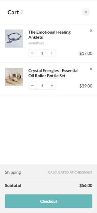
Ontrack Digital+ used Convert Experiences to add a cart slider or pop-up that persisted with the potential buyer across all pages on the site, till a transaction was successfully logged.
Test results were analysed through the one-tag Google Analytics integration.
The campaign had only one test variant, which was expected to out-perform the control.
Traffic was directed to the test from the following sources:
- Organic
- Paid
- Referral
- Social Drive
- Display
- Direct
90% of the traffic was from the United States. And 87% of people used mobile devices.
The Control:
The original dedicated cart checkout page, without any tweaks.
It was served to 34,682, over 1 week.

The Variant:
The modified cart pop-up that stayed with the potential buyer til the transaction was completed.
It was served to 34,682, over 1 week.

The Result:
| Goals | (Compared to Control) | Confidence of Result | Winner |
| Ecommerce Conversion Rate | +10% | 97.55% | Variant |
| Revenue/Visitor | +12% | ||
| Average Products/Visitor | +14.45% | ||
| Average Order Value | +2.18% |
The impact of a normal cart page being replaced with an interactive slide cart (pop-up cart), easily accessible anywhere on the website, at any time was truly profound
Andra Baragan – Ontrack Digital+
What Can You Learn from This Success Story?
- The accepted may no longer be acceptable. This is one of the biggest advantages of taking an experiment driven approach. You get to question everything. A dedicated cart page is a given for most E-commerce stores. And while Cart optimization isn’t anything new, re-thinking how the cart is served to potential buyers, based on their browsing and buying habits can reveal hidden improvement opportunities. If the data points to an anomaly in buyer behavior, be guided by the discrepancy to come up with innovative solutions that can be validated by A/B testing.
- Move beyond testing on a page. Multipage testing or funnel tests can be a new take on an old paradigm. Tools like Convert Experiences make it easy to inject an element into all stages of the buyer’s journey, and measure the impact of the same.
At Ontrack Digital, we deliver highly specialized conversion optimization programs based on qualitative and quantitative research performed on-site and continuous experimentation. We have helped drive significant ROI gains for numerous eCommerce businesses through our data-driven conversion optimization programs. Our conversion optimization programs are best suited for ecommerce sites that generate over 7 figures revenue per year.
At Convert, we’re on a mission to create meaningful, sustainable experiences for today’s users and future generations. As the only Climate Neutral Certified A/B testing platform, we’re proud to offer a robust, affordable, and feature-rich platform that’s been an industry favorite for over a decade. But we’re not just about optimization for profit. With a Conscious Business approach, we’re dedicated to making a real difference and driving positive change within the CRO space and the world.
