The Challenge: Going Beyond “Okay”.
What do you do when your control is working just about okay…. But you are hungry for near dramatic improvements?
Improvements that have the potential to unlock an additional 15% of your net revenue.
Two things:
- You (triple) down on understanding purchase intent & sophistication of your buyers.
- You go all in on crafting a site journey that gets out of their way as much as possible.
This is exactly what Enavi and Xtrema.com did.
60% of traffic to the Xtrema site did not view a product. And this held true for traffic across all channels.
Xtrema buyers were fairly savvy. They had shopped cookware before.
Informed by past tests run for its varied clientele, Enavi decided to zero in on 3 potential problem areas where the Xtrema website was concerned: navigation menu, homepage hero & sub-hero, and collection pages.
NOTE: Xtrema.com had undergone a site redesign prior, and there wasn’t much usable performance data to go by.
Enavi:
- Added custom GA4 events (via GTM) to track user behavior in the three problem areas.
- Added a Lucky Orange instance to illuminate trends & patterns in interactions and element discovery.
- Triggered pre and post-purchase surveys for qualitative and “WHY” focused insights.
Based on preliminary findings, two tests were run.
One on the main navigation menu, and the second test was run on the sub-hero section of the home page.
The hypotheses were as follows:
Navigation Menu:
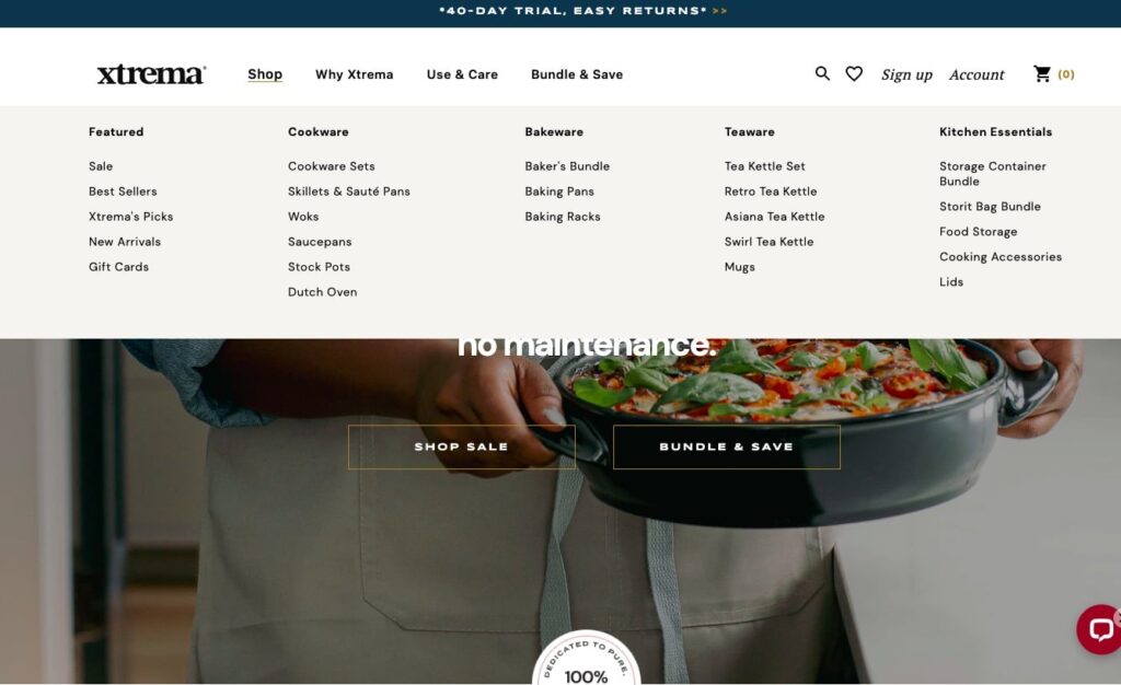
Adjusting the top-level menu to include the primary product categories with direct product linking will make shopping behavior easier and increase product views.
Sub-Hero (Shop By Category):
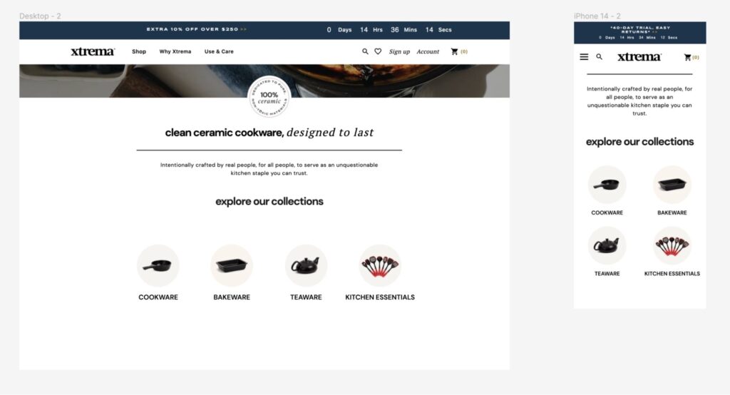
Adding a mobile-friendly, icon-led Shop by Collection design will increase visibility of key collections while increasing product views from the homepage.
The Tests: Simple Is Often the Best Solution.
We’ve shared the test specifications below:
Test #1: Navigation Menu
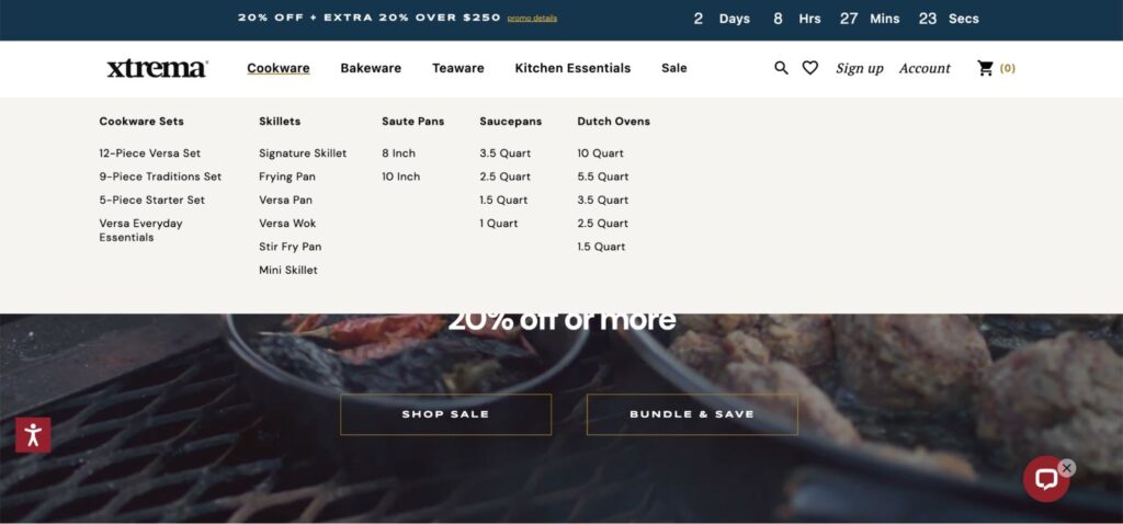
- The variation showed top level categories with direct product linking, instead of a generic “Shop” dropdown.
- Number of Variations Served: 1
- Primary Test Goal: Product views
- Other Metrics Tracked: Purchase Conversion Rate (CVR)
- Traffic Split: 50/50
- Test Duration: 5 days
Test #1 Screenshots
Control

Variation

Test #2: Sub-Hero Section
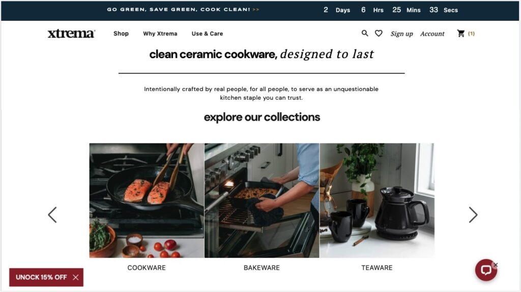
- The variation introduced a sub-hero “shop by category” section on the homepage in place of a “Shop Best Sellers” button. This menu design suited lower intent users well.
- Number of Variations Served: 1
- Primary Test Goal: Collection Views
- Other Metrics Tracked: Purchase Conversion Rate (CVR)
- Traffic Split: 50/50
- Test Duration: 8 days
Test #2 Screenshots
Control

Variation

Digging Into Numbers: Sample Size, Significance & ROI
We have already implemented four winning tests with Xtrema, which has allowed us to see the lift from testing AND in a live environment. A conservative annualization of these results (using revenue per session) would yield an incremental lift for the client of ~$755,000, representing roughly a 15% in their ecommerce revenue.
Sheldon Adams (Enavi)
Test #1: Navigation Menu
- Percentage Increase in Product Views: 16.7%
- Statistical Significance of Result: 100%
- Sample Size: 9249
Test #2: Sub-Hero Section
- Percentage Increase in Collection Views: 40.41%
- Statistical Significance of Result: 100%
- Sample Size: 7937
Tech Stack Used:
- Convert Experiences (and its various integrations)
- GA4
- Analytics Toolkit (For agile testing)
What Can You Learn From These Tests?
- Incremental improvements accrue. This isn’t just a platitude to fortify your will to test in the face of experiments that do not win, it is also a mindset that keeps being okay with “just okay” at bay.
The best time to test is when the ship isn’t sinking. Testing uncovers competitive advantages and eliminates bottlenecks that can plug revenue drain, and improve bottom-lines throughout the year. And not as one-off “campaigns”.
- Follow the customer. Analyze what they’re showing you … corroborate these patterns with qualitative data. Solution aware buyers do not need to be (excessively) “guided” with confusing filters and instructions.
- Sometimes you have to step away from directing the user journey, simply share key differentiators, and allow sophisticated customers to find their way to their best-fit products.
Enavi was founded to help brands navigate the fast-paced ever-changing world of e-commerce with a diverse team of experts, and an intuitive slate of apps that combine research-driven revenue optimization, customer-centric design, and custom development solutions. At Enavi, the team lives and breathes the things that make marketing more persuasive, and shopping experiences more fruitful. Get started by requesting a FREE strategy session on the Enavi website.
At Convert, we’re on a mission to create meaningful, sustainable experiences for today’s users and future generations. As the only Climate Neutral Certified A/B testing platform, we’re proud to offer a robust, affordable, and feature-rich platform that’s been an industry favorite for over a decade. But we’re not just about optimization for profit. With a Conscious Business approach, we’re dedicated to making a real difference and driving positive change within the CRO space and the world.
