A popular online grooming store was looking to improve its sales and revenue per visitor. One of its key products — a bundle offering of scents for men — showed potential for optimization. The premium quality of the offering coupled with the rich, descriptive copy it used weren’t translating into sales, as well as the store desired.
To find out what could be done to boost its sales, the store engaged Conversion Fanatics.
Conversion Fanatics set out to learn if — and what — could be done to persuade more people to buy (or subscribe to) the store’s bundle offering.
The Hypothesis:
Conversion Fanatics conducted deep qualitative research to find out what stopped the store’s visitors from buying. It ran a poll on the product page to learn the visitors’ hesitations in going ahead with the purchase.
When Conversion Fanatics analyzed the poll results, it discovered a few key friction points users experienced when buying. The most common one happened to be that the visitors couldn’t choose which scent they wanted.
We did an exit poll and found some major commonalities based on the answers we were given from the visitors. The client has a bundle offer that includes choosing from multiple “scents” of the product. Even though the information was included on the product page, the visitors were still finding it hard to choose which scent they wanted. It was by far the most common answer from the poll.
Justin Christianson, Co-Founder & President
Based on its learnings from the qualitative research and analysis, Conversion Fanatics hypothesized that helping people choose which scents to buy would bring down the friction and get more people to buy, and thereby result in more sales for the store.
Conversion Fanatics hypothesized that:
If we made it easy for the visitors to choose between scents, it would remove friction on the page, improve the buying decision and ultimately increase sales conversions.
Justin Christianson
The Methodology:
Spread:Equal 3 way split: 33/33/33 | Visitors:Roughly 2000 visitors per variant |
Confidence Score:95% | Duration:15 Days |
The Treatment:
Guided by the hypothesis, Conversion Fanatics proposed and created two variations to test against the control.
Both the versions explained what the scents smelled like and thus offered visitors guidance on choosing the right ones.
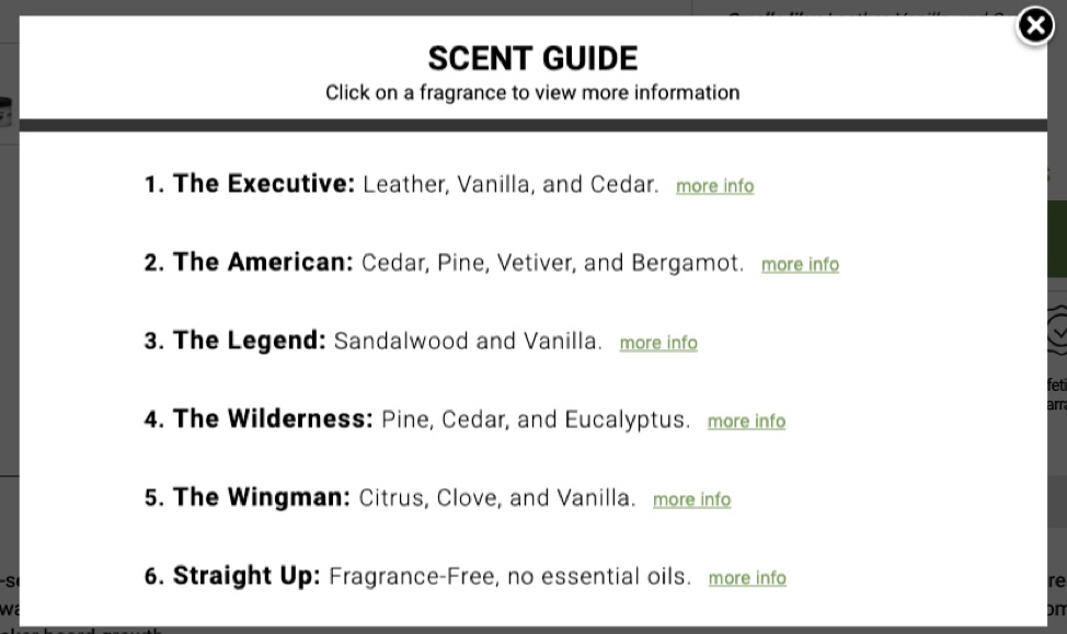
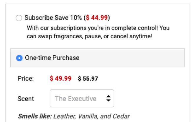
We tested two different versions. One being a “help me choose” link with a light box that had more information and a quick way to choose. The other variation was simply a recap of “Smells Like:” near the drop down to choose the scent and not having the light box with more information.
Justin Christianson
Var 1: The first version added a link to help users choose. Clicking the link opened a light box that shared more information about the scents and offered a quick way to choose.

Var 2: The second variation used a recap of how the scents smelled like with a simple “Smells Like:”

Both the versions were tested separately on desktop and mobile.
Conversion Fanatics tested the challengers against the original version over a period of 15 days. The test traffic included visitors from paid channels and social campaigns and each version saw about 2000 visitors.
A very lean tech stack was used for the experiment: Hotjar for running the poll and conducting qualitative research and analysis and Convert Experiences for running the experiment. Conversion Fanatics also set up some custom dimensions in Google Analytics for better tracking and reporting.
Results:
Both the challengers beat the control.
Also, quite unsurprisingly, the challengers performed differently on desktop and mobile.
Variation 1 (that showed the light box) outdid both the control and the second challenger on desktop and resulted in an 11% increase in completed orders, with a 24% increase in revenue per visitor.
Variation 2 (that showed the quick “smells like” summary) outperformed the control and the first challenger on mobile and resulted in a 53% increase in completed orders, with a 37% increase in revenue per visitor.
The key performance indicators (completed orders and revenue per visitor) improved hugely as a result of the experiment.
That mobile and desktop in this case as in most cases performed much differently. One variation did well on desktop while the other variation did well on mobile. But making it easy for the visitors to choose was a big catalyst to the success.
Justin Christianson
The Big Takeaways For You:
Friction points offer excellent opportunities for conversion optimization. Learning what’s stopping your visitors from completing an action and addressing them with design or copy tweaks or by offering additional information or cues (as Conversion Fanatics did in this case) can dramatically improve your conversion rates. Qualitative research is a great way to get inside the head of your visitors and uncover the most pressing friction points that discourage them from making the purchase.
Lean stack, limited data? You can still have a solid hypothesis. Ideally, you must back your hypothesis with a few different data points. But sometimes, you might get the needful, definitive insights to form your hypothesis right from a single source. For instance, in this case, the learnings Conversion Fanatics got from its qualitative research were good enough to form a data-backed hypothesis to power its winning experiment.
When running tests consider both desktop & mobile. In this case, Conversion Fanatics saw remarkably different performances by the challengers across desktop and mobile. Often, if you only run an experiment on just desktop or mobile, you might not be able to find out what could work better for the other. So if you’ve traffic to support experiments for both your desktop and mobile users, you might want to go for it.

Conversion Fanatics offers full-stack conversion rate optimization services and delivers proven and predictable results for its clients. With its results-driven approach, Conversion Fanatics has helped more than a hundred companies (of every size right from SMEs to Fortune 500) realize an average improvement of 33% in their conversion rates.
At Convert, we’re on a mission to create meaningful, sustainable experiences for today’s users and future generations. As the only Climate Neutral Certified A/B testing platform, we’re proud to offer a robust, affordable, and feature-rich platform that’s been an industry favorite for over a decade. But we’re not just about optimization for profit. With a Conscious Business approach, we’re dedicated to making a real difference and driving positive change within the CRO space and the world.
