The Ultimate (Giant) Shopify Conversion Optimization Checklist For Entrepreneurs & CRO Agencies
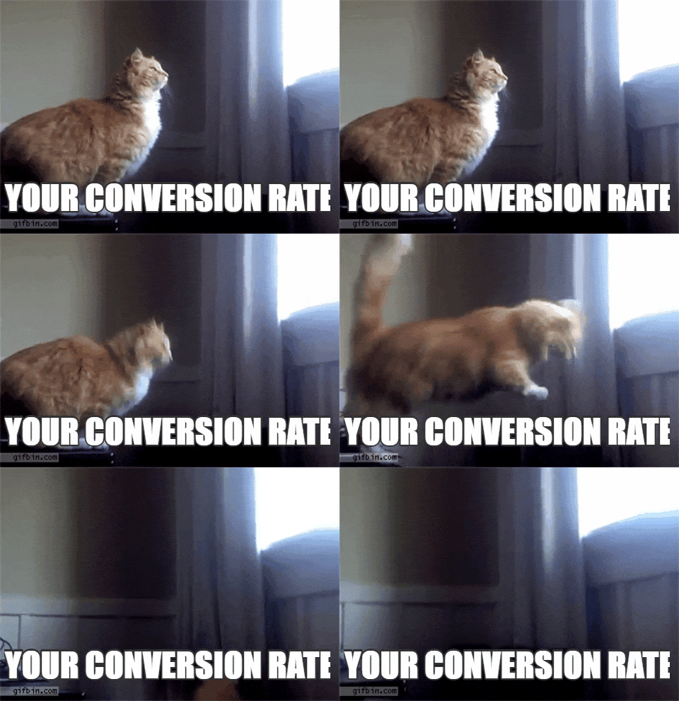
You live and breathe conversions. And yet this happens:
You cannot chase conversions without understanding why people buy. And you probably already know that.
But if your answer to that question is because your product is cheaper or the shipping costs are low, you have to dig deeper.
People buy based on emotions.
CRO is about solving customer problems and pains, not shifting pixels on a page.
Talia Wolf, Founder and Chief Optimizer, Getuplift
The first step to improving conversions is understanding what drives your customers to purchase.
We’ll show you how to use that to improve your conversions no matter what aspect of your Shopify store you’re trying to optimize.
Shopify Store Search Engine Optimization Checklist
Shopify SEO allows your store to rank better on search engines. While you may be tempted to build a keyword-first approach, SEO is all about understanding user intent and catering to it.
And as most Shopify store owners eventually learn and good CRO agencies will tell you, SEO isn’t a one-and-done strategy. The continual improvements compound over time.
But there are best practices that you can and should follow.
Basic SEO
- Invest in a custom domain
- Set up Google Search Console and Analytics
- Choose a fast and responsive site
- Install useful SEO apps
On-page SEO
- Use keyword research to optimize your pages
- Try a content optimization tool
- Start a blog to target long-tail keywords
- Prioritize internal links
Technical SEO
- Create user-friendly navigation
- Add structured data
- Speed up your load time
Let’s start with basic SEO.
Invest in a Custom Domain
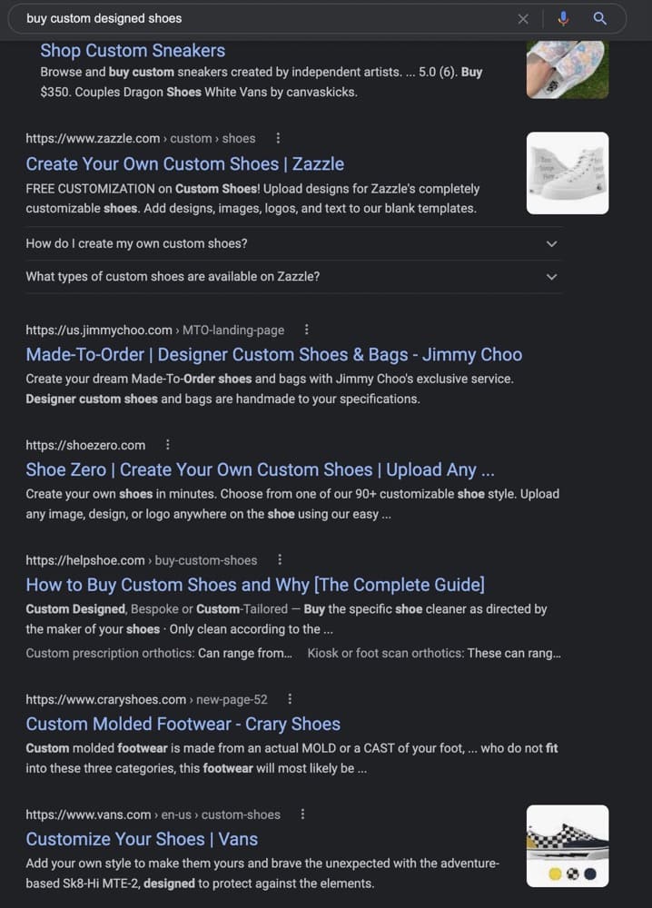
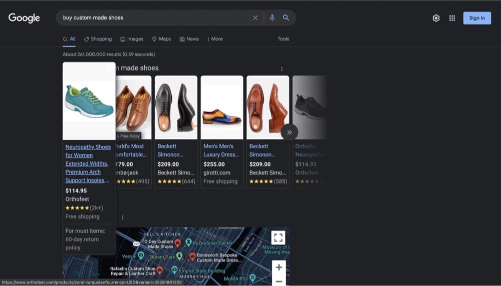
Most successful 6-figure Shopify stores have one thing in common—they use a custom domain. Your brand’s name is the first thing users see when your page appears on Search. Just look at this result for “buy custom designed shoes”:
See any “myshopify” in the URL?
Given how Google displays the URLs, it’s better for your brand and for your SEO strategy to have your brand name as the domain. Brownie points if your brand name has the keyword people are looking for.
Set up Google Search Console and Google Analytics
These are the two tools you’ll be using the most to improve your SEO.
Google Analytics can help you identify trends, patterns, and track visitor interactions, while Search Console helps you monitor and maintain your presence. Once you have sufficient conversion research to build a hypothesis, Search Console Insights can help you map customer pain points to queries (keywords) that visitors use to land on your Shopify site and optimize for them.
Step 1: Submit your sitemap All Shopify stores automatically generate a sitemap (a file that contains all the information about your site and how the content relates to each other) which you can submit through the Search Console.
Note: You can access your sitemap through www.yourstore.com/sitemap.xml
Step 2: Check for errors
Next check the Search Console for any crawling errors. These errors prevent Google from indexing your site.
Choose A Fast And Responsive Theme
Page speed can kill your conversion rates if you’re not careful. The more time it takes for your site to load, the more likely you’ll lose your audience.
Web pages don’t have loading bars. So when the page is slow, the visitor doesn’t know if the delay will be another 500 milliseconds or 15 seconds. Maybe it will never load. And the back button is right there.
Andy Crestodina, Co-founder and CMO of Orbit Media
Although you might want to choose a trendier theme, choose one optimized for speed and performance
Install Useful SEO Apps
You know the general recommendations: Only one H1 per page, keep the meta description under 155 characters, and page titles under 60 characters.
But as you scale, it is impossible to track and optimize hundreds of product pages manually. So instead, use SEO apps to do this for you.
We reviewed some of the best Shopify SEO apps with pricing and customer reviews that you can choose from.
Note: Keep an eye on your page speed because some plugins can slow down your store.
Now, let’s see how you can improve on-page SEO.
Use Keyword Research to Optimize Your Pages
Once you nail search intent and map those to your keywords, make sure you include those phrases in:
- Page Title
- Product Description
- Meta Description
- Page URL
- Alt Text (Also important to improve accessibility)
Some red flags you should avoid:
- Keyword stuffing in your copy
- Using the keyword multiple times to hit a specific density
- Ignoring keywords with a low search volume
Try a Content Optimization Tool
Thin content is a menace that plagues e-Commerce stores. If you have trouble writing product descriptions, landing page copy, or content for your blog, a content optimization tool might be worth a try.
A content optimizer tool can help you identify which related keywords have the most SEO power and show strong relevance signals to your products.
Manick Bhan, Founder and CTO at LinkGraph
Tools like Frase and Clearscope also let you analyze your competition and give you a suggested word count.
Start a Blog to Target Long-Tail Keywords
Blog posts educate your consumers and help you rank for long-tail phrases that your customers are searching for.
So if you don’t already have a blog, you might want to reconsider.
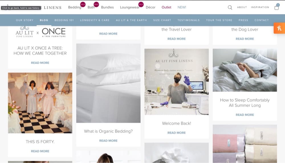
Take a look at Au Lit Fine Linens’ blog, Between The Sheets. The brand sells luxury sheets, linens, and pillows to ensure a good night’s rest and its blog follows that theme by addressing customer pain points.
Prioritize Internal Links
One of the tenets of off-page SEO is building links to your site. But don’t ignore your internal links.
For instance, if you sell boots for hiking and snowboarding, you should ideally link your content so users can find relevant products easily. You can also create a page for boots and link to all the different kinds of boots you offer which helps Google identify it as the pillar page (most important page).
This can also help you build topical authority and rank your content higher.
And finally, here are some tips for improving technical SEO.
Create User-Friendly Navigation: Focus on Functionality
The purpose of user-friendly navigation is two-fold:
- Helps users find more products which gets them to buy more and
- Improves your SEO (because what’s good for the users is good for SEO)
A few tips to keep in mind:
- Include a search bar
- Prioritize easy navigation
- Categorize your products
- Have filters to improve search
- Use mega menus if you offer lots of products
The advanced insights come from your customer research.
Are users complaining it’s hard to reach support? Include a link to your live chat in the header. Do they shop from various locations? Offer the option to switch currencies.
Are some items more popular? Include them at the top of your nav bar.
It’s best to create solid link architecture (making navigation intuitive for users and crawlable for search engines)—implementing what makes sense for your users and their experience on your site.
Google Search Central
Add Structured Data
Structured data tells Google what kind of page it is. You can use a schema generator or manually add schema to let the crawlers use that information to create rich results.
For instance, Zazzle uses FAQPage schema to display frequently asked questions:
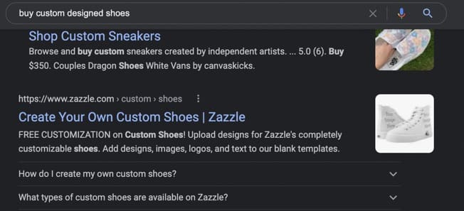
And as you can see, it occupies more real estate on SERP (search engine results page), which means users are more likely to see it and click on it.
Other types of schemas you can use:
- Aggregate rating
- Category
- Model
- Material
- Special offers
- Organization
- Website
- BreadcrumbList
- ItemList
- Product
Tip: Here’s Google’s documentation on Structured Data for Ecommerce Sites
Note: Off-page SEO for e-Commerce is equally essential to help you rank higher and primarily focuses on building links to your site and improving visibility on social media*.
Here’s Shopify’s guide to help you get started.
*While social media mentions aren’t a ranking factor, they aren’t entirely ignored by Google. For instance, if you create a Pinterest board for your products, there is a chance it might appear on SERP for the keywords you’re targeting.
Shopify Store Speed Optimization Checklist
While store speed is something that you’d technically cover in technical SEO, it deserves a special mention because store speeds impact conversions, not just rankings.
Unbounce’s 2019 Page Speed Report of 750 consumers found that over 70% are less likely to purchase if the site’s speed is slow.
First, check your store speed via PageSpeed Insights or Shopify’s Online Store Speed Report to note your baseline and view recommendations.
Tip: You may be in the green but shaving off a few milliseconds is still worth it.
Now here’s what you should be doing to fix it:
- Optimize Your Website for Mobile Use Using AMPs
- Compress and serve images in next-gen formats
- Reduce the number of HTTP requests
- Fix Broken Links and Minimize Redirects
Optimize Your Website for Mobile Use Using AMPs
You must make your Shopify store mobile-friendly in light of the widespread use of mobile devices. Shopify’s AMP integration can help you do this. Amplified Mobile Pages (AMP) is the abbreviation. Using this framework, you can construct mobile-friendly web pages that load quicker than ever before. They’re easy to use and will help you optimize your Shopify store for mobile devices, making it easier for customers to find what they need.
Shane Liuw, SEO Expert at First Page Digital
AMP pages load so fast that it almost feels instantaneous. In fact, you can use AMP across devices, not just mobile. Google also shows a lightning bolt next to AMP pages to let users know those pages load faster thereby increasing clicks and conversions.
Daniel Carter, SEO Manager of Skuuudle, recommends using AMP by Shop Sheriff, FireAMP or RocketAMP but also warns of the disadvantages of using AMP.
AMP supports Google Analytics under different tags so you need dedicated resources to track and analyze data. And since these pages do not show pop-ups and opt-in forms, you can lose leads and subscribers.
Compress and Serve Images in Next-Gen Formats
High-quality images on an e-commerce site are a double-edged sword. You can’t do without them, but having them on your page can slow it down.
Compress images without losing the quality through a tool like tinyjpg.com or tinypng.com or serve them in next-gen formats like WebP or AVIF. The latter takes up less space and consumes less data while maintaining the quality, unlike their predecessors.
Try it here: Creating WebP Images with the Command Line
Reduce the Number of HTTP Requests
HTTP requests affect the page speed in two ways. The more files on your website, the more requests the visitor’s browser has to make slowing down the load time.
But you can’t do away with this problem by having only one file. The bigger the file size, the longer it takes to transfer from your server to the user’s browser.
HubSpot’s Former Senior Product Marketing Manager, Jeffrey Vocell suggests aiming for between 10–30 files. Whittling it down to this number requires dedicated engineering resources. Check how many HTTP requests your site currently makes and which file takes the longest using Chrome’s Network Panel.
You can then choose to load the javascript asynchronously so multiple elements can load at the same time. Or, use lazy loading so that website elements load only when needed.
Finally, cut out assets that are eating into your page speed that you can live without (use visitor replays and heatmaps to identify content that is just sitting pretty) and combine your CSS files to reduce the number of HTTP requests.
Fix Broken Links and Minimize Redirects
When you have a large number of redirects on your website, it slows down the data transmission process. Remove any redirects that aren’t absolutely essential in order to speed up your store’s page load time and reduce the number of redirects on your website. Redirect pages that link to further redirect pages should likewise be avoided.
In the same way that redirection causes additional HTTP requests, broken links slow down your store’s page load time. Use site audit tools to look for broken links and fix them to avoid this. Visitors that type in the wrong URL might also benefit from bespoke 404 pages
Justin Caldwell, Co-Founder of All Home Robotics
For redirects
Use Shopify’s built-in redirect feature called “URL redirect” to apply 301 redirects.
For broken links
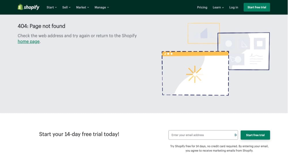
Use tools like ScreamingFrog, Ahrefs, or SEMRush to check for broken links and set up an alert so users don’t land up on a 404 page. On the rare chance they do, make sure you give them a couple of options to go back to product pages or the blog.
Take a look at Shopify’s 404 page:
Shopify Store Product Page Optimization Checklist
Your product pages are ready to be found but are you creating an experience that makes users convert?
No matter what you’re selling, people don’t care about the WHAT. They care about the WHY
Talia Wolf, Founder and Chief Optimizer, Getuplift
Wolf recommended asking these 4 questions to yourself about your customers to get started at the Conversion Hotel 2021:
- What pain does my customer feel before finding a solution?
- What are the emotional triggers that drive their decision making?
- What are their hesitations and doubts?
- How do they want to feel after finding a solution?
Once you have the answers, here’s what to do next:
- Spread your value prop evenly
- Use storytelling effectively
- Turn FAQs into carousel image captions
- Have multiple call-to-action (CTA) buttons
- Include more social proof
- Give visitors a taste pre-purchase
Spread Your Value Prop Evenly
Your value proposition shouldn’t be reserved only for the homepage. Your product pages need some love too.
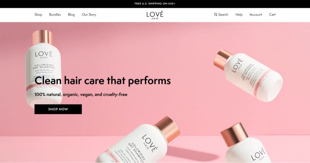
Take a look at Love Hair’s home page:
It’s abundantly clear to a visitor what the brand is about and why they should purchase. Then, when you look at the individual products, the narrative continues.
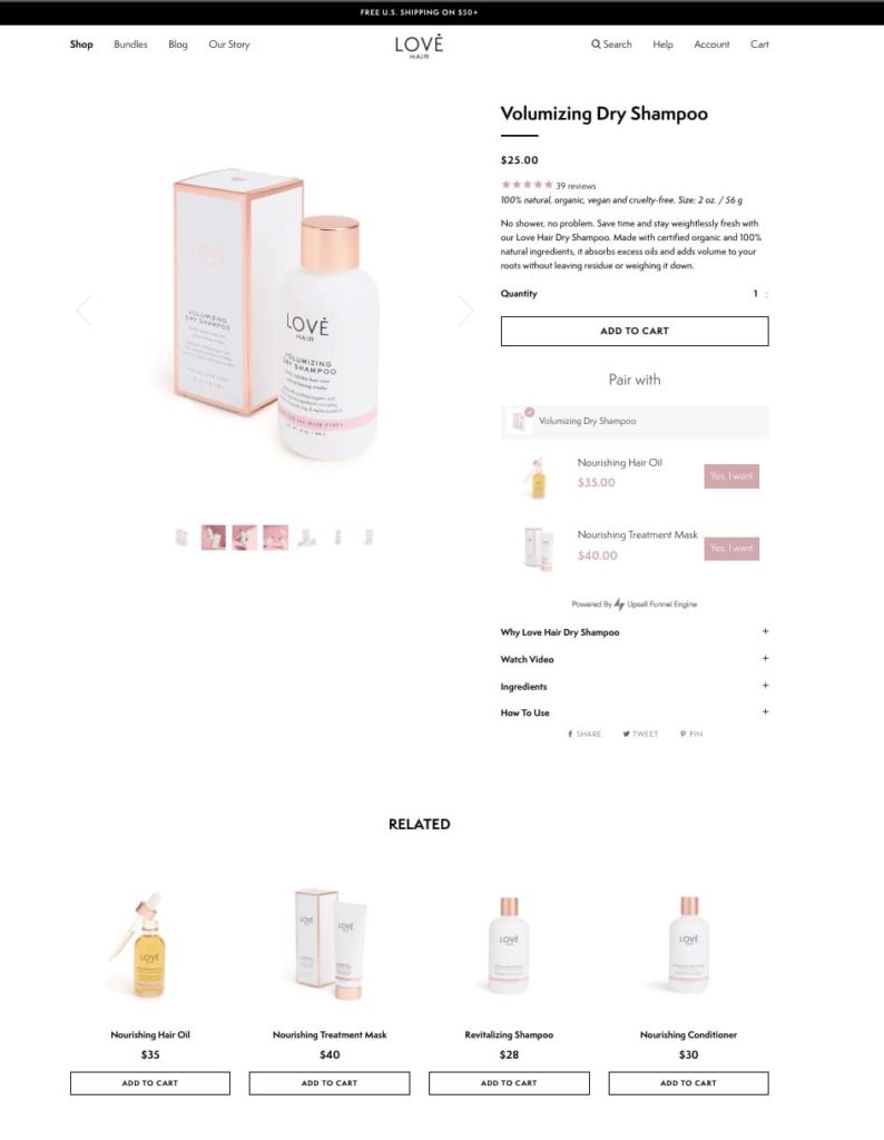
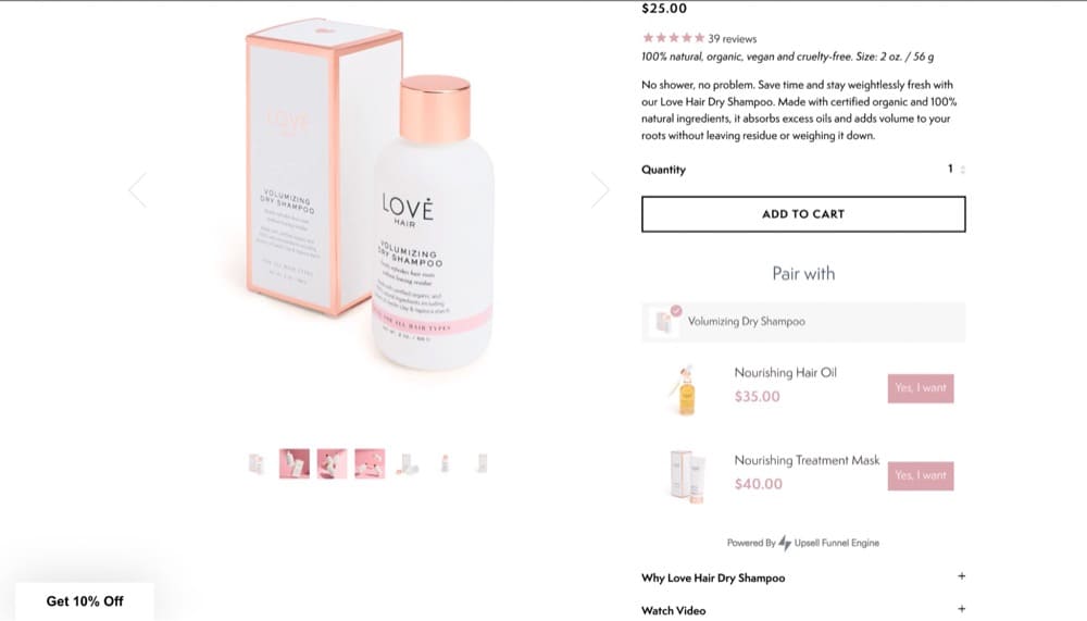
The benefit-driven product description shows how dry shampoo helps save time and stay fresh without weighing hair down.
Use Storytelling Effectively
If you want people to listen, don’t just rely on data. Use emotions and storytelling to keep them engaged.
Gilbert Eijkelenboom, Founder of MindSpeaking.com
At the Conversion Hotel, Eijkelenboom suggested the AND BUT THEREFORE framework to present your insights in storytelling:
AND allows you to set up the story. BUT elaborates on the problem. THEREFORE describes the solution or action
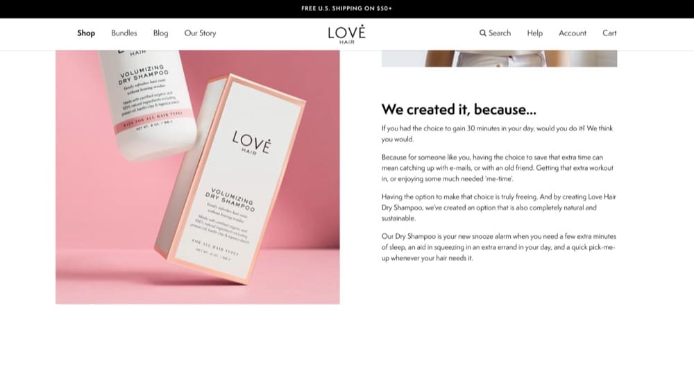
Love Hair’s product page capitalizes on this framework. There are many reasons a buyer might consider this dry shampoo—natural, sustainable, and cruelty-free.
But the brand understands its customers. Users want to steal time from their day instead of obsessing over their wash schedule, and that’s what the “We created it, because…” section delivers.
Turn FAQs into Carousel Image Captions
Carousels are no stranger to product pages but are underutilized.
MintMinds, a conversion optimization agency, tasked with helping its customer Lampenlicht.nl (a Dutch retailer) increase add-to-cart and revenue per visitor, realized customers wanted to know more about the product.
Once they paired product attributes to carousel images, it led to a 13% increase in the add-to-cart metric.
Control Desktop
Control Smartphone
Variant Desktop
Variant Smartphone
Have Multiple Call-To-Action (CTA) Buttons
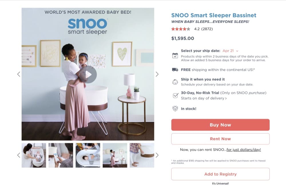
Having only one CTA may be alienating your audience. Take a look at this page from SNOO Smart Sleeper Bassinet:
SNOO uses 3 CTAs—Buy Now, Rent Now and Add to Registry catering to diverse user segments. Although Buy Now is the primary CTA, by giving options to expecting parents to rent the product or add it to their registry, they can cater to more users.
Include More Social Proof (Product Reviews, Ratings, User Images)
There’s no question that reviews matter. But how much social proof is enough?
The answer: It’s never enough. More is better.
In copywriting, length implies strength
Eddie Shleyner, founder of VeryGoodCopy
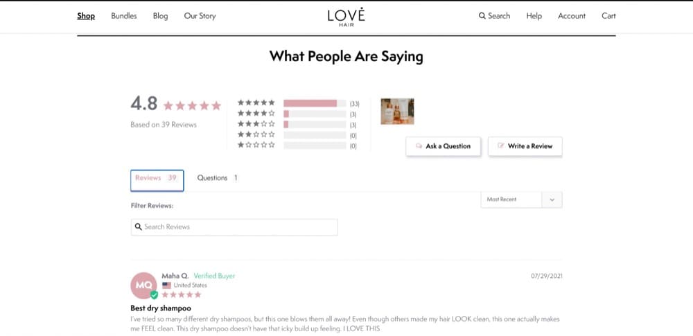
Love Hair’s product page uses reviews effectively and even allows users to ask questions:
P.S. Review mining is a great way to discover what users like about your product and weave it into your copy.
And if you want to give potential customers a better insight into how a product might look in their homes, ask for user images and display them prominently.
Give Visitors a Taste Pre-Purchase
The one difference between traditional retail and e-commerce that sticks out like a sore thumb is not being able to try a product before you buy it.
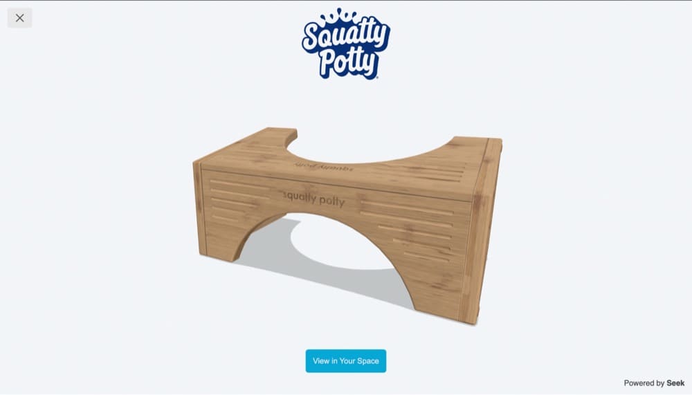
Minimize purchase risk through Augmented Reality (AR) or by sending sample sizes of new products with orders.
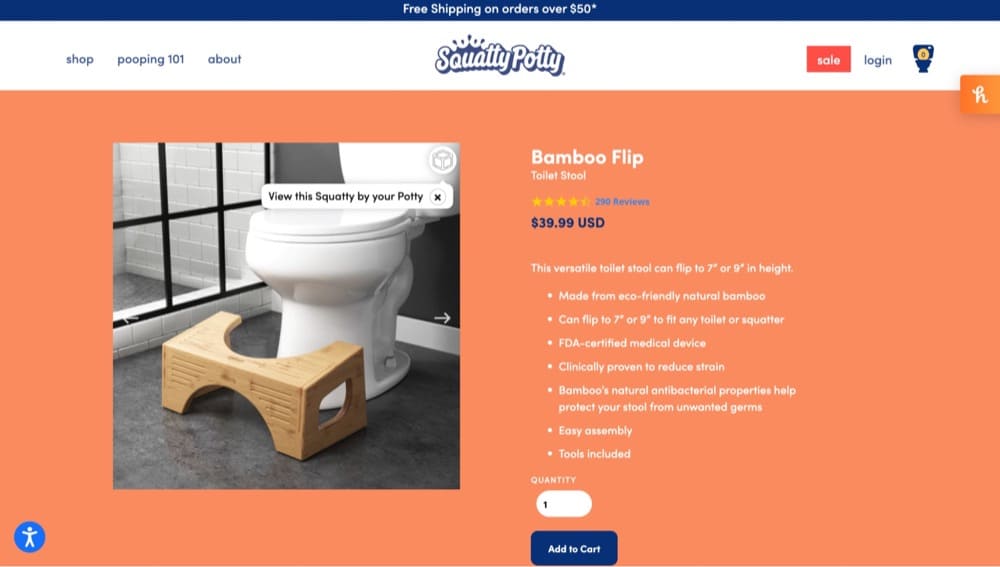
Here’s how Squatty Potty uses AR to show what the product looks like in 360, and you can view it in your bathroom:
Shopify Store Product Copy Optimization Checklist
Products don’t just sell themselves. Copy persuades and tugs at the emotional heartstrings that get people to click the BUY NOW button.
If your product is complex, you can’t get away with stuffing keywords in the heading and description and call it a day. You have to talk about the story behind it (see: the section above) and explain how it works.
- Include materials, country of origin, and measurements
- Format for skimmers too
- Write compelling and punchy CTAs
- Show shoppers the why and how
Include Materials, Country of Origin, and Measurements
Your copy should let customers know what the product is made of, where it’s made and how much does it weigh (shipping and customs charges vary), and the measurements.
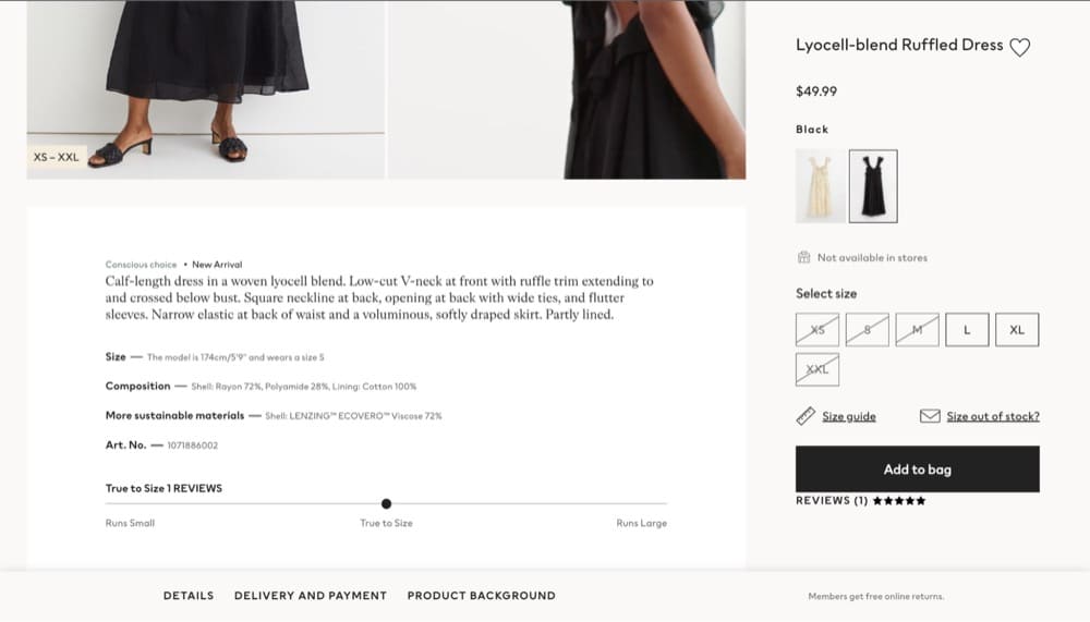
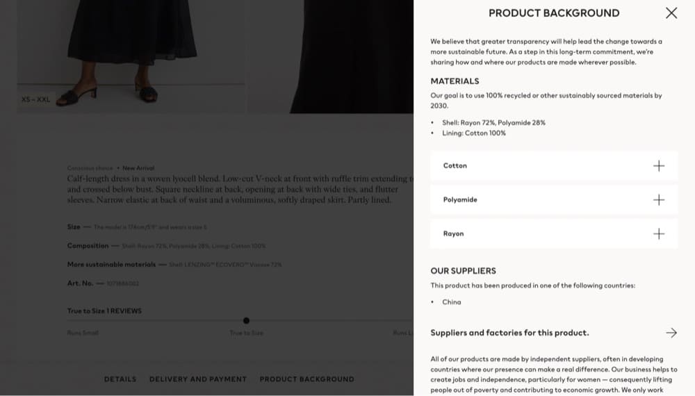
Bonus points if you’re big on sustainability or your items are made from recycled material. You should highlight that in your copy like H&M does:
When you click on Details or Product Background, more information pops up:
Format for Skimmers Too
Not everyone has the luxury to read tons of copy and it can clutter the page if you display too much information. Use bullet points, headings, and collapsible content so users can skim in a rush.
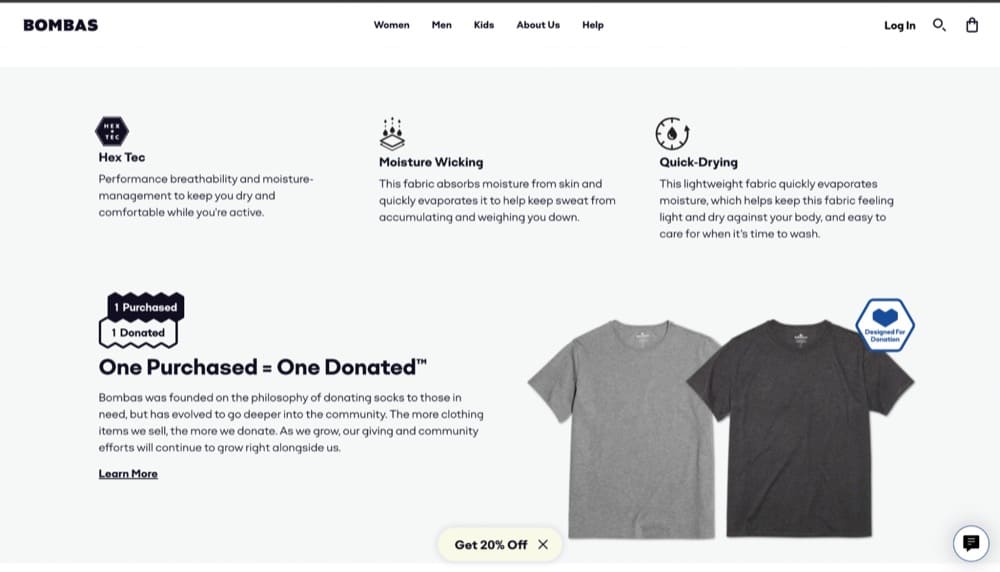
Bombas, a clothing company, has product pages that do this by displaying product attributes like so:
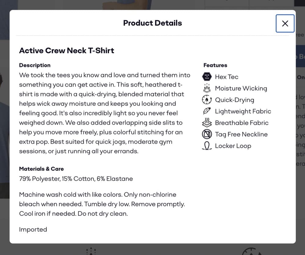
And if you click on product details on the page, you get a pop up with all the condensed information:
Write Compelling and Punchy CTAs
Retire the boring Add to Cart buttons and use something more specific like “Subscribe to get a good night’s rest” or “Yes, I want beautiful skin.”
Or keep it simple with “Shop Now” or “I want that.”
Love Hair uses a mix of both—“Add to Cart” for the main product and “Yes I want” to upsell related items that pair well with the item.
Show Shoppers the Why and How
Sometimes product descriptions aren’t enough. You also have to supplement your copy with a written explanation of how the product works or use a video.
Studio Neat is a great example of how you can use long-form copy to trigger an emotional response. The product page includes multiple high-quality photos, a video, social proof, and benefits.
Shopify Store Checkout Optimization Checklist
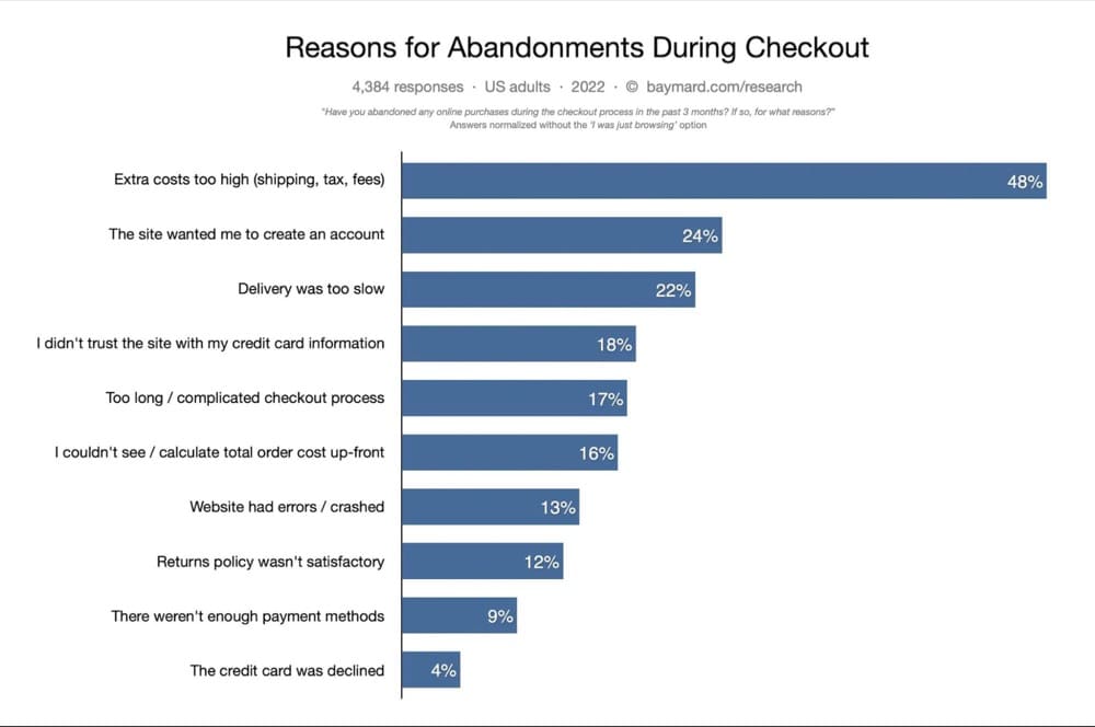
The last stage of purchase, i.e., the checkout experience left unoptimized, can lead to high abandoned cart rates. According to Baymard Institute, the average cart abandonment rate is currently 69.82%.
Baymard Institute’s 2022 research also tells us the top reasons why people abandon carts:
While your exact problems may differ, you can fix a lot of these issues.
Baymard’s research suggests that the average large e-commerce website can increase its conversion rate by 35.26% through better checkout and design.
- Optimize for international customers
- Limit the number of form fields
- Prove you’re trustworthy
- Autofill customer information or allow guest checkout
- Make the shopping cart pop
Optimize for International Customers
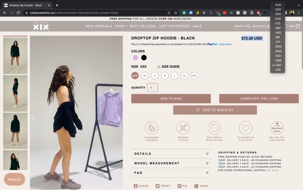
Since the primary reason for abandoned carts is extra costs i.e. shipping, tax and fees, make sure to display all this information upfront. Change currency and add shipping and tax information based on the visitor’s location during the checkout process.
Creatures of XIX, a designer dancewear brand, displays different currency and shipping information right on the product page:
Limit the Number of Form Fields
Users get overwhelmed and intimidated by a huge number of form fields.
When working on simplifying the form and form appearance, it’s important to remember that even optional fields add friction to the checkout flow.
Baymard Institute, Checkout Optimization
Baymard’s top three recommendations are:
- Collapse address line 2 and company name behind a link
- Use a single full name field
- Set billing address and shipping address the same by default
Prove You’re Trustworthy
Customers have to provide sensitive details like credit card details, address and phone number so if you can’t prove your site can be trusted, you’re going to lose the sale.
Include credit card logos, trust badges, seals and links to your privacy, returns and shipping policy. Baymard also suggests reinforcing the credit card field visually using background colors or shading to improve the perceived security of the field.
Validate credit card numbers and auto format spaces in the credit card field. These changes have been proven to boost conversions.
Autofill Customer Information or Allow Guest Checkout
Add Shop Pay as an option to autofill customer information and decrease friction.
Jarod Steffes, Co-Founder and CEO at Muddy Bites implemented Shop Pay and the company experienced a 1,167% year-over-year growth from 2019 to 2020.
We have a one-click checkout system that has a very high conversion rate with extreme growth.
If you don’t have Shopify Plus, consider allowing guest checkout so shoppers don’t have to go through the agonizing process of creating an account.
Make the Shopping Cart Pop
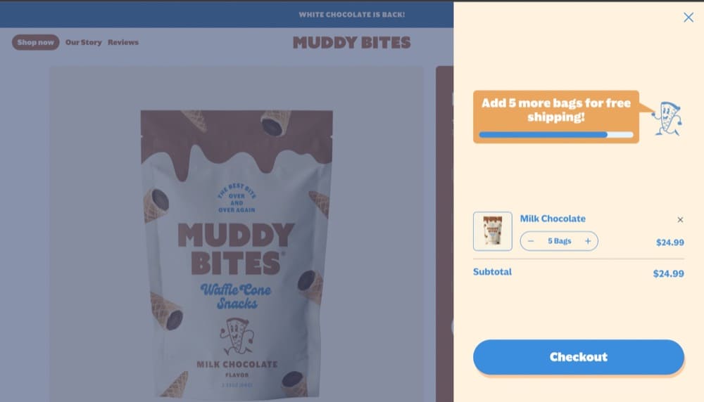
Carts also get abandoned simply because users are distracted. You can bring their attention to the cart by using interactive shopping carts, slide-in carts, or using a pop-up cart.
Take a look at Muddy Bites’ slide-in cart:
What’s also great about this is they tell users how close they are to getting free shipping which can help increase your average order value (AOV).
Shopify Store PPC Performance Optimization Checklist
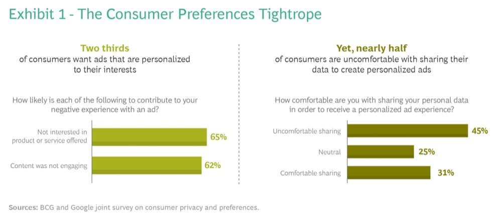
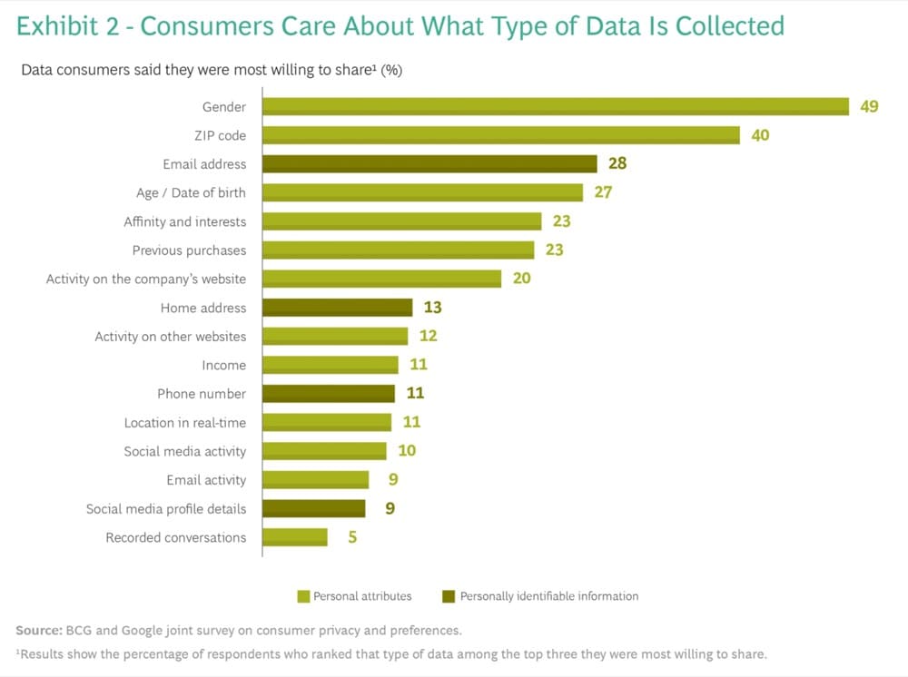
Although ads may be taking a beating with the new privacy updates, BCG and Google’s joint survey of 1,000 US and Canada consumers in August 2021 found that consumers do want relevant ads. But they’re uncomfortable sharing data needed to create a personalized ad.
For starters, take a consumer-first approach to data collection. When you start running ads, make sure you’re clued into what customers are buying instead of what you hope they’ll buy.
- Let consumers know what, why and how you’re collecting data
- Make sure your paid search ads and landing pages are relevant
- Make incremental changes to your landing page via A/B tests
Let Consumers Know What, Why and How You’re Collecting Data
The BCG and Google survey found that consumers are concerned with three things:
- What data is being collected?
- Why is it being collected?
- How is the data collected and is there a clear value exchange?
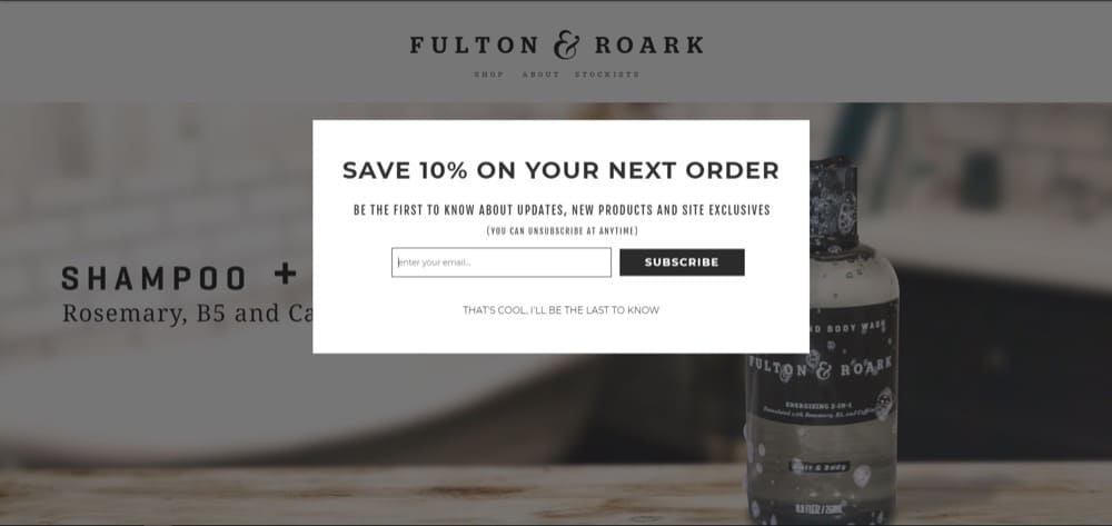
So when you use a pop-up to ask for phone numbers or email, make sure you also let users know what they get in return.
Offering a 10% discount on the first order is a common incentive brands use to build their email list. Fulton and Roark also let users know they’ll be the first to know about site exclusives and product updates.
Tip: Make sure your privacy policy covers data privacy and what you intend to do with user data in detail to comply with GDPR.
Make Sure Your Paid Search Ads and Landing Pages Are Relevant
Your ad talks about striped socks and shows pictures of striped socks but when users land on your page, you show them all kinds of socks instead of the ones they wanted.
Sure, you wanted shoppers to know you have variety but you’re unintentionally misleading them.
This is a good example of you getting what you click on:
Make Incremental Changes to Your Landing Page(s) via A/B Tests
Don’t pump money into ads and think users will automatically convert. Despite what you know about your audience, there’s always room for improvement.
And with A/B tests, you can make those small improvements and test the impact without blowing your budget in one go.
A/B testing platforms like Convert Experiences allow you to do that without stressing about code and hard-to-understand workflows. Plus, it’s perfect for agencies since there is no limit to how many subdomains and client accounts you can have.
Shopify Store BF/CM (and Sale Season) Optimization Checklist
BFCM is when consumers typically throw caution to the wind and shop more. Even though 2021’s Black Friday wasn’t that big a deal in stores, online shoppers broke records.
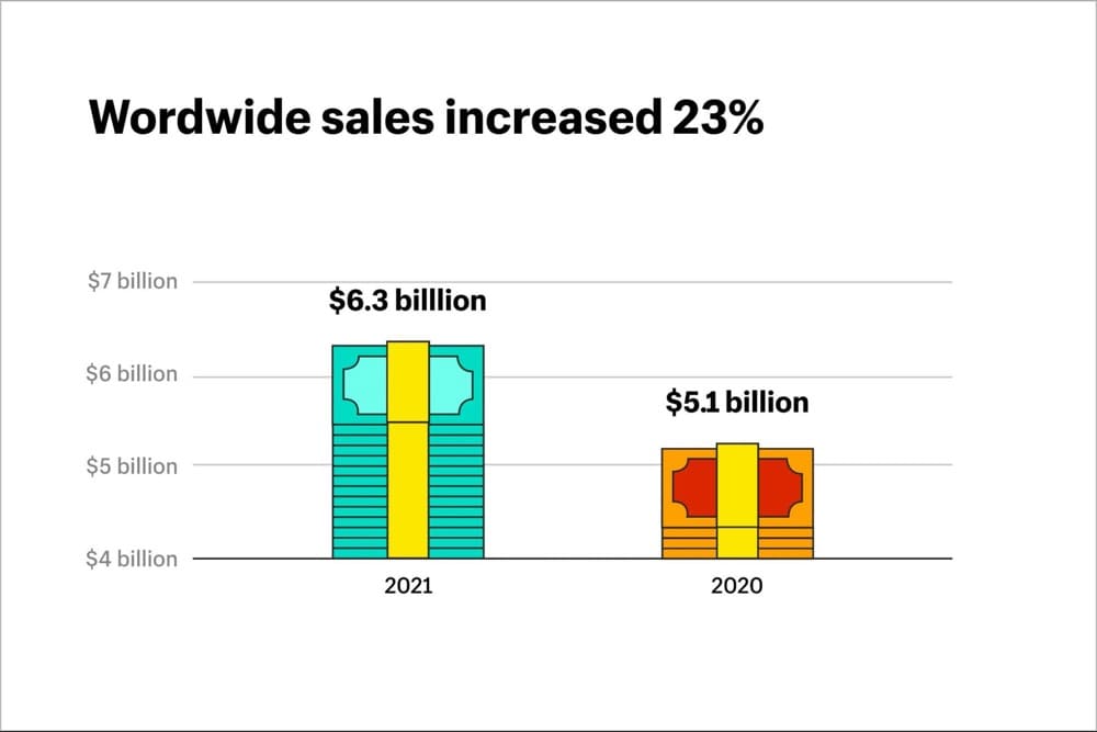
According to Shopify, worldwide sales increased by 23% during BFCM and that trend is likely to continue.
Here’s how to prepare for this year’s BFCM and holiday season:
- Deck the
hallssite with holiday cheer, sales, and CTAs - Make navigation and search a breeze
- Combine social proof with product images
Deck The Halls Site With Holiday Cheer, Sales, and CTAs
You can create a specific page for your holiday sales or add holiday cheer to your entire site. Some retailers only offer discounts on specific products, while others offer site-wide sales.
For instance, Alternative offered a mix of both:
Tip: Use easy-to-remember BFCM-themed coupon codes like Alternative did instead of a random string of numbers and letters.
Zhush up your CTAs to include gift-giving guides if you’re not offering discounts. Luxury brands like Armani typically don’t offer discounts but get in the holiday mood by switching up their feature images and call-to-action.
Focus on User Experience: Make Navigation and Search a Breeze
The last thing you want is confusing people when they land on your site during the holiday season. A/B test your navigation ahead of time and make sure search queries return results. Queries that end in no results can cause a user to bounce from your site immediately.
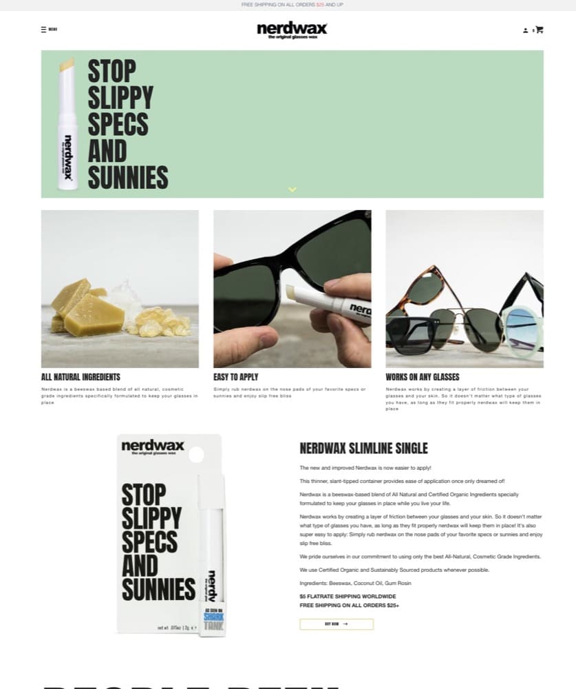
You can add your best-selling products right on your homepage like Nerdwax does:
Combine Social Proof with Product Images
Consumers are in a rush during the holiday season. Make it easy for them to make a discussion by pairing social proof with product images so they don’t have to scroll down.
You might use a ‘hero quote’ next to a ‘hero image’ saying something like “I was ready to start invoicing within 5 minutes…” or “I saved 2 hours a day watering my plants”. These ‘big ass quotes’ and work very well.
Craig Sullivan, Optimiser in Chief at Optimal Visit
Some Really Good Shopify Conversion Optimization Resources
- Best Shopify Conversion Apps: 2022 Round-Up of the Best Shopify Conversion Rate Optimization Apps
- Mini Makeover Checklist by Alley Hassen
- Checklist to improve your Shopify Conversion Rate by Nicholas Reed
- BFCM Checklist by Brad Haynes
- Holiday Season Tips for Higher Conversion by Craig Sullivan
Don’t Assume. Ask Your audience. Then Test.
While best practices or real-life examples from brands in your category can help you fix some of the most obvious problems, it’s not a replacement for conversion research or a guarantee that your conversion rates will skyrocket.
Conversion optimization is the lifeblood of 7+ figure Shopify stores. Successful entrepreneurs and CRO agencies never make the mistake of assuming they know what their audience wants.
But even asking your audience what they want and putting it out there on your page isn’t enough.
One of Amazon’s core values is this:
“If you don’t listen to your customers you will fail. But if you only listen to your customers you will also fail.”
Before they know they want it, they have to see it and the best way to test those hypotheses is to test them.
Use GoodUI to learn from A/B tests leading companies run.
Test rigorously, remove your biases, respect user privacy and conversion optimization will cease to become a short-term growth play. A tool like Convert Experiences can help you make CRO an active part of your marketing strategy and impact what all businesses ultimately want—revenue.
Written By
Sneh Ratna Choudhary

Edited By
Carmen Apostu

