The Hands-On Compilation of Shopify Store A/B Tests: 15 Conversion and Sales Boosting Test Ideas (To Inspire Your Success)
Tempted to switch your Shopify theme or try yet another CTA button color to increase conversions? If you’ve been tweaking elements on your store but conversions remain sluggish—it might be time to shift your approach to experimentation.
Instead of going down the rabbit hole of tweaking random elements on your site, start by identifying where your customers are getting hung up in their journey. Once you know where they’re struggling, you can design experiments specifically to address those pain points.
And the importance of this research-first approach can’t be overstated.
- You have to conduct deep qualitative and quantitative research. Probe those user journeys for Fears-Uncertainties-Doubts.
- You can get inspired by what others around you have done. All that effort should rightly spark creative solutions for your identified problems. But they should not replace your thinking (partly the ability to see what’s actually broken, and partly the direction you want your brand to take — aka how you wish to innovate)
TL;DR: This compilation of ideas is inspiration for context specific problems unique to your brand.
Each test idea in this blog post revolves around an important but often overlooked conversion barrier—for example, a lack of social proof or product use demonstrations—and presents several hypotheses and recommendations for you to test out.
Let’s get to it.
Ideas for A/B Testing the Homepage
Your homepage should represent what’s best about the brand and why customers should buy from you. In many cases though, the homepage lacks a clear focus on the user’s motivations and benefits and does not represent the brand well enough.
When you’re looking for test ideas, inspiration can come from anywhere – even your competitors! But don’t just implement their ideas; test them out on your store to see if they resonate with your customers. The homepage is a place to showcase the brand and featured products in a way that gets users interested and moving forward through the funnel.
Homepage testing is an important part of the optimization track because it can help you
- Increase CTR to the next steps in the funnel
- Create a positive brand perception and set the foundation for a great shopping experience
Ideas for testing may come from
- Heuristic research
- User testing
- Session Recordings
- Heatmaps
- Customer surveys
Homepage Test Idea #1: Press and Media Mentions Below the Hero Section
Many Shopify stores tend to overlook the importance of the press and media mentions on the homepage. In the rare cases where they use it, it is often located at the bottom of the page.
Recommendation
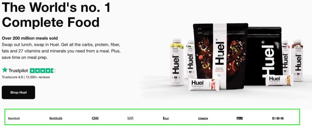
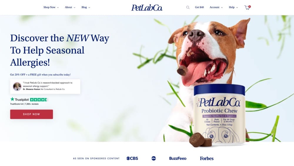
Highlighting the press and media mentions just below your homepage hero is a great way to show off what has been said about you.
Test the following:
- Adding a section below the homepage hero that highlights the press and media mentions.
- Providing more context by presenting quotes from the media and press alongside logos.
The press and media mentions on a site are essential for establishing trust with new visitors. First-time users are skeptical if they haven’t heard about the brand. Media mentions on the website may reassure them that they are doing business with a reputable company.
Now let’s take a look at some real brands that have used this type of social proof on their homepages.
Example 1: Huel.com
Example 2: PetLabCo.com
Homepage Test Idea #2: Use the Founder’s Story
Foundational stories are often overlooked by ecommerce companies, but they’re an important part of building customer loyalty. Not only do customers want to know how a brand was founded and what its vision is, but they also want to be a part of the story and relate to a brand on a personal level.
It is very common for ecommerce brands to hide this story on their About Us pages or even overlook it altogether. It’s a huge oversight, as they’re losing out on the chance to gain a very loyal audience.
Hypothesis to test
We have tested adding the founder story on one of the websites we are working on and the results were great.
We can see many brands that have amazing stories but they are hidden away on the About Us page.
After analyzing the segments of users that see the About Us page, compared to those that don’t see it, users that see it convert considerably better as they have gained more trust in the brand and know they are supporting a founder-led brand.
Background
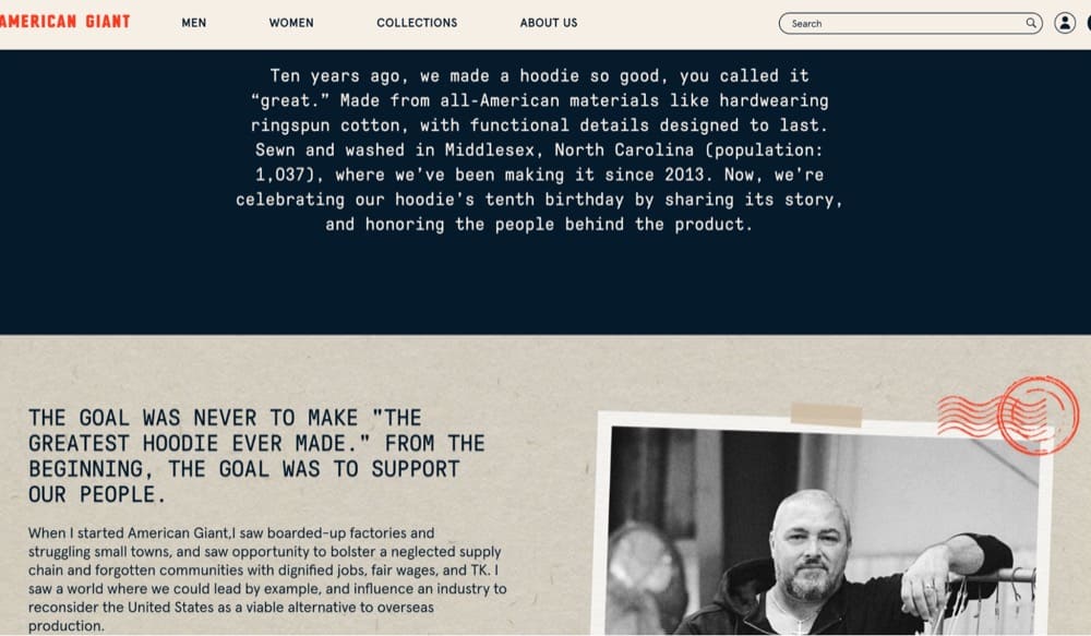
By telling your brand’s founder’s story, you create a bond with your visitors and users and build brand loyalty. It humanizes the visitor’s experience when they land on the site.
A story added to your homepage will catch more users’ attention and make them more trusting of your brand. As a result, there should be an increase in both clickthroughs and sales to the product pages.
Check out some brands that have successfully done this:
Example 1: Lunya.com
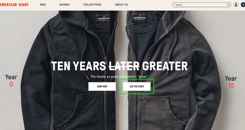
Example 2: American-Giant.com
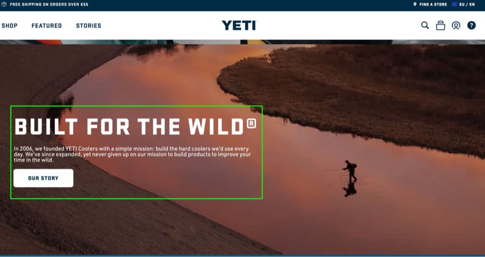
Example 3: Yeti.com
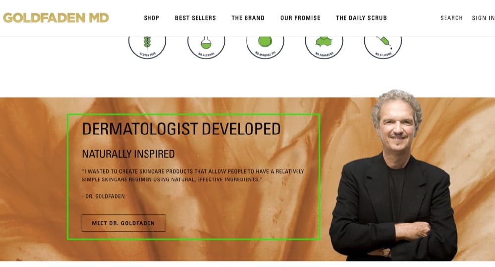
Example 4: Goldfadenmd.com
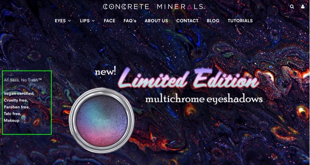
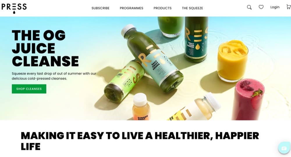
Homepage Test Idea #3: Benefit-focused Hero Section
First impressions are essential, which is why you want to make sure your hero section of the homepage really stands out. The user usually decides whether to continue exploring the website or abandon it at this point.
That’s why you need to make the hero section as attractive as possible and communicate value right away.
Recommendation
Make sure you test these elements:
- A clear value proposition
- A hero image that highlights the product
- An actionable CTA
- Social proof which might include ratings or a testimonial
Hypothesis to test
The above-the-fold section of the homepage is the first thing that visitors see when they land on the site. If visitors fail to understand what the brand sells, they are most likely to abandon the site.
A well-optimized hero section can be used to guide visitors into the middle of the funnel from the top of the funnel.
Here are some brands that do just that.
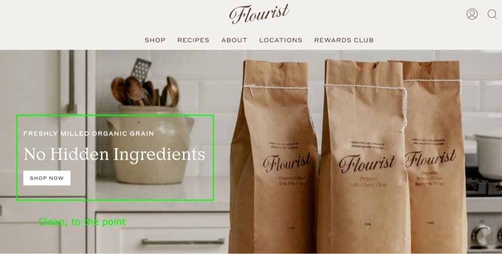
Example 1: Flourist.com
Example 2: ConcreteMinerals.com
Example 3: Press-London.com
Ideas for A/B Testing Collection Pages
Congrats on keeping visitors on your website and getting them to your collection pages!
Here comes the fun part – helping shoppers of all interests (and budgets) find what they’re looking for. Think of collection pages (also known as category pages) as aisles in your store. You don’t want your visitors to get lost in them.
To make this experience as smooth-sailing as possible, help users filter results and find products that meet their needs.
Collection page testing is an important part of the optimization track because it can help you
- Increase CTR to the next steps in the funnel
- Increase CTR to product page views
Testing ideas may come from a variety of sources
- Heuristic research
- User testing
- Session Recordings
- Heatmaps
- Customer surveys
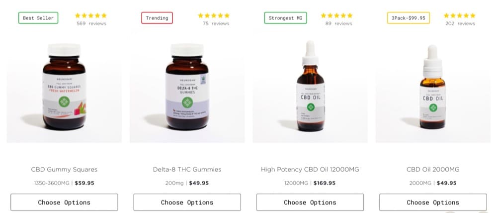
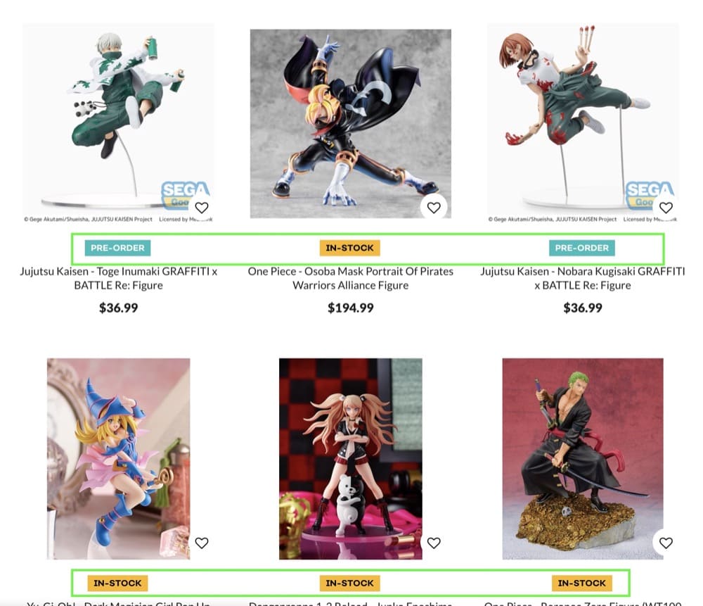
Collection Page Test Idea #1: Use Product Badges
The collection page is one of the most important pages in an online store, where visitors can search and browse for products. Visitors will be more likely to purchase from a site that has well-thought-out collection pages.
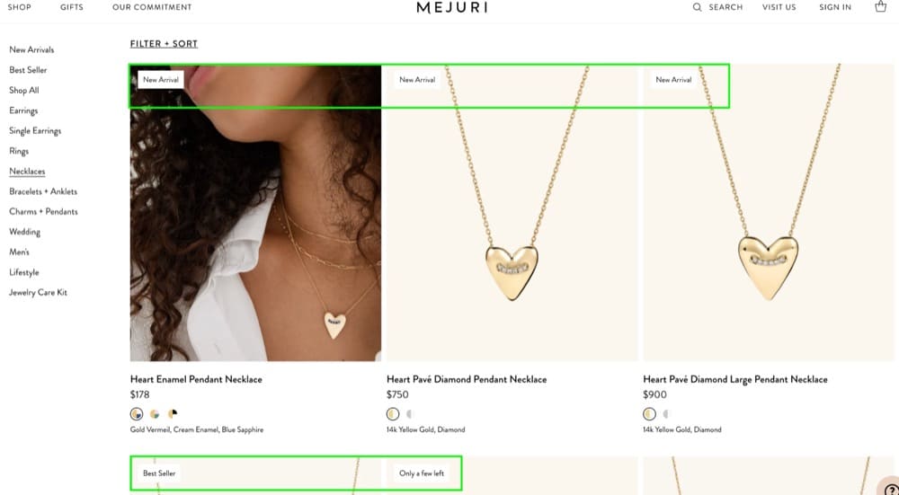
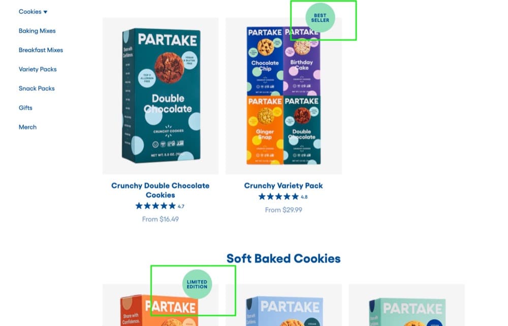
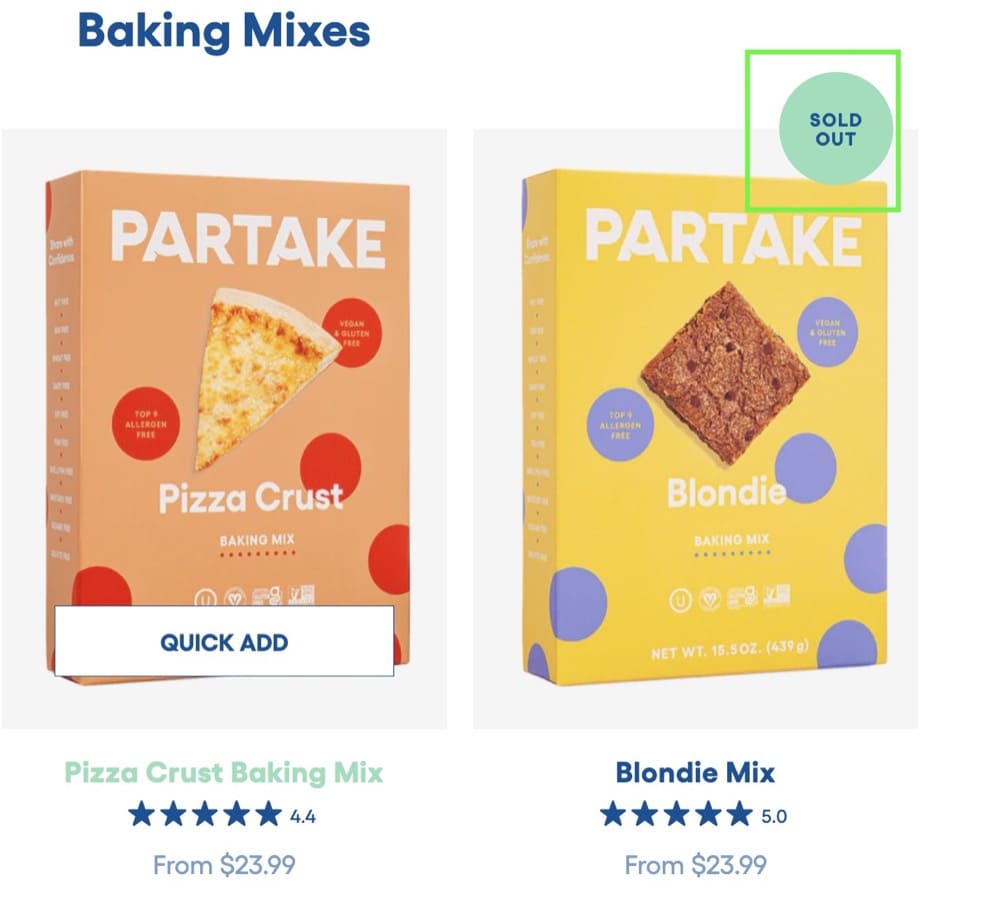
Product badges used on these pages are a powerful way to highlight certain products in your store and encourage customers to purchase them. You can use badges to promote your most popular items, new products, special offers, or clearance items.
Scroll tracking analysis and session recording analysis can be used to understand how visitors interact with a collection page and identify areas for improvement.
Recommendation
- Test adding product badges, like “Top seller” and “Trending”, to some of the products on the collection page.
Hypothesis to test
Adding context-sensitive badges to your product listings can help a buyer decide, at a glance, which products they might want to investigate further.
For instance, a regular shopper on your website might want to know what’s new. A “New” badge on products in a category would allow such a buyer to quickly know what’s been added as they browse.
Here are some examples of ecommerce stores that make intelligent use of product badges on collection pages.
Example 1: CrunchyRoll.com
Example 2: Mejuri.com
Example 3: Partakefoods.com
Collection Page Test Idea #2: Add a Search Bar
Category pages are usually where visitors browse through a large number of products and find the specific item they are looking for. However, sometimes category pages can be problematic. If visitors are unable to find the exact product they want, they may leave the site without purchasing.
Recommendation
Website visitors that use the search function are more likely to convert.
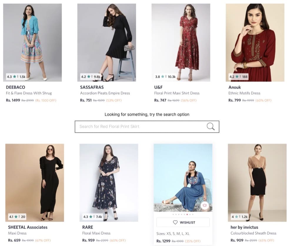
Make sure you test placing the search bar in a prominent place, like the middle of the collections page. This will make it easier for visitors to find what they are looking for.
Hypothesis to test
Visitors that use the search option tend to convert higher than those who do not. Incorporating a search bar in the middle of the collection page can help visitors find the product they’re looking for faster and thereby increases the conversion rate.
Ideas for A/B Testing Product Pages
You’ve seen it happen time and again: users browse through your product pages (PDP), but they don’t actually add any products to their cart.
Product pages provide a great place for potential customers to get all their information about the products they’re interested in. You can use this space to go all out with the product features, testimonials, reviews, and anything you can use to showcase your product.
Product page testing may help you
- Increase add-to-cart rates
- Increase sales conversion rates
Testing ideas may come from a variety of sources
- Heuristic research
- User testing
- Session Recordings
- Heatmaps
- Customer surveys
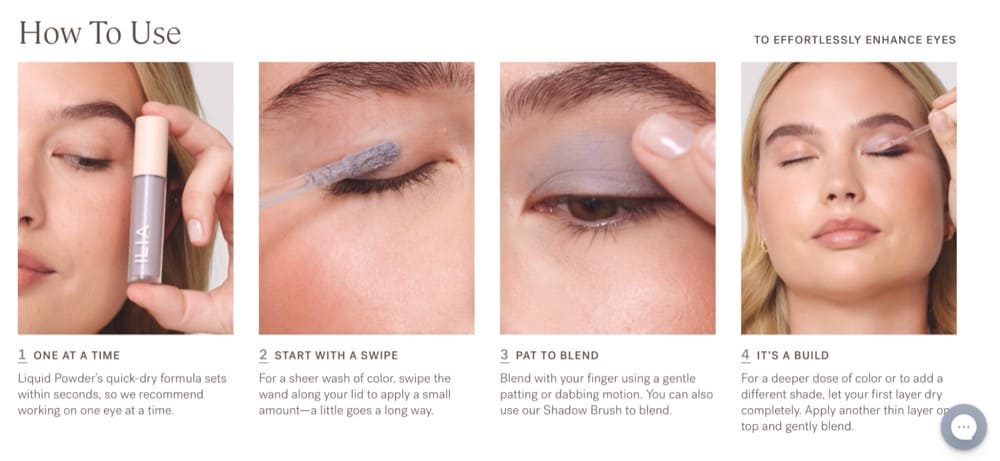
Product Page Test Idea #1: How to Use Section
One of the main points of friction in any shopping journey is not having a clear understanding of how the product works.
Recommendation
We recommend testing:
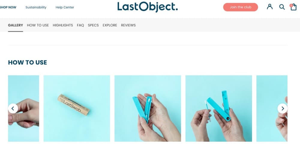
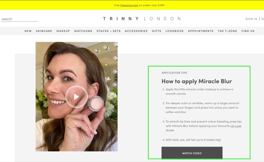
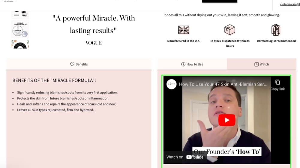
- Adding a “How to use / How it works” section on the product page to educate the visitors about the product.
- Using images or gifs to show the product being used
- Demonstrating how the product can be used while highlighting its advantages
Hypothesis to test
“How to use” sections can provide potential customers with a quick and concise explanation and remove the anxiety of buying a product they don’t understand.
These ecom stores understood the assignment:
Example 1: LastObject.com
Example 2: TrinnyLondon.com
Example 3: 47skin.com
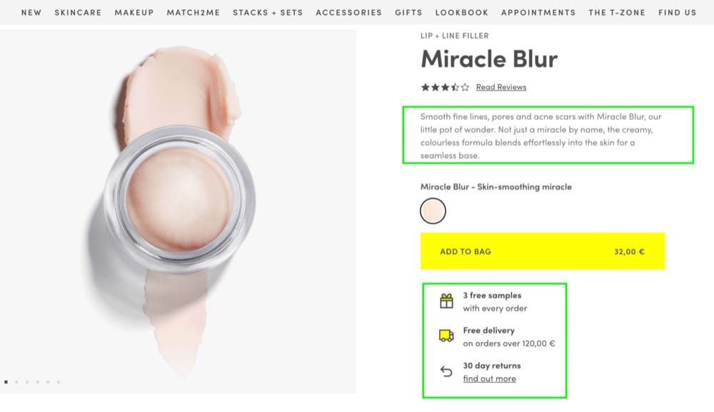
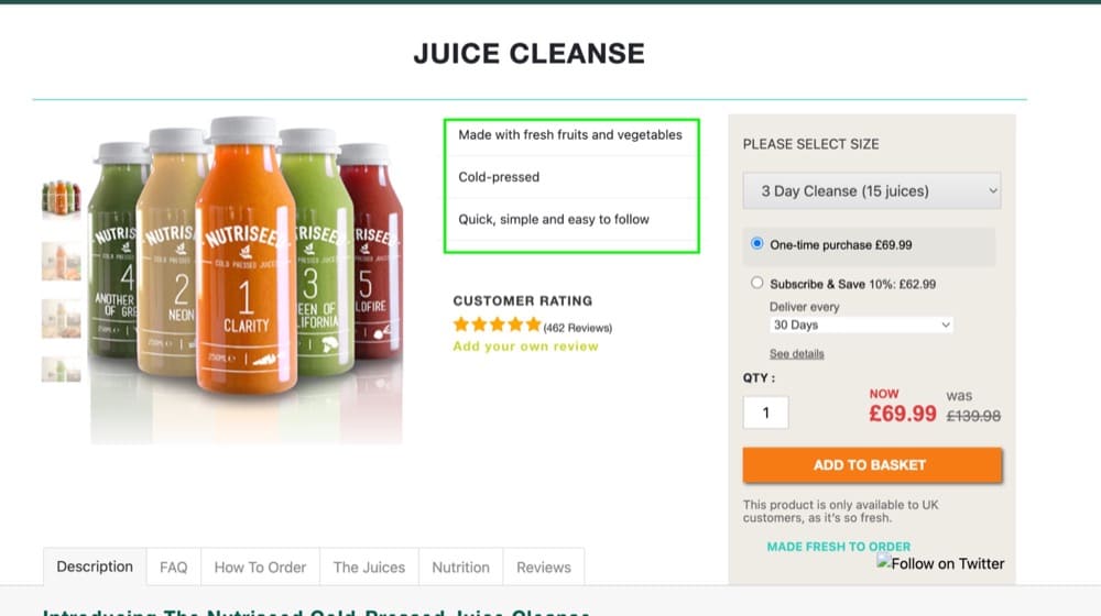
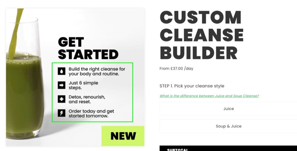
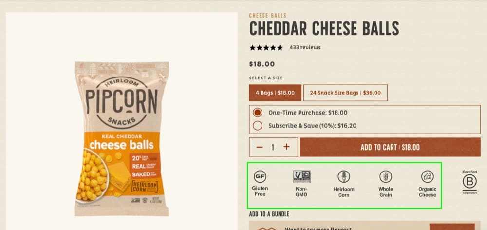
Product Page Test Idea #2: Highlight the Top Benefits
The hero section of a PDP is where a visitor should be able to understand what the product does and how it’s beneficial for them.
Recommendation
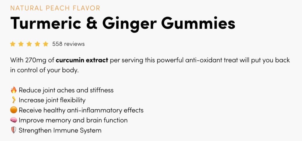
- Highlight the three to five most important benefits of the product.
Hypothesis to test
The above-the-fold section of a product page should answer the visitor’s question “What’s in it for me?” or “How will this benefit me?”.
In highlighting the benefits of the product, we are aiming to increase its perceived value. In the same way that these brands did:
Example 1: TrinnyLondon.com
Example 2: NutriSeed.co.uk
Example 3: Fresh-London.com
Example 4: Pipsnacks.com
Product Page Test Idea #3: Present Real Results
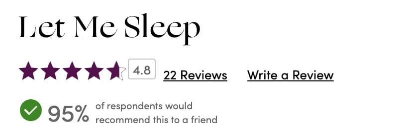
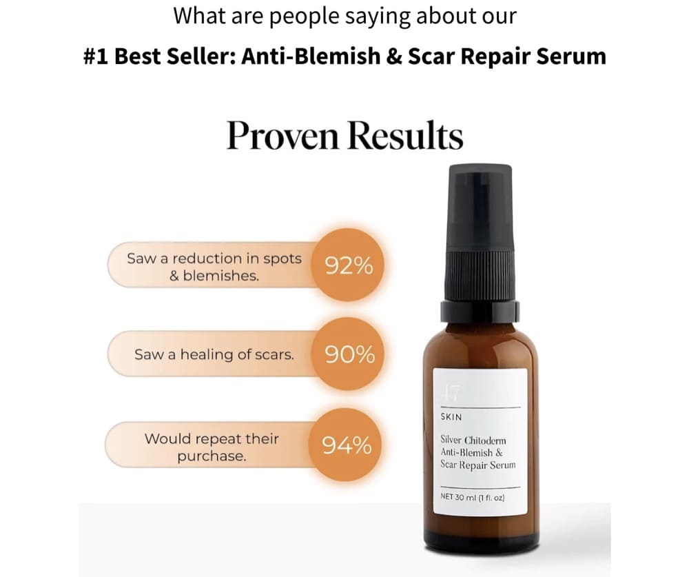
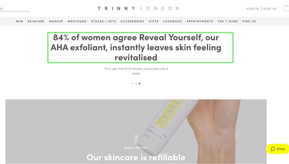
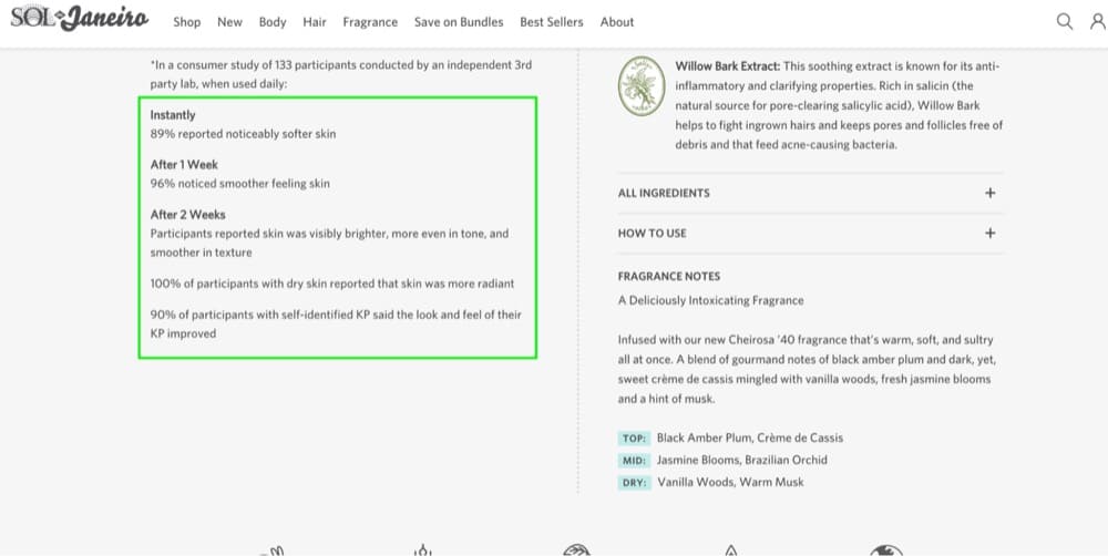
When it comes to beauty and health brands in particular, new visitors are generally anxious about whether the products would work for them.
Recommendation
Try:
- Showing real results in the above-the-fold section
- Providing examples of how the product has worked for other users
Hypothesis to test
It is common for visitors to search for multiple solutions before purchasing a product. A lot of visitors might have tried other products previously, which makes them cautious about trying new products.
The more results we can show, the more we can reduce skepticism and give new users hope that the product will work for them.
Brands that inspire trust through actual results include:
Example 1: 47Skin.com
Example 2: TrinnyLondon.com
Example 3: SolDeJaneiro.com
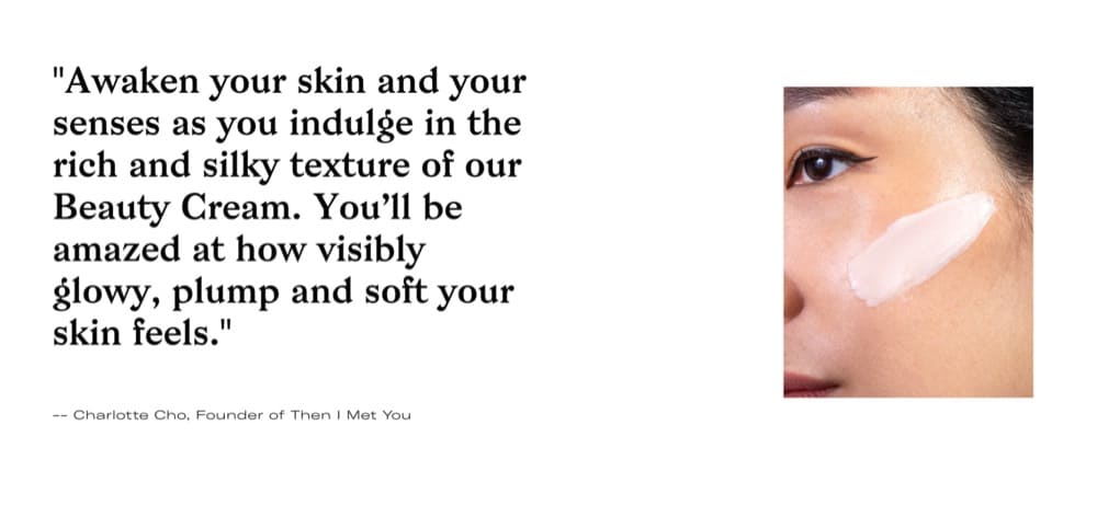
Product Page Test Idea #4: Image Storytelling
Product photos are an important element of an online store. They provide potential customers with a visual representation of the product and help to give them a sense of what it would be like to own or use it.
Recommendation
We recommend testing the following:
- Using product photos that convey a story (lifestyle images)
- Incorporating copy related to the product, such as benefits or facts about the product.
Hypothesis to test
When customers are shopping online, they rely heavily on images to make their buying decisions.
Product photos give potential customers a clear idea of what the product looks like and how it can be used, while lifestyle images help to tell a story about the product and connect with the customer on an emotional level.
Good product photos and lifestyle images can make all the difference when it comes to conversion rates. By telling a story through images, businesses can ensure that their products stand out from the competition and that their customers have all the information they need to make a purchase.
Example: ThenIMetYou.com
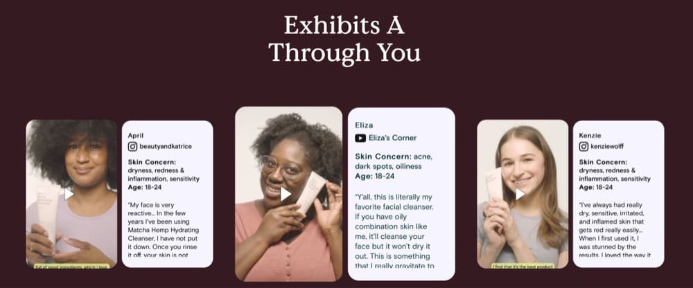
Product Page Test Idea #5: Use Tailored Social Proof
Ecommerce stores often use Shopify apps like Judge.me or Loox to collect and display reviews. Although they are generally helpful in building trust, they may sometimes fail to convince the visitor to purchase because they may not target the visitor’s most pressing pain point.
Recommendation
We recommend testing:
- Curating testimonials that address the biggest pain points and how the product helped
- Showing before-and-after results
- Adding UGCs to the product pages
Hypothesis to test
By using relevant and targeted social proof, businesses can create a more personal connection with their visitors and increase the likelihood of converting them into customers.
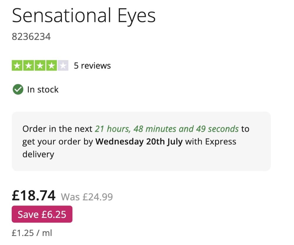
Product Page and Checkout Test Idea: Estimated Shipping/Delivery Time
This is a common problem with online shopping. Oftentimes, there is no clarity on estimated shipping or delivery time, which can create anxiety about when the product will finally arrive. This can be frustrating for customers, particularly if they are relying on the product for a special event or occasion.
Recommendation
- Include the estimated shipping time on the product page and checkout page.
- Use urgency like “order within the next 6 hours to have it shipped today” to persuade visitors to buy.
Hypothesis to test
Shipping causes friction for visitors since it involves cost. When there is no estimated shipping time mentioned, it increases the possibility of them abandoning the funnel.
By adding clarity around the estimated shipping time, we might reduce the abandonment rate down the funnel.
Ideas for A/B Testing Cart Pages
Users add products to their cart but they rarely complete their purchases.
In fact, the average online shopper abandons their cart 70% of the time. There are many reasons why this may be, including the fact that shoppers may use their cart as a wishlist, rather than intending to make a purchase right away.
As a result, online retailers need to find ways to motivate their users to complete their purchases.
This can be done through a variety of means, such as offering discounts, simplifying the checkout process, or providing free shipping. By finding the right mix of incentives, retailers can increase their chances of converting abandoned carts into completed purchases.
Tests on cart pages are an important part of the optimization process because they can
- Increase checkout initiated rates
- Increase sales conversion rates
As with the other pages, testing ideas may come from a variety of sources
- Heuristic research
- User testing
- Session Recordings
- Heatmaps
- Customer surveys
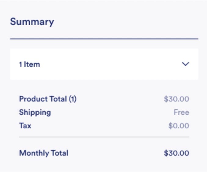
Cart Test Idea #1: Display the Final Price
Shipping costs and other charges are not always calculated before visitors reach the checkout funnel after adding a product to the cart.
Recommendation
We recommend testing:
- If there is any shipping cost involved, display that in the cart.
Consider the shipping cost, discounts, etc., when calculating the total amount.
Hypothesis to test
To complete the purchase, your customers need all the information related to payment. They are more likely to abandon their basket before paying if they are uncertain about what they will be charged.
Having the final price displayed in the shopping basket before the checkout page increases the chances of the customer not abandoning their order.
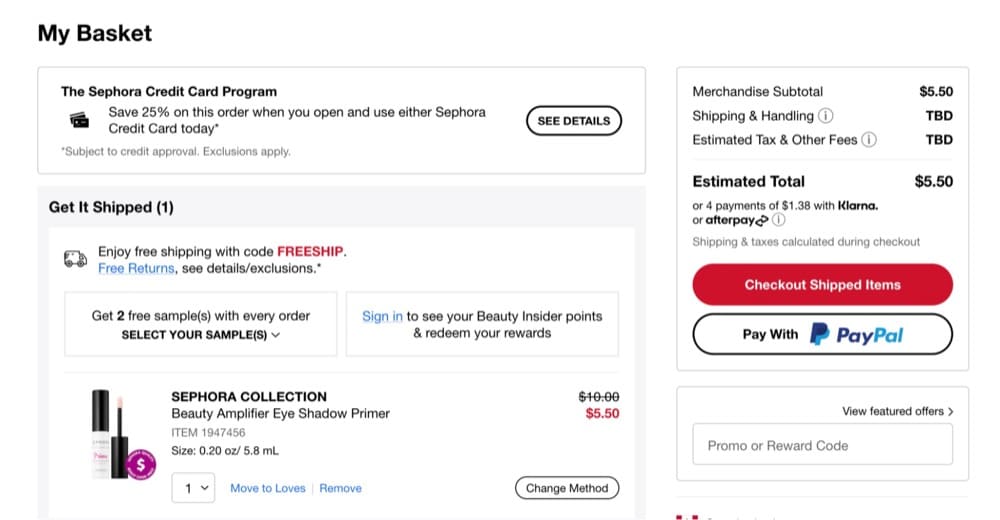
Example 1: Sephora.com
You can see how Sephora is informing users of the fact that there can be additional costs to the order.
Ideally, you can ask for a zip code and then calculate the Shipping & Tax on the spot.
This way, users won’t have any unpleasant surprises when they reach the checkout.
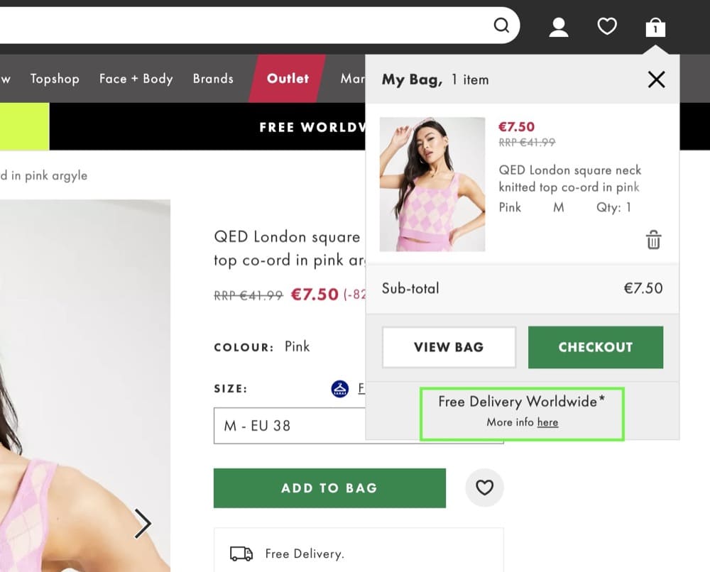
Example 2: Asos.com
Asos.com are doing even better as they are offering Free Delivery Worldwide and they are showing it as soon as you add a product to your cart.
That enough is a very strong motivator to reduce cart abandonment.
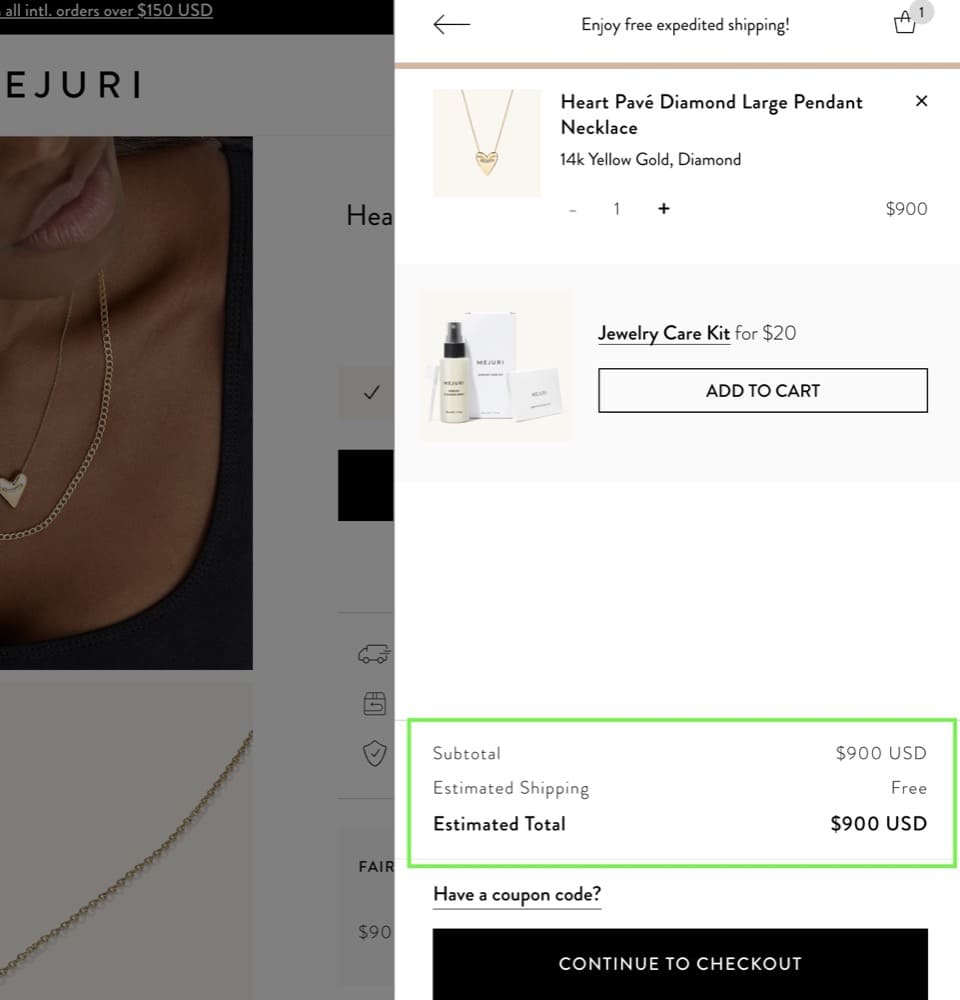
Example 3: Mejuri.com
Mejuri is also showing the estimated shipping directly on the cart.
Cart Test Idea #2: Highlight Guarantees and Benefits
Cart abandonment is a major problem for ecommerce brands. An estimated 70% of carts are abandoned, so optimizing this part of the funnel offers a lot of opportunities.
Recommendation
- Highlight benefits, guarantees, free shipping, easy returns and exchanges, trust seals, etc. in the cart.
Hypothesis to test
Free shipping, money-back guarantees, or easy returns and exchanges are strong motivating factors that may reduce cart abandonment and encourage customers to complete their purchases. While these incentives may cost the business money in the short term, they can pay off in the long run by reducing anxiety for potential customers, providing a better customer experience, and ultimately increasing sales.
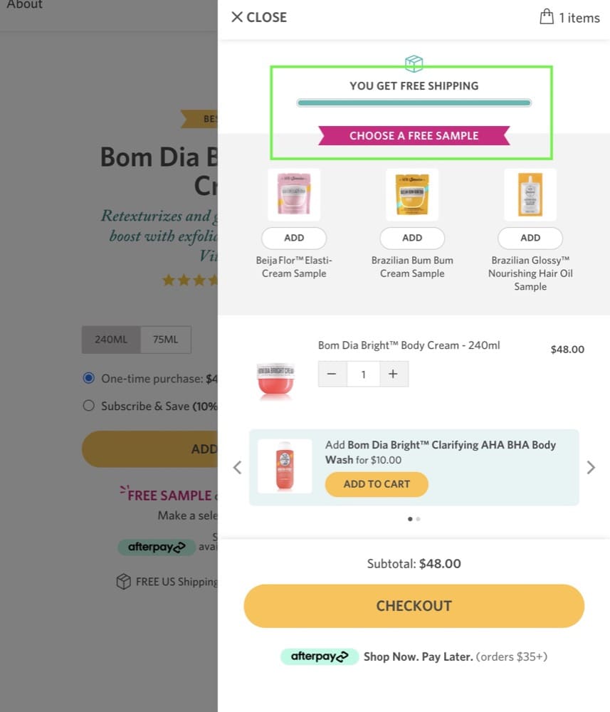
Example 1: SolDeJaneiro.com
SolDeJaneiro.com is bringing it all out on the cart. It is sure to entice users and reduce cart abandonment with free shipping and a free sample they can choose from.
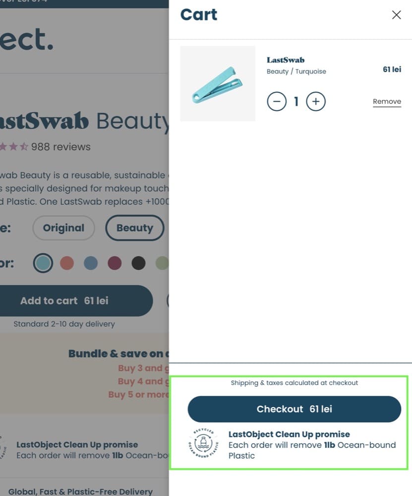
Example 2: LastObject.com
Benefits don’t necessarily have to be financial. Sometimes you can use a benefit that will make them feel a lot better about their purchase and do some good.
In this example from LastObject, each order removes 1 lb of ocean-bound plastic, supporting the brand’s mission.
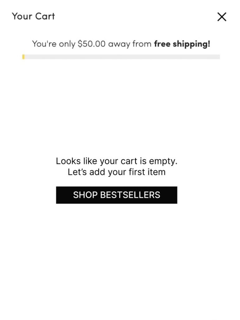
Cart Test Idea #3: Empty Cart Optimization
An empty cart shouldn’t be left empty for long. Instead, it should prompt the visitor to start their shopping journey.
Recommendation
We recommend testing:
- Adding one or two top-selling products as suggestions in the cart
- Having a CTA that sends the visitor to the bestsellers page
Hypothesis to test
By doing this, visitors are more likely to remember their carts and less likely to leave them behind. Additionally, this could help to increase the overall number of items in the cart, which would lead to higher sales for the store.
An Idea for Sitewide A/B Testing: Use Microcopy to Remove Friction
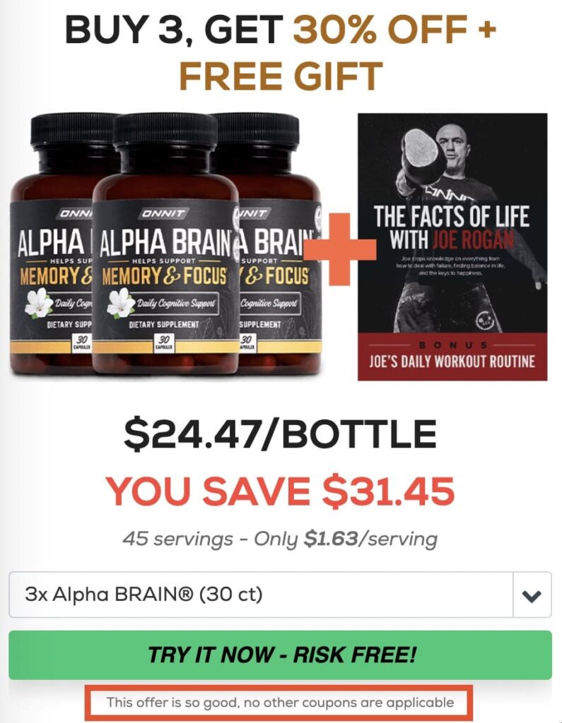
Sometimes, elements on your website, such as unclear CTAs or complex requirements, make visitors hesitant to click further, especially in the middle and bottom of the funnel.
Microcopy can be used to provide instructions, clarify terminology, or reduce friction at key points in the user journey. When used effectively, it can help to remove barriers and make it easier for visitors to convert. By addressing the concerns of potential customers head-on, businesses can ensure that visitors feel confident about moving forward in the purchase journey.
Recommendation
Try
- Adding microcopy below the CTAs and in strategic positions where it involves user interaction.
Hypothesis to test
By using microcopy strategically, we aim to reduce the anxiety or doubt the visitor might have before clicking a CTA and thereby help increase the clickthrough rates.
So there you have it. 15 ideas of things to test in your Shopify store, on your homepage, collection pages, product pages, cart pages and site wide, to bolster brand loyalty, increase conversions and get more sales.
And don’t forget to let me know how you get on with these tests at [email protected].
Written By
Andra Baragan

Edited By
Carmen Apostu


