Ecommerce Checkout that Improves Customer Acquisition: 6 Strategies No One Should Ignore
The emergence of e-commerce is one of the main talking points today.
People are opting internet shopping like never before, while online companies are witnessing their heydays. In fact, the e-commerce business model is proving to be so successful that the trend doesn’t seem to decline anytime soon.
According to a recent report by Statista, the retail e-commerce sales worldwide are expected to touch $4.8 trillion by 2021 from $2.3 trillion in 2017.
However, any successful model attracts many competitors around it and in this age of fierce competitiveness, getting things right is absolutely important. So in case of an e-commerce business, checkout is one of them main crucial aspects that needs to be perfectly right. A smooth and seamless checkout process holds the key in terms of sales and profits. On the other hand, if people experience even minor glitches during checkout, they abandon shopping carts straightaway, which is very appalling and frustrating for online marketers. As reported by Baymard Institute, the average cart abandonment rate is whopping 68%.
Thus the cardinal question that arises here is how will you ensure a smooth checkout process and prevent shopping cart abandonment?
To answer this, you need to be proactive in finding ways to reduce fears, increase trust, and providing better customer experience on your online storefront. So by designing a good checkout process, you may just be able to get more people from the checkout to becoming an actual customer.
Here are some highly potent ways to create an effective checkout process:
1. Provide a short, simple, and engaging checkout experience
A short and easy checkout process ensures that your customers are less likely to abandon the shopping in the middle. You need to include only relevant fields in the checkout page and condense the whole payment method into it. The fewer fields you give your customers to fill in, the more improved their shopping experience will be. More form fields create the digital hurdles for your customers that ultimately prevent them from getting converted.
The following is a customer-friendly checkout page of “Create & Barrel”.
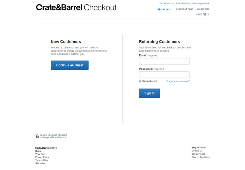
You need to focus on the design of your forms. The size of the field should be indicative of the information you are expecting the users to enter. You shouldn’t ask the same information in multiple places of the checkout, while pre-filled data for certain fields will make shopping convenient for frequent customers. Clearly describe different form fields for the users. Don’t force them to register, rather offer the option of checking out as a guest.
Furthermore, an engaging experience also comes through other factors like page loading time and website speed. If these factors aren’t addressed effectively, shopping cart abandonment will likely to increase. The fast speed of your e-commerce checkout page depends on a reliable and dedicated webhosting. Since of websites depends on the sizes of files and images, so cPanel and Plesk effectively manage your webhosting by compressing files and images present on webpages.
2. Offer multiple payment options
Payment process is very important, especially in an online business, which is why you need to create a user-friendly payment page where there are enough payment options available for your customers. The more you make it easier for them, the more you will be able to increase your conversions and sales. 56% of shoppers expect a variety of payment options on the checkout page because they need a convenience of choice.
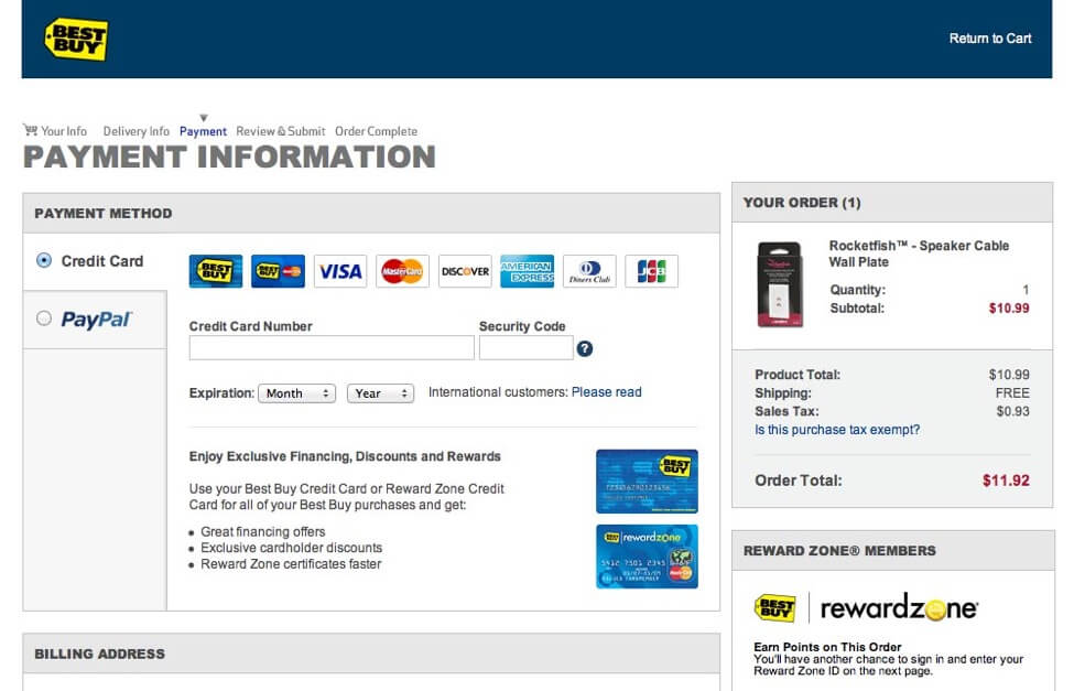
You might not know but there are all kinds of customers out there who would like to pay in different ways. If you don’t provide enough options, they will not make any purchase; so make sure to include all the common methods of payment. For example, Pay-Pal is must-have because of its apparent security and convenience. If you allow regular debit and credit cards to e-wallets and cash on delivery (CoD), you will make sure no customer goes back empty handed from your site.
3. Provide free shipping
Checkout is all about providing convenience and positive experience to your customers. Free shipping is one such option that attracts many customers to make purchases. In fact, high shipping cost is among the top reasons by which customers leave shopping carts. Free shipping is enticing to most of the customers and will convince them to buy when they wouldn’t otherwise. It is a long-term play, so taking a short-term loss could be a smart sacrifice for you because in the long run, this policy will generate loyal customers and brand advocates. There are many ways with which you can offer free shipping – free shipping on everything, free on some items, free above a threshold, and free at certain time of year.
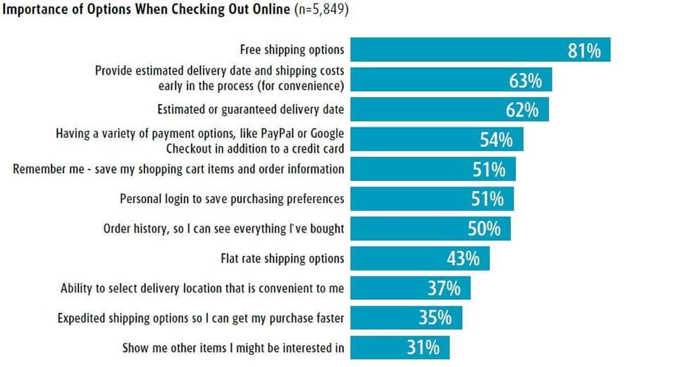
Basically, free shipping is a form of e-commerce loyalty program for rewarding regular customers. It’s a no-brainer to assume that customers will use something more if it’s free than if they have to pay. Additionally, you can choose to offer free shipping in conjunction with more delivery options such as overnight express delivery on a cost sharing basis.
4. Add a live chat for real-time conversations
Adding a live chat feature can prove to be an effective checkout optimization strategy. It will not only increase conversion rate, but also create a good user experience and hence, boost sales significantly. Live chats provide real-time answers to the queries posted by prospects & customers and keep them engaged to make the sale through. According to an eConsultancy report, 83% of online shoppers need support to complete a purchase, else they will abandon the checkout process in the middle. That means, live chat can make it pretty simple for customers that can considerably cut down their time on calling or sending emails. It can also be used to send reminders to users who have reached a certain cart value.
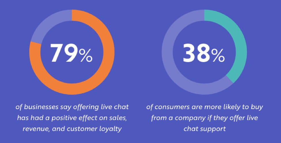
Whenever your customers are stuck during the checkout or experience any disparity in prices, the customer support representative can guide them using the live chat option. Thus, live chat system helps you in keeping customers informed, engaged and prevents them from browsing further into a competitor website.
5. Reassure the customers their personal details are secure
Customers involve in any type of transactions primarily on trust. Unless they are fully convince about the safety and security of your online business, they will be reluctant to make any purchase. This is where trust signals play a critical role to put your prospective customers at ease. A trust signal is an element on your website that will cut anxiety and friction shoppers might have going through the checkout process.
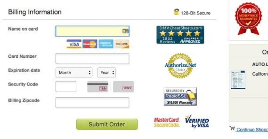
There are certain types of trust factors – some offer reassurances that your site is secured by a certain technology, whereas others are proof of your business’s conduct or trustworthiness. They can be immensely powerful as they offer peace of mind to your customers. They remain reassured that in the event of you turning out to be unscrupulous, their money or investment is protected. Also at the time of final payment stage, customers are on complete guard in terms of furnishing important information. Thus, showing trust signals can significantly address this concern.
6. Make it mobile-responsive
In this age of smartphone revolution, it is pertinent that your online shopping portal is mobile-responsive. Even if it is responsibly designed site, is your checkout process responsive, too? As a matter of fact, more and more people are not just browsing on their mobile devices, but they are making all kinds of transactions as well. You need to provide them positive experiences when using their phones for mobile shopping. The basic pain points customers experience with non-mobile responsive sites are – difficult navigation, poor product images, and inconvenient checkout process.
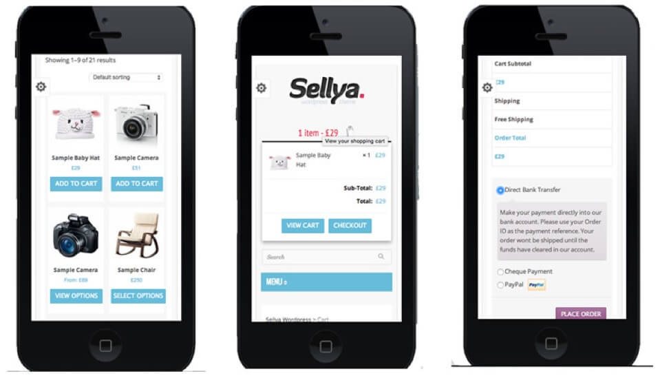
Therefore, responsive design ensures that the customer does not have to scroll down, navigate or enter information on a screen that is already small.
A mobile-responsive experience will make it easy for your customers to add or remove products from their shopping cart. It’s also important your checkout page should keep updating whenever changes are made.
Wrapping it up
Checkout process is an important part of any online business and if it isn’t smooth, shopping cart abandonment is guaranteed. So a good checkout experience is one that requires as little time and effort as possible on the part of customers. The above tips are aimed at improving user experience of your checkout page.
Written By
Smith Willas

