Use Exit Intent Popups to Boost Your Signups by 150% (In Just 15 Minutes)
Exit-intent popups get a lot of hate.
People say they’re annoying and useless, and fail to re-engage visitors who decide to leave the site.
But that’s simply untrue. We love exit-intent popups because they’re powerful and they work!
When Organic Aromas asked for help with improving signups to their store, they had about 250 signups per month.
Although a couple of basic signup forms were already in place, the conversions were pretty low, averaging at around 3%.
It took us a mere 15 minutes to boost their conversions by 150% and get the subscription rate to 660 new signups per month.
That’s pretty amazing, wouldn’t you say?
Among a few other techniques that we have experimented with, the exit-intent popup stood out the most.
Here’s an example of a high-converting exit-intent popup:
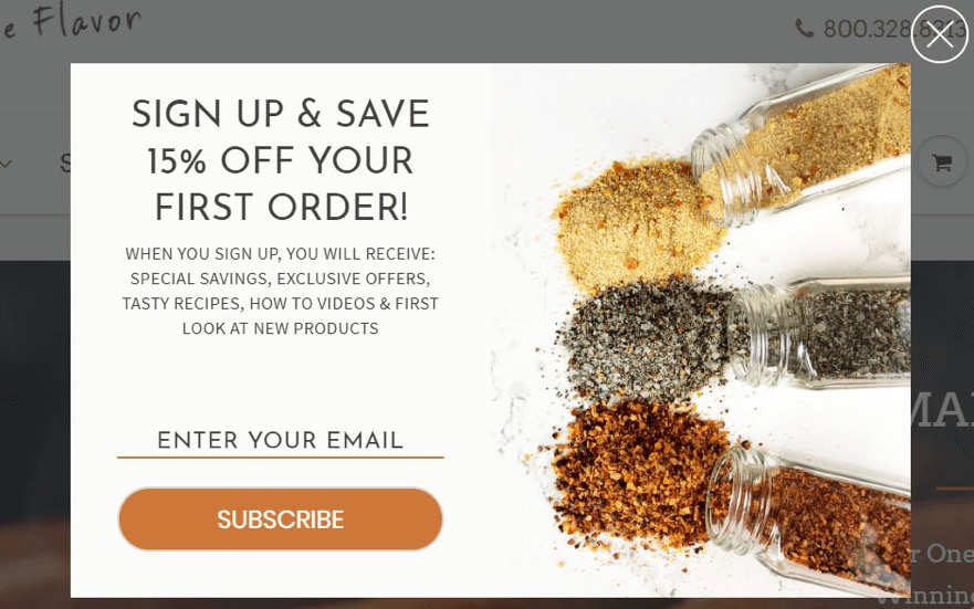
Could your online store do with a similar boost in monthly signups?
Follow these steps to learn what we did and replicate it to propel your own business.
The context
When Organic Aromas approached us for help, they already had a few simple signup forms live on their site:
- The default Shopify signup form in the footer
- An always-visible Sumo.me bar at the top of the page
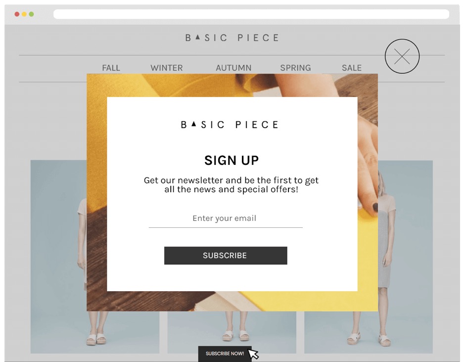
While the store was getting a decent number of signups, with the conversion rate ranging between 1.75% and 4.47%, the owners thought they could do much better.
And so did we, when we saw their numbers.
So, we set up a cycle of weekly experiments to see what type of popup would have the biggest impact on their conversion rate.
It took us about 15 minutes each week to set up a new exit-intent popup for Organic Aromas. Over the course of this experiment, we tried the following:
- immediate popup
- delayed popup
- passive signup box
- exit-intent popup
Let’s look at how each of these performed.
The immediate popup
Typically considered one of the most annoying popups, the immediate popup shows up on the visitor’s screen immediately after they land on the page.
This means it is quite intrusive because it doesn’t take into account the visitor’s intent, behavior, or anything else. It’s there to serve its own purpose.
You would expect this popup to fail miserably, but that just wasn’t the case with Organic Aromas.
In the week it was in effect, the immediate popup generated 135 new signups and achieved a significantly higher average conversion rate of 7.4%.
We considered the immediate popup a solid, albeit slightly unexpected success.
The delayed popup
We set up the delayed popup to only show up after three clicks – once a visitor lands on the website and clicks on three different sections, we show them the signup popup.
Why three clicks?
Through various testing exercises, we discovered the three-click rule to be a simple but effective way to identify engaged users.
You know how the saying goes: “The more engaged your user, the higher the conversion and subscription rates.” So we put that to a test on the Organic Aromas website too.
Overall, it yielded excellent results. While the signups were lower than what we generated with the immediate popup, the ultimate conversion rate blossomed – 14.1% of new subscribers ended up buying something that week.
Passive signup box
Next on the list was the passive signup box, which is an always-visible widget at the bottom of the page.
The passive signup box has a two-step process. The visitor needs to click on the widget first to call out the popup and then enter their email to subscribe.
In essence, it was a similar tactic to what Organic Aromas was already using with the always visible Sumo.me top-bar signup form.
The results were pretty similar too – less than 1% of visitors signed up.
The exit-intent popup
It was finally the exit-intent popup’s turn.
Just as we expected, this popup generated the best results for Organic Aromas.
The exit-intent popup offers a great balance between passive and visible, which is typically the reason why it consistently outperforms other types of popups.
Seeing as it only shows up when the user is about to leave the page, the exit-intent popup maximizes the huge potential of the right timing, as well as matching the user’s behavior.
However, to keep the existing customer on the site, you will need to do more than just grab their attention.
You will need to pique their interest. This can be done using the combination of killer copy, a tempting offer and compelling imagery.
Here’s a great example from Roadside Vapes:
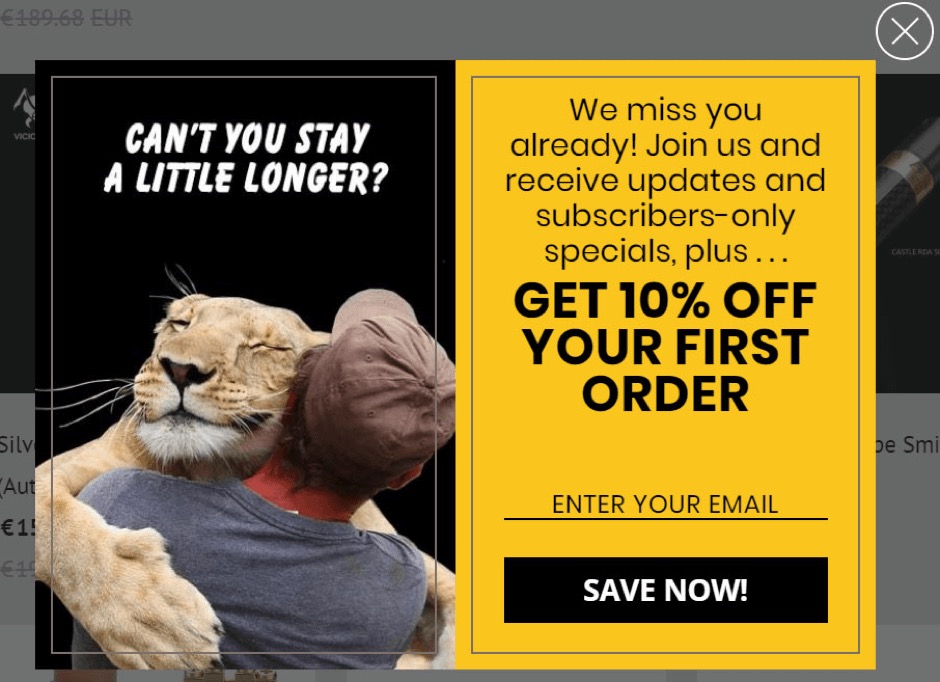
The proven formula for a high-converting exit-intent popup:
- A captivating image (the lion hugging a human does the job here)
- A bold statement or question (be sure to include an exclamation mark somewhere)
- A compelling offer, such as special discount, free shipping or $X off their first purchase.
Has this formula worked for Organic Aromas? You bet it did!
Not only did it help generate 660 new subscribers in one month (that’s a 150% increase), but it also boosted the order conversion rate to a fantastic 19.03%!
In other words, almost 20% of new subscribers ended up making a purchase only because of the popup, which is more than 6 times better than their previous conversion rates.
Final thoughts: every little detail matters
No matter what, exit-intent popups are a truly powerful tool in your arsenal. Not only will they help you increase new signups, they will also push your store’s profit margins way up!
The key takeaway to remember is that a high-converting exit-intent popup consists of the following elements: the right timing, a great visual, actionable copy and a compelling offer.
With a strong exit-intent popup on the site, you don’t just have a chance to boost your signups by 150%, you can also achieve a whopping 20% increase in order rates.
And that’s a strategy worth testing!
Written By
Bernard Meyer

