How to Optimize Webinar Registration Landing Page to Increase Conversions
Note: This post is a part of our CRO Month 2019. Share it with the #Optimizein28Days to promote optimization awareness and how CRO can help businesses thrive.
Did you know that the average viewing time for a webinar is a staggering 56 minutes?
Yes, that’s right.
In a world where attention spans are getting shorter, it is a surprise that webinars are getting that much traction. This is probably why 53% of marketers use webinars as an integral part of their content strategies.
This goes on to show that webinars can be an important tool in any marketer’s arsenal and should be utilized to not only generate leads but also nurture prospects.
But, getting people to register for your webinars is not as simple as it sounds. This is a webinar registration landing page comes into the picture.
Webinar registration landing pages are very important to get people to register for your webinars and, hence, should be optimized for maximum conversions.
Let’s take a look at some of the most effective ways you can optimize your webinar registration landing pages to get more registrants:
Clearly List the Viewer Benefits
The first step in crafting the perfect webinar registration landing page is to tell your potential viewers what benefits they will derive by investing their time in your webinar.
You can do this by:
- Listing the solutions that you will provide for the common challenges faced by your target audience
- Telling them what questions you will answer in your webinar
- Listing the topics that you will cover and what your audience will learn through your webinar
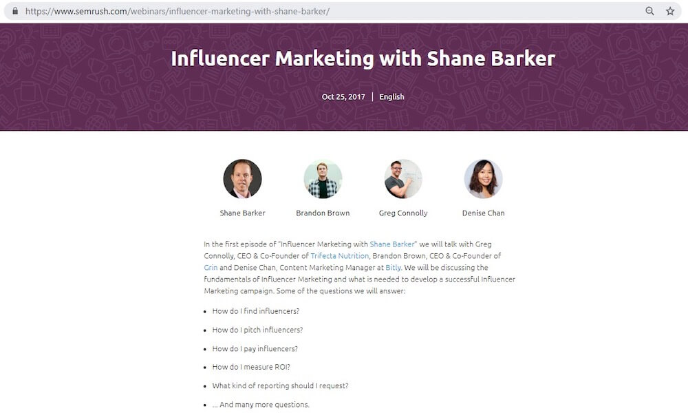
For example, check out this webinar registration landing page for one of my webinars. I clearly mentioned the key questions that I would answer in my webinar. This helped visitors decide whether or not this webinar would be relevant for them and explained why they should register for it.
No matter how you choose to convey the benefits of attending your webinar to your potential viewers, ensure that you do so.
RESOURCE ALERT: How to Improve Your Webinar Conversion Rates
Use Teaser Videos
Teaser videos are a good way to grab your audience’s attention and get them interested in your webinar. According to an EyeView case study, videos on landing pages can help boost conversions by up to 80%.
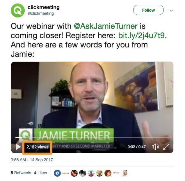
For example, ClickMeeting is a webinar software company that regularly creates influencer-hosted webinars. They have used a video teaser to promote one of these webinars, which was hosted by Jamie Turner, the CEO and Founder of 60 Second Marketer. In this video, he briefly talked about what will be covered in the webinar and how attendees can benefit from it.
Videos are the most effective form of content, so why not embed these right in your webinar registration landing page?
Types of videos that you can add to your webinar registration landing page:
- Create a teaser video using some of the footage from your previous webinars to give people an idea of what they can expect.
- Create a short video explaining the benefits of attending the webinar.
- Introduce yourself and your expertise in the given field, through your landing-page video.
Also, don’t forget to add calls-to-action in your video to get maximum conversions for your webinar.
Write Compelling Headlines
Headlines are sort of like the first impressions that a viewer gets about your webinar and, hence, are critical in deciding whether a viewer will register for your webinar or not. According to Copyblogger, 80% of people read headlines, but only 20% move on to read the rest.
This clearly indicates the importance of headlines to get your audience’ attention and drive conversions.
Quick tips to create compelling headlines:
- Show exclusivity of the webinar by using terms like “get first access before…” “never before…” “xx reveals the secret tips…” etc.
- Use numbers and statistics in your headline to add more credibility to your claims.
- Write a headline showing an achievement or a success story.
- Get creative and write a catchy headline.
- Write the key benefit in your headline itself. You could use phrases like “learn how to…” “get more conversions using…” etc.
- Ask a question to intrigue readers to continue reading to find out the answer.
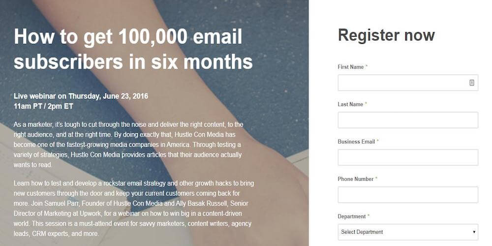
Look at the example of this webinar registration landing page by Upwork. They have used a benefit-driven headline. They have also used numbers to make specific claims that sound more credible than a vague statement.
Create Urgency and Scarcity
Another useful tactic while designing your webinar registration landing page is to create a sense of urgency and scarcity. You can do that by using calls-to-action like “hurry up,” “limited seats,” “grab your spot now,” etc.
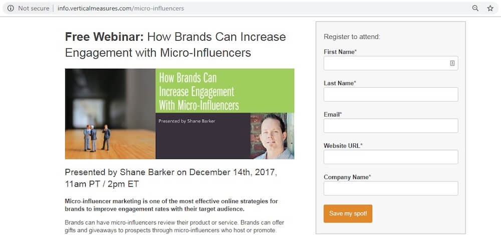
For example, check out this webinar registration landing page on which I used the CTA “Save my spot!” to create a sense of scarcity. This makes visitors feel like if they don’t save a spot now, they might not get a chance to do so later.
Bonus tips on how to create a sense of urgency to register:
- Use a countdown timer to show that time is running out.
- Count down the number of seats remaining, to get people to sign-up quickly.
- Use CTAs that create a sense of urgency, as I explained earlier.
Use these tips and tricks to get the maximum conversions from your webinar registration landing page.
Add Customer Testimonials
Adding testimonials to your webinar registration landing page provides social proof and lends more credibility to your claims.
You can show testimonials from satisfied customers who liked your services, to show your industry expertise. You can also show testimonials from people who attended previous webinars and thanked you later for the insights that they got.
You can use a template like the one shown below on your registration page:

Use Effective Calls-to-Action That Convert
Calls-to-action are an important component of your webinar registration page because ultimately these are what drive conversions.
Your CTAs should be attention-grabbing, easy to locate, and compelling enough to get people to register for your webinar.
Tips to create effective CTAs:
- Make sure that your CTAs are clearly visible on your landing page.
- Use bright, attention-grabbing colors (like a bright green).
- Use command verbs like “register,” “enroll,” “grab,” “reserve,” etc. that encourage people to take an action.
- Create a sense of urgency.
- Generate curiosity by asking a question or providing a hook that makes people want to know more.
For example, the CTA in PromoRepublic’s registration page is right at the top, clearly visible, action-oriented, and compelling. They have also emphasized the fact that registration is free to encourage more people to register.

Showcase the Hosts
It is important to showcase the hosts and guests for your webinar because those are the people that you are asking your audience to listen to. So, you need to give people a reason to listen to these hosts by telling them about their designations, experience, industry expertise, etc.
Things that you can include in your host bio:
- A headshot image of good quality
- Designation
- Years of industry experience
- Areas of expertise
- Awards and achievements
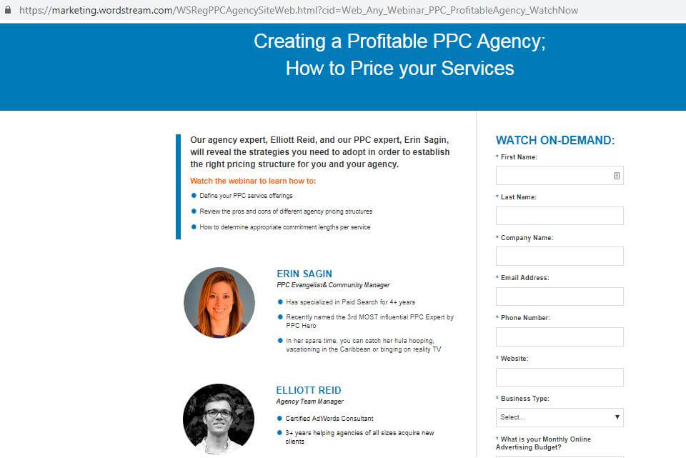
For example, check out this webinar registration landing page from WordStream. They have clearly highlighted the experience and expertise of their webinar hosts.
Keep it Simple and Visually Appealing
Last, but not the least, keep it simple and elegant. An aesthetically-pleasing registration page will do half your work for you. And the easier and simpler it is to register, the more likely people will be to actually register for your webinar.
Check out this brilliant registration page for Amy Porterfield’s webinar. The registration process is so simple and the design so visually-appealing, who wouldn’t want to register for this?

Conclusion
Webinars get much longer viewing times than any other form of content and should be a key part of your content strategy. Optimizing your webinar registration landing page can help you get more people to enroll for your webinar and increase your audience reach.
Use the tips and tricks above to optimize your website registration landing pages and maximize conversions.
Written By
Shane Barker
