8 Product Page Tips to Increase Traffic and Conversions
Online retail is booming, generating $214.6 billion in the US in the third quarter of 2021. For customers, online shopping is convenient and gives them the option to compare products from different stores.
With so many people now buying online, there’s money to be made. But, the internet is also a competitive marketplace as e-retailers are constantly improving their services.
Besides quality products, affordable shipping, and value for money, there are other ways to attract customers. One of the most important areas to focus on is your product pages.
Before a potential customer hands over their hard-earned money, they’ll want to see a descriptive page that entices them to click “add to cart.” So, how do you make your product pages stand out?
Read on because we’ve put together a list of eight product page tips that you can use to increase traffic and conversions.
1. Analyze Your Product Pages
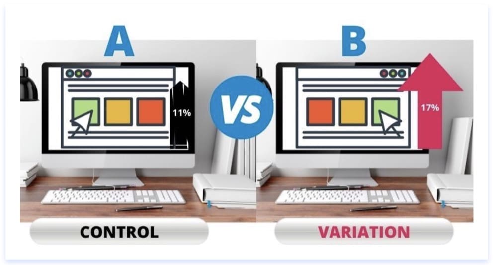
Before you start making changes, you should analyze your current product pages. You can ask friends and family as well as perform A/B testing. This is also known as split testing.
Using the A/B testing methodology, you can create two or more product page designs. Then, you can ask a selection of people which they prefer.
If you have competitors in a similar industry, you can analyze them in your research. How do your product pages compare? Are they professional? Are your prices comparable?
When analyzing your product pages, look out for:
- Fast loading pages
- An intuitive design that’s suitable for web and mobile use
- Descriptions that include any unique product attributes
- Product dimensions
- Product reviews
- Product pricing and a buy now button
- Permalinks that include the product name
- Secure “https://” URLs
- Delivery and payment information
There are just a few factors to consider. You can use Google Pagespeed Insights and other tools and plugins to pinpoint areas that you need to work on.
For example, Google Analytics will help you track visitors so you know how they are finding you and how long they stay. And, it’ll give you information about your audience, like their location.
If you’re selling software or other virtual services, you can do a pricing page analysis. Your customers will expect your pricing structure to be clear, with a list of key features.
Your product pages should also reflect your brand. Remember, the goal is to make shopping as easy as possible for customers.
Take your pricing strategy to the next level by A/B testing your prices to see what works best for your business. With this information, you can optimize your profits and grow your company even more.
2. Try Cross Promotion
If you want to get traffic and increase conversions, cross-promotion and collaboration can help you get there. Even if your pages are user-friendly, you can still miss out on customers if you haven’t gained their trust.
You can approach influencers to try your products and share their reviews on social media. They’ll already have a following, and if others share your products, new customers will be more likely to try your brand.
You can also reach out to established websites for cross-promotion. You can share press releases about specific products or offer to write guest posts. If there’s a complimentary product from another brand, there may be an opportunity to promote each other. For example, you can collaborate with a florist if you sell candles.
Some websites have best-of lists featuring the top products in a specific industry. If you can find the right fit, ask for your product to be included on a listicle.
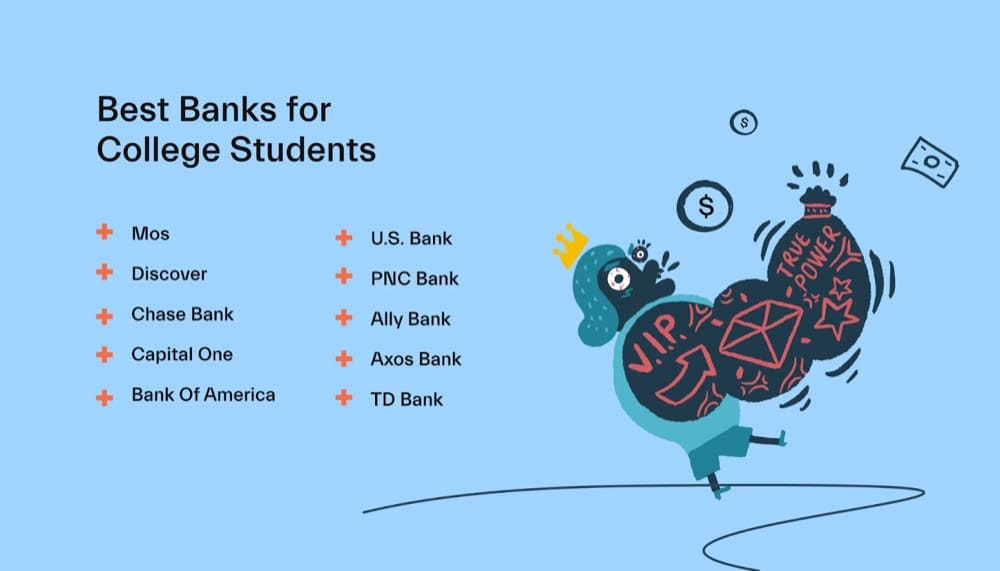
Here’s an example. Let’s say you’re a bank with a strong online presence. You could ask MOS to add your product to its best banks for college students listicle:
Having your name cited on an authoritative website like this could help drive traffic directly to your website and increase your conversions.
3. Upgrade Your Visual Media
If you have a physical product to sell, your pages should feature around five product photographs. These should look professional and highlight different angles.
For example, if you sell cameras, you can have separate images showing the front view, back view, box view, and accessories. You can even upload a photo of someone using the camera.
White backgrounds usually work well for product photography. You can invest in a lightbox or edit your photos afterward.
If you’re in software, you can use product screenshots and custom graphics.
Graphics are essential if you want to improve traffic and conversions, but consider using video as well. Video can take your product pages to the next level, giving users more detail. And, video can give website visitors a value-add.
For example, one of Preply’s services is a course that lets students learn English online. To support those looking to learn a second language, the brand has created a series of mini-lessons.
These videos are free, and they’re featured on the product page:
All of the language videos are cataloged on a dedicated YouTube channel. Not only do these videos add interest to the product page, but they can bring extra traffic directly from YouTube.
If you’re creating your own videos, plan your content out and use editing software to ensure that you’re presenting the most professional and attractive-looking content possible.
Remember, these videos represent your brand. They are an extension of your business, and as such, you want to ensure that they’re of a certain quality. Editing software can be helpful in that regard, as it’s now easier than ever to create professionally edited videos from your computer or even your phone.
Get 26 more tips to use images in your A/B tests and increase your conversion rates.
4. Offer Discounts and Free Trials
Another way to boost your product pages is with a special offer. If you have a product to sell, your offer could be a discount for first-time purchases, or a “buy two get one free” deal.
To access these offers, you can ask site visitors to sign up for your email newsletter. This strategy can encourage people to shop while also reminding them about products they might want to purchase in the future.
For virtual products and software, you can offer a free ebook or a limited free trial.
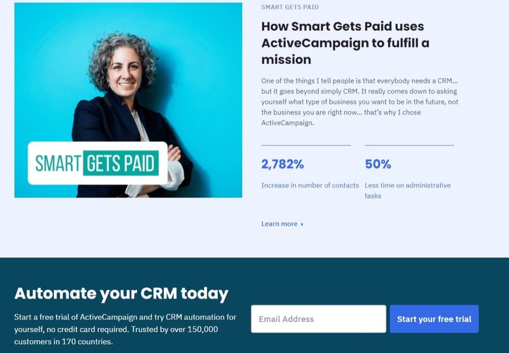
Here’s an example of a company that’s got the balance right. ActiveCampaign invites potential leads to try its sales CRM for free. The company believes in its product and knows that if users try the software, they’ll be more likely to continue with a paid subscription.
As you can see from the following screenshot, ActiveCampaign asks for an email address in exchange for the free trial. The company can check in with leads and support them through the process.
5. Encourage Shoppers to Leave Reviews
43% of Millennials read reviews before making a purchasing decision.
Because these reviews can directly impact your sales, they’re something you should cultivate and prioritize. When shoppers receive their orders, you can send an email asking for a review. Some companies have incentives for reviews, such as entry into a competition or a discount on their next purchase.
If you give excellent customer service and quality products, customers will be more likely to share their experiences.
Consider adding a star rating system to complement your customer reviews. If someone is in a hurry, they may look at how many stars a product has received instead of combing through multiple pages of long-form reviews.
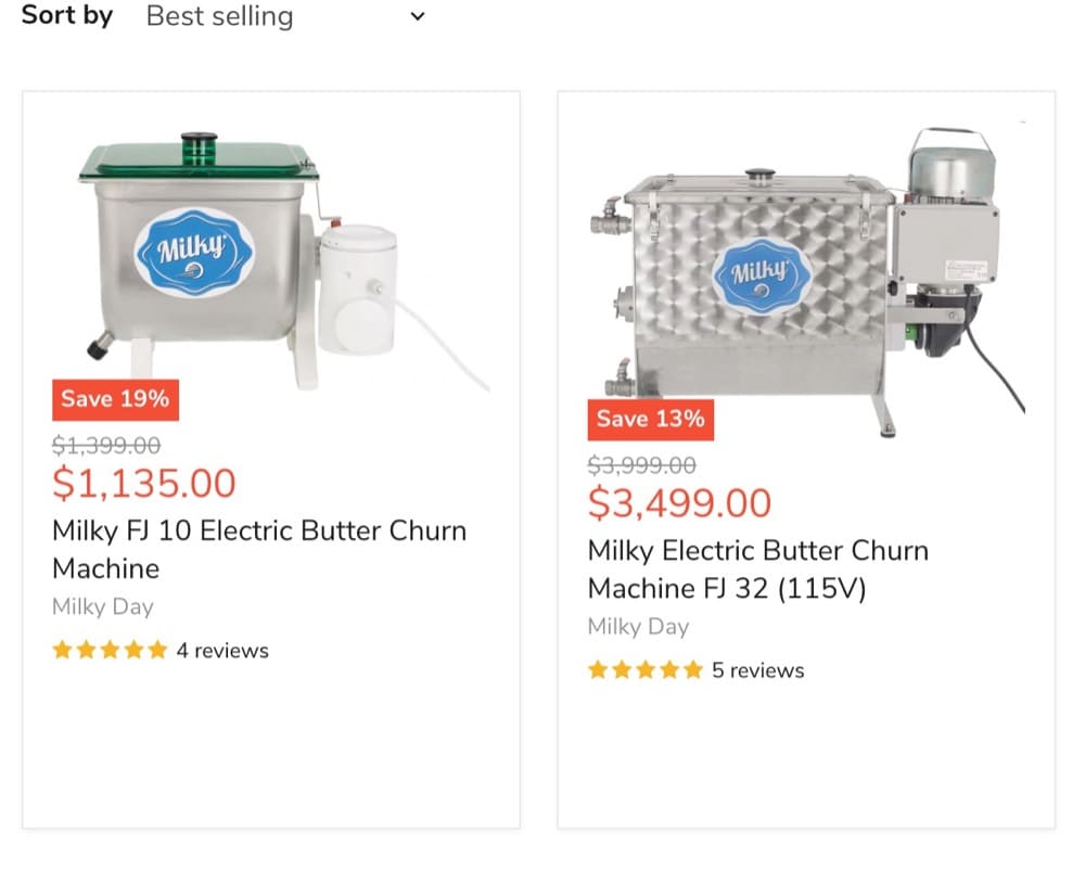
Take a look at how HomeStead uses star ratings and reviews on its butter churns page. The page gives you an overview with a star rating. If you click on the actual listing, you can then view the reviews in full.
If you notice any negative reviews, respond to them and resolve the issue quickly. For example, if a customer complains that an item hasn’t arrived, you can assure them that you’re following up on this with the shipping company.
6. Master the Content
Every word on your product page matters. This is your opportunity to engage website visitors and make sales.
Your content should be relevant and reflect the voice of your brand. For example, if your products are fun and lighthearted, keep your language light and upbeat.
Analytics expert Neil Patel says, “Keep copy concise and highlight the high points. Use bullets to help visitors read and digest them quickly.”
Visitors need to understand what you’re selling, but too much text in one place can be overwhelming. So, you can have tabs that expand for more information.
For example, there could be a brief product description, a tab with an ingredients list, and a tab with instructions on how to use the product.
Your product titles and meta titles are also important. Think about what your audience is searching for, and add any relevant keywords to your copy.
Use your website to show customers that you know what you’re talking about. Start a blog and include resources and guides.
Make sure to also A/B test the content of your product pages. You’ll want to check how the traffic is if you are converting customers from it or not and what can you do to improve it.
For example, you could create different options with changes in the language, the pricing, and the imagery used. This way, you’ll find out what version of your product pages converts more and which one to implement moving forward.
You can also add links to resources on your product pages. Think about a company that sells mattresses. At the end of each product page, there could be a link to relevant articles from the brand’s blog.
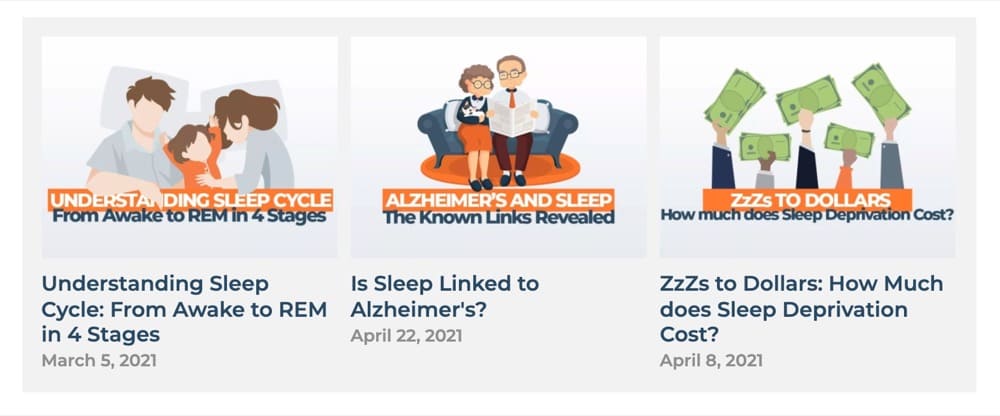
It could look something like this example from Sleep Advisor:
Don’t forget to check your content for spelling and grammatical errors. You can use a free tool like Grammarly for this. It’s also a good idea to read your product descriptions out loud when editing, as this will help you identify any awkward phrasing.
7. Focus on the Finer Details
Certain products will need more detailed descriptions. If you’re selling clothing or shoes, you’ll need a sizing chart. Remember, international sizing isn’t the same, and the wrong advice could lead to returns. If you’re open for business in multiple countries, you’ll need to include size conversions.
Does your product come in a range of colors, patterns, or scents? You should add all of these variables to the listing.
Are there any specific care instructions? Does the item need to be washed in a certain way? If it’s edible, does it need to be refrigerated?
The weight and materials could also be important. For example, glass and plastic can look similar in a photo, so you’ll need to give your customers realistic expectations.
Customers won’t always visit your shipping and payment pages. To make it easier, you can include the most relevant information on your product pages. For each listing, add shipping times and product availability. If you’re experiencing delays or the product is on backorder, make it clear in the description.
You can also highlight any special payment options. These can include “buy now, pay later” partnerships, cryptocurrencies, and Paypal. If your customers know their preferred payment method is available before they go through the checkout, it can increase conversions.
8. Give Your Customers Something More
Improve the user experience by giving your customers the full service.
Consider adding live help to your product pages. Good customer service can encourage them to buy. Depending on your needs, you can use live operators or a chatbot.
Keep your inventory updated, so users don’t accidentally purchase an item that’s out of stock. However, if you are a proactive brand, the “right inventory forecasting software” can help you avoid stock out situations. Then use a “restock notification” button to notify customers when an unavailable product comes back online.
If you have multiple products, cross-selling and up-selling can be beneficial. You’ll often see online retailers showcasing similar items on the product listing. You can also show any items they’ve viewed before as a way to entice them into another purchase they may be mulling over.
Excessive pop-ups aren’t recommended, but there are occasions when a simple pop-up is acceptable. When a visitor first reaches the product page, a pop-up box with a special offer could be the catalyst that gets them to buy.
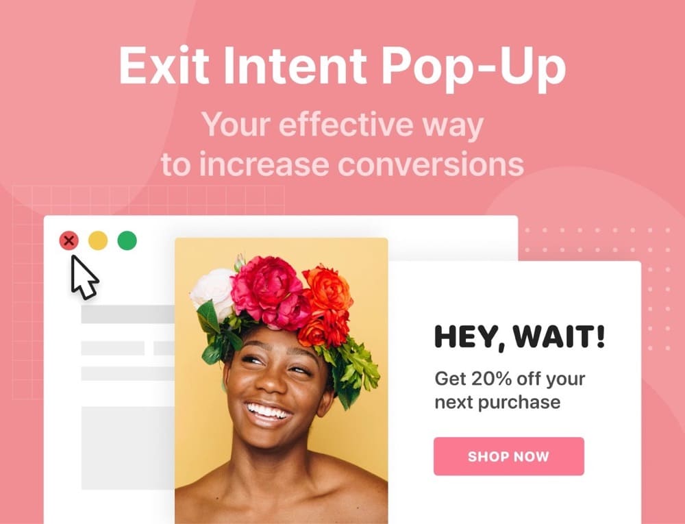
Or, when they leave, you can have an exit intent pop-up. This simple website add-on targets customers who need a gentle nudge.
Here’s an example:
Any pop-ups should be easy to close and fit with your website branding. If they’re intrusive or feel like spam, it could dissuade customers from shopping with you. They should only ever be shown once per visit.
Enhance Your Product Pages to Increase Traffic and Conversions
If you have something to sell, your website is the place to do it. While your homepage creates a good first impression, designing websites to increase traffic and conversions can turn browsers into paying customers.
Now is the time to analyze your product pages, increase traffic, and improve conversions.
You can start with cross-promotion and collaboration, sharing your pages on other reputable websites. Upgrade your visual media with professional product photography and videos. You can offer discounts and free trials and encourage shoppers to leave reviews.
Check your content to make sure it’s error-free and includes all the information your customers need.
Finally, focus on the finer details and give shoppers something extra, like live help and an exit intent pop-up.
By doing this, you’ll turn your product pages into important tools that will boost your traffic and increase your conversions well into the future.
Written By
Shane Barker

Edited By
Carmen Apostu

