How to Create an Effective Facebook Landing Page
A Facebook landing page is like a gateway between your Facebook ad and your product.
And it’s extremely important that you get it right to get good Facebook advertising results.
Imagine seeing a Facebook ad about a new Lion King movie… Clicking on it to sign up to see the movie… And then being led to a landing page featuring tens of different movies from Star Wars to the Simpsons…
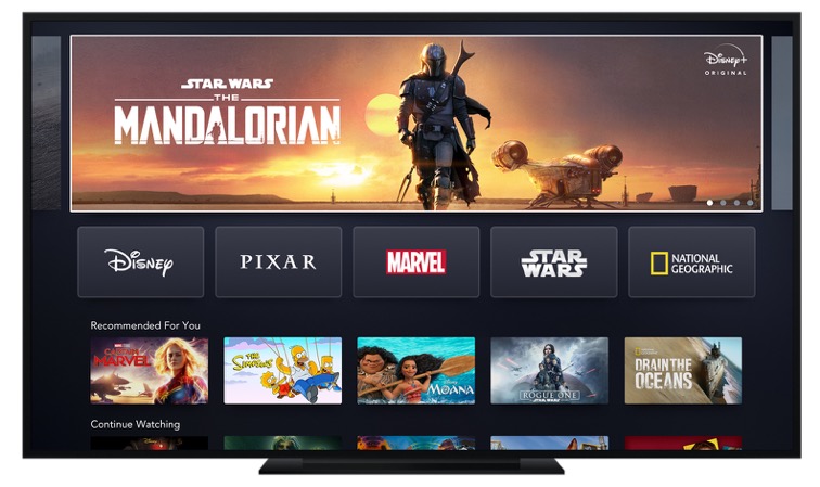
Maybe if you keep scrolling, you’ll also be able to finally get to the Lion King movie.
But why all this hassle? If you’re like most people in the world, you would have likely given up and just googled the movie instead of trying to locate it on the crowded landing page.

To avoid such situations of Facebook ad and landing page mismatch, advertisers are creating custom landing pages to match with each of their ad creatives.
And so should you: so that you’ll have more relevant landing pages that lead to more visitors (that leads to more customers and revenue).
In this guide, we’ll take a look at how to build highly converting Facebook ad landing pages, from aligning the key messages to including all the important landing page UI elements.
But first, to be 100% clear about what we’re discussing here, let’s try to better understand what the term “Facebook landing page” means, and why it’s important to create them.
What Is a Facebook Landing Page?
A Facebook Landing Page is the web page where people will land after clicking on your Facebook ad.
To give you an example, let’s consider the well-known marketing & sales tool HubSpot. They have been building their product for multiple use cases from marketing analytics to sales tracking to content management.
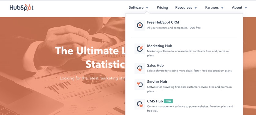
Instead of sending all their online ad traffic to the home page, HubSpot could build up a Facebook ad strategy that involves multiple campaigns for various audiences.
For example, one of HubSpot’s Facebook ads promotes its Marketing Hub.
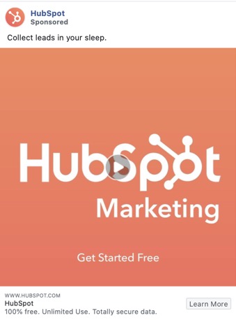
Does this ad lead you to their website’s home page as you click? Nope! It leads you to a special landing page that matches the advertised product.
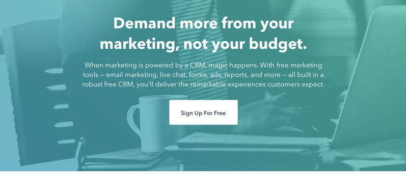
There are thousands of examples of such custom landing pages.
Should I Create a Landing Page For My Facebook Ads?
Having a well-thought-through landing page that matches with your Facebook ad’s key messages is beneficial in many ways:
- Your Facebook ads’ and landing page’s messaging is aligned – after clicking on the ad, the audience will find exactly what they were promised in the ad.
- You can create multiple custom landing pages for different messages. An alternative to this would be leading all the ad traffic to your home page which would be less relevant.
- You will have higher conversion rates – if the offer on the landing page matches that in the ad, people are more likely to convert.
- You can get more accurate reporting data. Each landing page will have its custom URL and you’ll get more granular data to your customer acquisition reports.
- You can create advanced remarketing audiences – imagine being able to retarget people who visited landing pages with various messages, and showing them increasingly relevant remarketing ads.
Now if you’re ready to dive in, here are the top 5 strategies to keep in mind when creating effective landing pages for Facebook ads.
1. Align the Key Messages & Branding
The best Facebook landing pages mirror the ads leading there. What this means is that:
- The landing page has the same headline as your Facebook ad.
- The style and branding (font, colors, illustration’s style, etc.) match across your marketing assets.
- As a result, the landing page looks like a natural extension of the ad that someone just clicked on.
Take this Restream.io ad for example. The key message in the ad creative is “Stream Live Video to Multiple Platforms.”
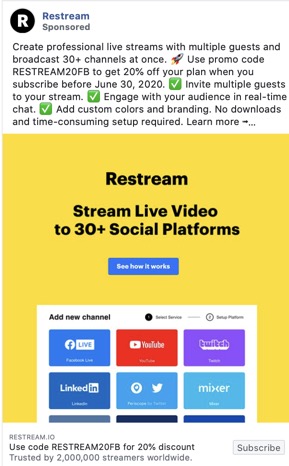
Once you click on the ad, you will land on a custom landing page that has the same opening message: “Multistream to 30+ platforms simultaneously.”
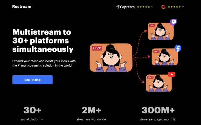
If we were to criticize the landing page a bit, it could also have the same colors as the Facebook ad. But let’s be realistic: Brands run tens of different Facebook ad images at once and they can’t create a fully similar landing page for every single one of them.
2. Add an Offer They Can’t Refuse
To nudge people to take the next step after visiting your landing page, sum it all up with an attractive offer that’s hard to refuse.
This could mean adding a promo code (and offering a discount) or giving your product away for free for a 14-day or 30-day trial period.
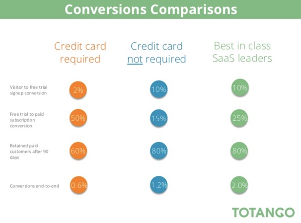
A study by Totango found that the conversion rate (for opt-in free trials) was 15% for SaaS businesses, and the rate jumped to 50% for opt-out trials. They also found that brands that do not require a credit card to start the free trial period got better results than those who did.
To give you one example of a Facebook ad promoting a special offer, let’s look at this ad by Asana. The ad’s headline includes the offer to “Try free for 30 days.”
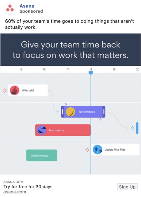
As a user clicks on the ad, they will find themselves on a Facebook landing page that repeats the offer.
Tip: If you promise a free trial or discount in your Facebook ad creative, make sure that your post-click landing page echoes this promotion. Otherwise, you will end up with many disappointed people and your ads might do more harm than good.
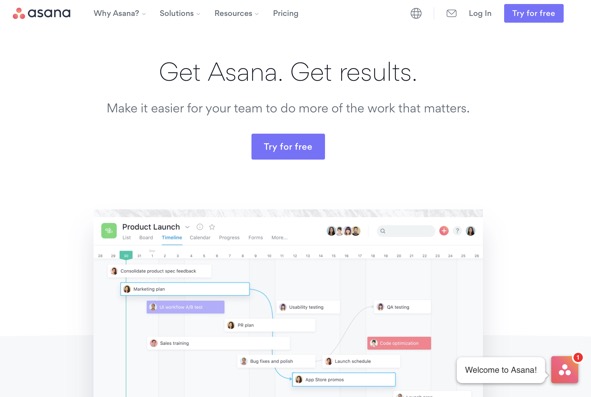
Don’t forget to add Facebook Pixel to your landing page, so that you’re able to track all results in the Facebook Ads Manager.
3. Drive Higher Conversions with Social Proof
Any salesperson or marketer can come up with a list of attractive claims to promote their product.
But the best marketers know that people also expect claims to be proven.

Adding social proof to your Facebook landing page will help to convince the visitors who have doubts. Usually, social proof is added to a website in the format of:
- Customer testimonials
- Links to popular media coverage
- Well-known client logos
- Review site ratings
Tip: Some brands also use social proof in their Facebook ad creatives.
Here’s one example of a Facebook ad with a landing page that includes convincing social proof. As you click on this ad by Wrike…
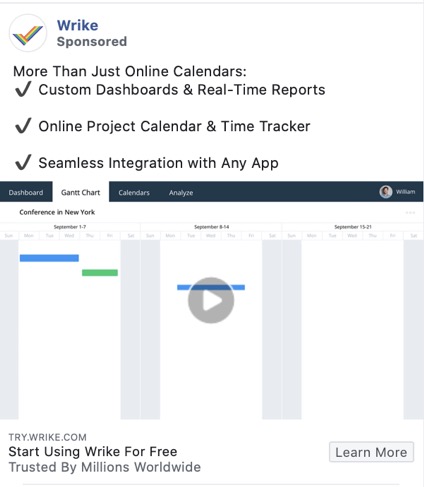
… You will land on a web page that lists the company’s top customers right in the header.
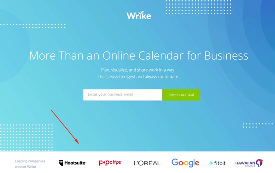
As you scroll down the page, there’s even more social proof in the format of customer testimonials.
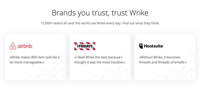
According to some resources, 72% of consumers state that positive testimonials and reviews increase their trust in a brand. Do not miss out on this opportunity!
4. Add Clear CTAs (Call to Action)
When it comes to Facebook ads and landing pages, people like to clearly understand what will happen once they click on the ad or a button on the website.
This means that the clearer (and more attractive) your call-to-actions are, the better results you will get.
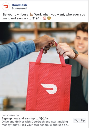
This Facebook ad by DoorDash is targeting food delivery couriers. The call-to-action is clear as day: Sign up and earn up to $x per hour.
Notice that in addition to driving people to sign up, DoorDash also gives them a clear reason to do it: to earn extra money.
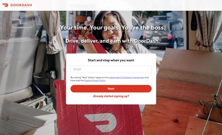
The Facebook ad landing page where people will find themselves has a header with one clear focus point: Sharing the email address (after which users end up in a signup form that asks additional questions).
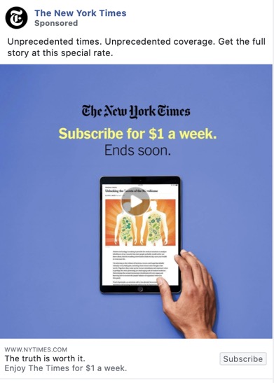
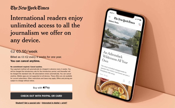
Here’s another example by The New York Times, offering a special discount to new subscribers.
What we like about their Facebook landing page is how simple and straight to the point it is: It tells the value proposition in one sentence, mentions the discounted price, and provides two possible payment options.
Tip: Add a call-to-action button both to the header and the end of your landing page, so that the people who scroll to the bottom of the page can conveniently locate the CTA button and take the next step in your marketing funnel.
5. Build Momentum Across Your Conversion Funnel
We’re all so preoccupied with creating a unique and high converting landing page for our Facebook Ads. But what about the landing page that comes after the landing page?
Don’t forget to create a landing page for your landing page.
What we mean by this is that after a user completes the conversion – signup or purchase – on the landing page, you can lead them to another landing page.
For most brands, this means leading people to a Thank-you page.
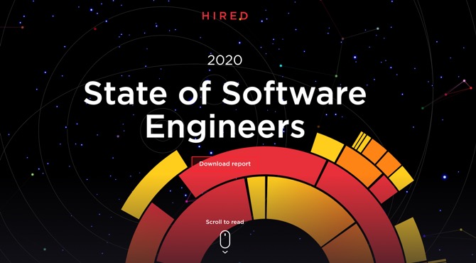
For example, Hired’s e-book landing page invites people to download the report.
Once the visitor downloads the e-book, they’ll end up on a thank-you page. However, instead of just saying “Thank you for downloading,” Hired is using the full potential of the web page by showcasing their product’s benefits and inviting people to learn more.
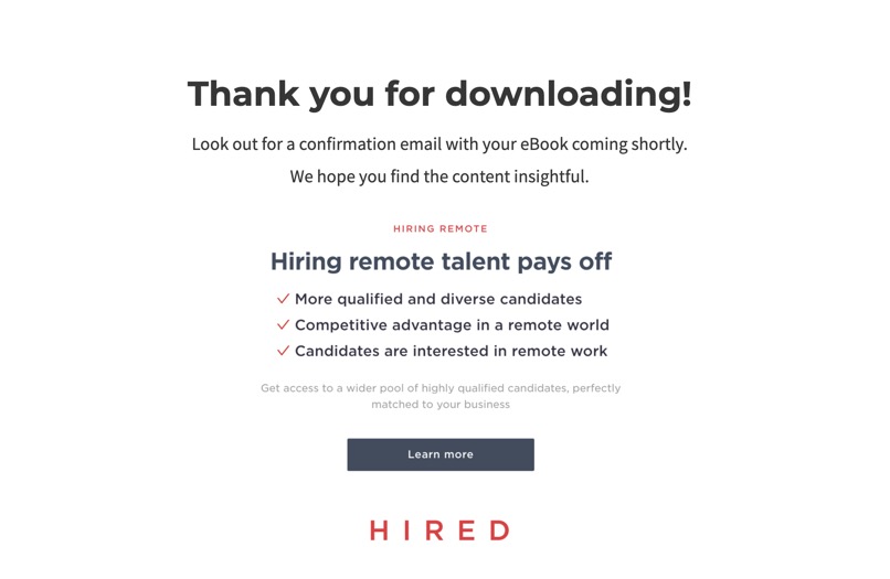
Tip: You won’t need to build a custom thank-you page for every single Facebook landing page. Start with one but make it good – and use it for all of your ads’ landing pages.
Ready to Build Your Own Facebook Landing Page?
Alright! Now that you’re equipped with the know-how about building highly converting Facebook landing pages, it’s time to get started with it.
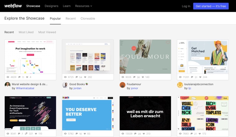
If you’re looking for additional inspiration, check out the Webflow landing page gallery to learn what other brands’ Facebook landing page examples look like.
And don’t forget to apply all the best practices that you just learned. Here’s a quick recap:
- Create a custom Facebook landing page for every different key advertising message.
- Make sure that your Facebook ads’ and landing page’s messaging and design are aligned.
- Include attractive offers like discounts or free trials that help to nudge the visitors to complete the conversion.
- Add a clear call-to-action both the beginning and end of your Facebook landing page.
- Take full advantage of the post-conversion landing page experience and create a thank-you page that moves people down your marketing funnel.
Good luck creating Facebook landing pages and getting a higher return of investment out of your advertising budgets.
Written By
Luke Heinecke

Edited By
Carmen Apostu

