5 Ways Heat Maps Could Make or Break Conversions
Heat maps deserve more credit than we could ever give them. They allow us to analyze how people are engaging with our content.
In this post, I’ll show you how you can use heat map analysis to tweak your website to maximize the user experience. Thus, driving up your potential for conversions.
From minimizing bounce rates to optimizing for smooth user experience, there’s plenty of use for heat map analysis in improving conversions.
Strategize Your Content To Minimize Bounce Rates
Everyone in digital marketing knows that content is definitely king. It’s one of the most significant factors in getting your pages to rank and is a foundation for conversion. However, one of the biggest questions that people often ask is, “How long should the content be?”
The length of your content depends on your audience and industry. However, you can determine what kind of content your users want by analyzing heat maps.
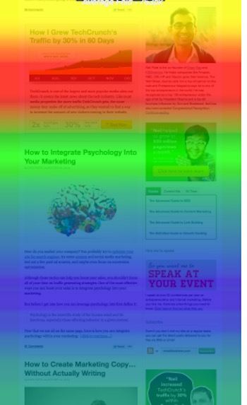
In this scroll map you can see where users start losing interest:

Heat maps will help you see when and where your users will start “bouncing off” of your page. This enables you to strategize content correctly and determine the proper length of content that you’ll need per page.
Here’s what:
Run a heat map analysis off of all the popular pages on your website, this way you’ll know how your audience reacts to your content and when they leave. After doing this, you’ll know how many words they are willing to consume before they start leaving.
Analyze Behavior and Ease The User Experience
User interface can be considered one of the most critical factors in ranking and conversions. The easier it is to interact with your website, the easier it will be to get them to stay and possibly convert.
Being able to determine how a user interacts with your webpage allows you to adapt to your user. Also, heat mapping makes it easier for you to see how a user moves around your page and how they engage with it.
It helps answer these fundamental questions:
- How long are they spending on a particular object on a page?
- What do they usually click on?
- Where are they focusing their attention on?
- Which parts of the page should we improve or add links on – as a result of the questions above?
Here’s an example; imagine having a simple table on your website with figures, and you notice the space on the headings is “hot.” This is a possible indicator that your visitor is trying to interact with this table – they are probably trying to click on a heading to see if it links out to relevant data, or maybe, they are trying to sort the table.
Check out this example:

As you can see, there have been users that have tried to click on areas on the page that they could have thought to have a link to another piece of content. Alternatively, it could be because they might have thought that there would be some interaction.
Remember – always optimize and build for the user.
Optimizing Your Internal Links
Everyone knows how important it is to have inbound links, but what you shouldn’t forget is the power of internal links.
Navigation is one of the priorities of having a good internal linking structure, but one of its best uses is to keep users on your site much longer. The more time they spend interested in your content, the more likely they are to develop trust and the ease of conversion is simplified.

In this example, you can see that the anchor “SEO” is a hotbed for engagement. This signifies that it’s a great anchor to use.
Heatmaps allow you to analyze the pages that you have and check out which internal links are working to keep visitors on the site longer. It allows you to adapt to how the user wants to navigate on your website.
Google Analytics groups link statistics together, but through proper heat mapping software, you can see which links are being often clicked per page.
Remember this.
The same popular internal link that you use for one page will not always have the same popularity when used on another page. The key here is to maximize engagement and determine what link works for what page.
Test Your Pages
Heat maps and scroll maps are a great way of testing elements of your relevant pages. They allow you to find out if users are reacting to the elements of a page in the way that you expect them to react to it.
There are days where we spend a lot of time in the overall design of a page and neglect ensuring that it serves a purpose. Heat mapping removes the guesswork and allows you to positively know which parts of a page you have to improve on or eliminate altogether.
Check out this homepage, you can immediately see which parts are being given the most attention.

You can even use them to determine which parts of a page cause your users to abandon your website – as mentioned earlier in content strategy.
Improving Your CTAs
Calls-to-Action can be considered the driving force of conversion and adequately utilizing the lessons from heat mapping will allow you to create CTAs that work. These are particularly important if you’re running an e-commerce website.
Heat maps will help you identify the click behavior of your potential customers and check if your CTAs need some work. Alternatively, you can also check if you need to de-optimize.
Through heat map analysis, marketers have determined the following facts when it comes to CTAs:
- Simple CTAs get more conversions because people do not want to have too many options right away.
- If you are going to use photographs, remember that people like faces, especially ones that are smiling.
- Use colors that are easier on the eyes of your user.
- Utilize a shallow depth of field when you use images.
- Visitors look towards where the person in your photograph is looking at.
As you can see, the heat-mapping analysis allows you to track, quantify and analyze user behavior. Through proper usage, you can use it to tweak your web properties for better engagements resulting in higher conversion rates.
Written By
Catalin


