10 Actionable Ideas to Increase Website User Engagement
Editor’s Note: Best practices change—so does this blog. This article was originally published on May 10, 2016. It’s been updated for accuracy and usefulness in 2021.
Website user engagement is an important indicator determining the success and ranking of your site. Every website is competing with rival brands to increase its engagement levels. Even if you attract a huge amount of traffic, this won’t mean much unless you’re able to engage visitors and get them to perform the desired action.
Engaging users is the crucial first step in the conversion process. You must engage your audience before you can convince them to buy or subscribe. Also, having users leave your website within a few seconds will negatively impact your bounce rate. So if website user engagement is so important, how exactly can you increase it? In this article, I’ll outline 10 proven tips that can help you effectively engage with visitors.
Engaging users is the crucial first step in the #conversion process. Share on X1. Reduce page load time
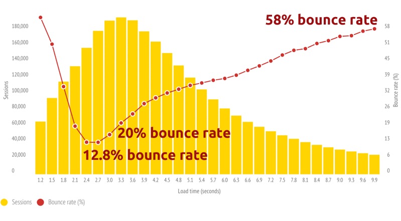
You’ve probably had an experience with slow-loading pages yourself. You find a website that looks interesting, then you click on the link only to be kept waiting for it to load. You likely exit the website because it’s frustrating to wait and wait. A study conducted by Soasta found that pages loading just one second slower can experience a 56% increase in their bounce rate. That spells trouble for website user engagement.

Conduct a page speed test using free tools like Pingdom and see if your site loads within two seconds. If not, take the steps to improve the load speed by removing unnecessary elements from your pages. Images can be engaging, but try to limit the number of images per post so that the page loads faster. You could also download plugins that will ensure image loading is delayed until readers scroll to the specific area.
(Pst…if you use A/B testing tools, you might want to know how those will affect your load time. We wrote about it here).
2. Improve your internal linking structure
In addition to boosting your SEO ranking, a good internal linking structure will enable users to navigate your site easily. Then you’ll be able to generate more page views with each visitor and decrease bounce rate. Both are essential for website user engagement. Try using relevant anchor texts to link other related content on your website.
Kissmetrics has a great article outlining some general guidelines for these. But the basics are:
- Links should have a descriptive anchor text,
- They should be specific, and hyper-relevant
- They should go somewhere new (aka: not to somewhere as easily accessed from your main nav.)
For example, I linked to an infographic about bounce rate using the anchor text “bounce rate” in the paragraph above. This is a good example of how internal linking works. You can implement this for website user engagement too. But avoid overdoing the internal linking tactic because it could annoy users (and search engines) if you do it excessively in a post.
If you have a particularly relevant content piece worth highlighting, you can also mention “Read Also/Recommended for You” links in the middle of the post.

3. Display related content
This website user engagement tip is somewhat similar to internal linking. Simply display relevant posts at the end of each page. This helps visitors easily find related posts if they require more information about the topic they were initially reading.

While you can do this manually, you can also shorten the process using plug-ins, which automatically place snippets for more posts or pages at the end of your content. It allows you to display these posts using either a thumbnail or text link.
Some examples for WordPress:
- YARPP
- Jetpack
- Contextual Related Posts
- Related Posts Pro for WordPress (premium – $$$)
- Yuzo
4. Simplify navigation
What if lots of your site visitors leave because they’re unable to find something?
Many websites are too difficult to navigate, resulting in a high bounce rate and poor website user engagement. Simplify and re-organize your navigation structure so that users can find the page they need without much effort.
Take a look at the example below from Threadsforthought.com. Here the navigation menu has been organized neatly. Visitors won’t get confused about where to find the latest lookbooks or check out sales.

A few things that make for less-than-great navigation:
- An inaccessible navbar. Depending on your site style, you may benefit from “sticky navigation”—or navigation that stays with you upon a scroll.
- Poor categorization. You want to make sure all your most important links are accessible from your main navigation. But, a giant mess of links doesn’t do anyone any favors. Group your like links.
Slow loads. Be careful—robust navigation can sometimes slow down your above-the-fold load speeds. Make sure your navigation is designed in a way that doesn’t slow your homepage down.
5. Choose your writing style
Your style of writing can impact your website user engagement by determining how readers respond to your content. What works for one audience base might not work well with another. There are two predominant writing styles on the Internet – a friendly, easy-going conversational tone and a more formal professional tone.
The majority of websites opt to use the former style – from quirky and fun informational websites like Buzzfeed to popular Internet marketing sites. However, the formal tone may be better for business websites providing more serious content.
Choosing a brand voice can not only help you to engage your users—it can help differentiate you from your competition, and build trust amongst your audience. If you’re hoping to learn more, Distilled has a great deep dive.
6. Use a responsive design
Statista reported that 52.7% of the world’s population used their mobile phones to access the Internet in 2015. In 2020, the number of mobile users worldwide stood at nearly 7 billion (!). For Internet marketers, this means that building responsive websites is critical to engage both desktop and mobile users. It could be frustrating to navigate your desktop website on a mobile phone, which prevents good website user engagement.
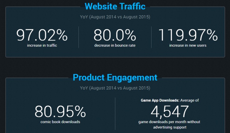
For Biowars, a fully responsive website helped them completely engage users. After the upgrade, they experienced an 80% decrease in bounce rate and a whopping 119.97% increase in new users. Biowars also improved product engagement with an average of over 4,500 game downloads in a month without advertising support.

A few “quick” no’s, if you’re trying to be mobile friendly.
- The obvious: people are over pinch and zoom. Put in the effort to design a mobile friendly version of your site (in particular, for your checkout and product pages)
- Cursors are smaller in comparison to screen size than fingertips. Adjust your button sizes accordingly.
- Keep it simple. Some elements look great on desktop, and are a mess to navigate on mobile. Get rid of them and focus on the content that counts.
7. Study your audience
Gain insight into the preferences and values of your audience by conducting a survey. This will help you create content that your target group can truly engage with. Ask them questions about what they like and what they expect from you. Find out if they feel you’re lacking in certain design features or content coverage.
Your feedback will show where you need improvement for better website user engagement. I suggest using tools like Survey Monkey for adding polls and surveys to your site. Whatever your survey is about, make sure you keep questions short and simple. Avoid taking too much of your visitors’ time with lengthy surveys.
A few other ways to better get to know your audience:
- IDIs (in-depth interviews). In terms of qualitative research—this is one of your best bets. It’s literally talking to your audience, developing reports, and drawing out a lot of solid, nuanced data on how they interact with your brand.
- User Testing. See how visitors are interacting with your site—where their roadblocks are, what’s confusing, and how you can better collaborate with your users.
- Live Chat Transcripts. Reading back your live chat queries is a great way to detect problem areas. Visitors will tell you when they can’t find what they’re looking for. This is an easy way to listen.
8. Add a prominent search box
Too many websites get this wrong. Isn’t it a tad too ironic to have to search for the search box?
Some people visit your website to find something specific. If they’re confused about how to find that, they’re going to leave. Engage your visitors by allowing them to easily find what they’re looking for. Add a prominent search box that users can easily locate to locate specific content.
You’ve probably noticed that most websites have their search box on the top left. So users generally expect the search box to be located there. It’s best to go simple with your search box design, but adding features like a drop-down menu or an auto-suggest feature could boost website user engagement. Here’s a good example of a clearly visible search box from ShaneBarker.com. Notice how the magnifying glass is red, which makes the box more prominent.

9. Collect email addresses
Website user engagement isn’t just about engaging with a new visitor once. It also concerns your ability to drive visitors back to your site. You can do this by collecting their email address, which you can use for sending new content updates. Plug-ins like Bloom provide great tools for creating an opt-in form and building your email subscriber list.
Having a pop-up opt-in form when visitors land on your page is the most popular choice. However, you could place a subscription form on your site’s sidebar. Adding an opt-in box at the end of posts could also engage visitors after they’ve thoroughly enjoyed your content. The Crazy Egg blog has a subscription form at the bottom of their blog posts.

Warning: If you’re in Europe, collecting email addresses from Europeans, or just don’t want to fall behind on data privacy—GDPR is going to affect how you collect email addresses (and all other personal data). More info here.
10. Hold contests or giveaways
Contests and giveaways are the best way to improve every aspect of your performance. They’re beneficial for page visits, subscriptions, conversions, and website user engagement. Create your giveaways in a manner wherein users reap rewards for taking certain actions. For instance, you could out a reward for referrals, content shares, social media likes, or product reviews/testimonials.
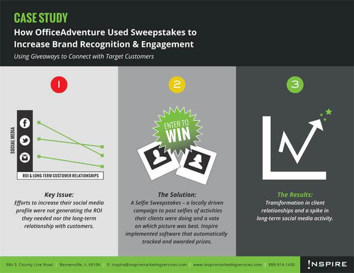
The benefits can clearly be seen in the case of OfficeAdventure, an app that brings together various offices to embrace a fit lifestyle. They used sweepstakes to not only increase brand recognition but also improve website user engagement.

Conclusion
With website user engagement being an essential aspect determining the performance of a business, you need to make the most of the above tips. Run tests to see which works best for your website design instead of simply settling on one. As you can see, your focus should be on making your website attractive, interactive, and user-friendly.

Written By
Shane Barker

Edited By
Carmen Apostu

