Stats 101 — A Visual Guide
We all want to make good data-driven decisions from our experiments. After all, that’s why we run experiments in the first place.
But how many of us actually feel confident navigating the complexities of p-values and standard deviations to make truly well-informed and confident choices from our test results?
If you’re a product manager, a marketer, or an analyst, and you feel this pain, you’re not alone. A common question asked by product teams I’m consulting is this: “How can I understand stats well enough to make confident decisions from my A/B test results?”
My response is usually a visual guide, as documented in this article. It focuses on the core statistical concepts needed to make effective decisions. It won’t cover everything. For instance, it’s missing Minimum Detectable Effect and Power, but hopefully, it is enough to equip you with the foundational knowledge you need to interpret results more confidently.
This guide attempts to demystify statistics.
Now, to do this, we need an example scenario and the scenario I’ll be using is this:
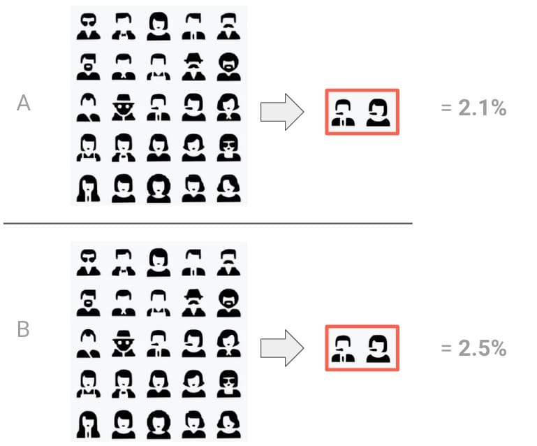
We ran an A/B test and got the following results:
– A (control group): 2.1%
– B (variant group): 2.5%
Whoa, whoa, where are all the stats? Well, a physics teacher once told me not to write anything down until I properly understood it. So, this is what we’ll be doing here. We’ll add statistics as we learn about them and understand their purpose.
Why statistics?
A good place to start our journey is understanding the specific problem statistics aims to solve. For this, let’s look at some definitions.
Statistics is the science of using data to glean insights about the world around us. It’s not about torturing data until they confess, but rather about finding meaningful patterns and relationships that might otherwise go unnoticed.”
“Data are not just numbers; they are a summary of the world as we see it. The power of data comes from the context we provide and the questions we ask.”
Naked Statistics, Charles Whelan
And also…
Statistics is about extracting meaning from data and dealing with uncertainty in that process.
Sir David John Spiegelhalter, Statistician and Fellow of Churchill College, Cambridge
But wait, why are we focusing on uncertainty? Well, assume I presented you with three experiments from the same website. The conversion rates are different because they’re from different parts of the site.
The question is, can you identify the “real” A/B experiment in the table above? The other two experiments are A/A experiments, that is, there’s no difference between what each group experiences.
I know. There isn’t enough information or context to answer the question, right? We instinctively know this. And even after I give you the answer…

… it’s still unclear how we could have correctly identified the A/B test. We need more information before we can make that assessment. But what information would satisfy us?
Traffic and conversion rate, perhaps? Well, let’s see.
Traffic, conversion and user samples
Let’s dial this back and ignore A/B tests for now. Instead, let’s talk about our site with no A/B tests running. We’ll return to A/B tests once we’ve understood some foundational concepts.
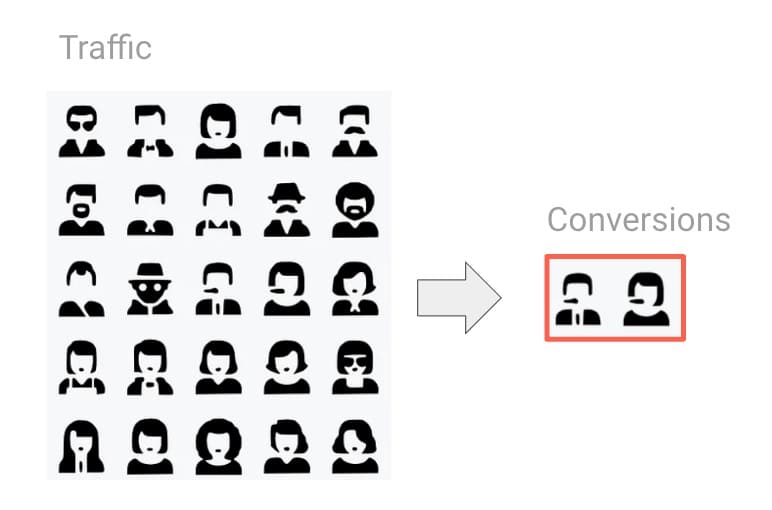
Let’s get an understanding of our traffic volume first. Our website is highly trafficked. We’re talking millions of users per day. Now, this is a good start. High traffic volume helps us get a more stable picture of user behaviour, making it less likely that random fluctuations will skew our results. But let’s see if we can take this further by looking at conversion rates, too.
A conversion rate measures the proportion of users or sessions that hit a specific goal or goals. Common uses include making a purchase, filling out a form, etc.
We can calculate conversion like this:
Technically, we need to multiply by 100 to get to 2%, but you get the gist.
In the example above, the conversion rate is 2%. But let’s say we picked a random day of the month:
For this random day, the conversion rate might be 1.67%. But if we took a range of days, for example, an entire month, now we get 2%.
So the observed conversion rate varies; it’s not fixed. It can fluctuate due to seasonality, day of the week, holidays, promotions, differences in where our users find us, etc. If we include more users, we get a more representative figure. And the 2% conversion rate is an average for that entire month.
Alright, now bear with me here. I’m gonna get a little crazy. What if we took a random slice of traffic over that same month, perhaps taking a random few hours each day?
Would we expect to see a 2% conversion rate for that slice? Not necessarily. But we might get close.
So, what if we did this again, taking another random slice? In fact, let’s get nuts. What if we did this ten times? What conversion rate could we potentially see? We’d expect to see a range of values.
These ranges could look like the following:
Above is a range, marking 2% as the mean.
Why don’t we always get 2%?
For a part of the answer, let’s look at a random sample of users:
Each one of these users is unique. They have their own hopes, dreams, and desires. What’s more, they behave differently day to day. This means each user converts differently.
When we check a slice of our traffic, we can’t assume we’ll always have a representative sample of all our users in each group. And we need a representative sample to compare traffic in an A/B test meaningfully.
A/B testing, and even A/A testing, is like slicing our traffic. For instance, our experiment saw a 2.1% conversion rate for a control group. And 2.5% for our test group.
So, can more traffic volume help make it more representative?
It depends. A big part of the noise could come from the fact that users may behave differently on weekdays vs. weekends, for example.
But even if we ran our example test for a number of weeks to try to normalise the seasonality-based noise, we can never expect to see a complete match between our groups. It’s just not realistic unless you’re using some sort of multiverse device.
So, then what else can we do?
Answer: We need to know when we see a signal above the noise. Imagine we’re trying to identify the half-decent face in a sea of AI-mangled faces below. It’s hard at first until we get some help to direct our attention to that signal.
So, to understand our A/B test result, we need to better understand the “noise” in our test. This will help us determine whether a signal is a real signal (a real human face) or just another mangled face that happens to look more human. A key part of determining this is to understand standard deviation.
Standard deviation
Let’s get back to our A/B. As a reminder:
- A (control): 2.1%
- B (variant): 2.5%
The absolute difference between them is 0.4%.
Also, remember the ten random slices we took from our site with no A/B tests running?
Do you notice how most of our observations clump around 2%? That makes sense, right? This is our average, after all. Keep that in mind.
Now, consider if we could get an average of the distances between our list of observations and the average. It might give us some perspective on the “noise” between the conversion rates.
This is what standard deviation is. It’s a measure of the variability in a data set that quantifies how spread out the values are. Specifically, standard deviation represents the average distance between each number and the average value.
This helps us understand how spread out the distribution of our numbers is.
We can use the STDEV formula in Google Sheets or a similar function in Python, etc. All we do is add a list of numbers to the function to get this average:
You’ll notice that the list of numbers I’ve entered into the calculator is our A and B conversion rate numbers. Our standard deviation is calculated as 0.28.
Why are we using the test and control conversion rates to calculate the standard deviation?
Let’s return to our analogy of that busy room, the sea of mangled AI faces, and very few “normal” looking faces. We’re interested in measuring the “background” noise.
Similarly, we want to measure the “static” or “noise” in our website’s conversion rate. We don’t know the true level of this background noise, so we use the data from both the test and control groups to estimate it.
Put another way, when we calculate the standard deviation in this case, we’re not trying to measure the difference between the test and control groups, but instead, we’re trying to figure out the typical amount of random “noise” we see in our website’s conversion rates.
Great. We’re getting somewhere. Now, how can we put this standard deviation to use?
The normal distribution curve
We’ll start by redoing the range chart we made earlier. We previously worked under the assumption that no A/B test was running, and we had a conversion rate of 2%.
Now we know we are analysing an A/B test and that A is a control group. So, let’s treat this as our baseline. So, 2.1% conversion rate is our mean now.
Then imagine if we were to take ten random slices of the conversion rate for traffic from this control group and place them on the range.
Now, let’s use the standard deviation (I’m rounding to 0.3 here for simplicity) and place numbers separated by that distance on the chart (we’ll get to why we’re doing this soon, I promise).
So, basically we get this:
We have ten observations so far. Now, for some magic. You see, if we make more observations, the distribution becomes smoother and more like the shape of a bell.
If we had ten thousand observations, it would look like this:
This is called the normal distribution curve, often called the bell curve. It’s a fundamental concept in statistics. It arises from several mathematical theorems that tell us that when we take enough samples from a population, the sampling distribution of the average will tend towards a normal distribution, as seen above.
The great thing is that we don’t need to make ten thousand observations. If we know we have a decent amount of traffic and our observations are from the same website, we can assume this shape (based on the errors in our averages).
It’s also important to note that this distribution curve represents the estimated variability of the delta between our test and control conversion rates.
One improvement we can make to help us here is to update the numbers to use standard deviation units like this.
Each number represents a distance from the mean, which is set to zero. This means:
- 2.4% becomes +1 standard deviation from the mean
- 2.7% becomes +2 standard deviations from the mean
- 1.8% becomes -1 standard deviations from the mean
- Etc.
Doing this means navigating the chart in terms of distance from the mean. It’s also universally applicable to different conversion rates.
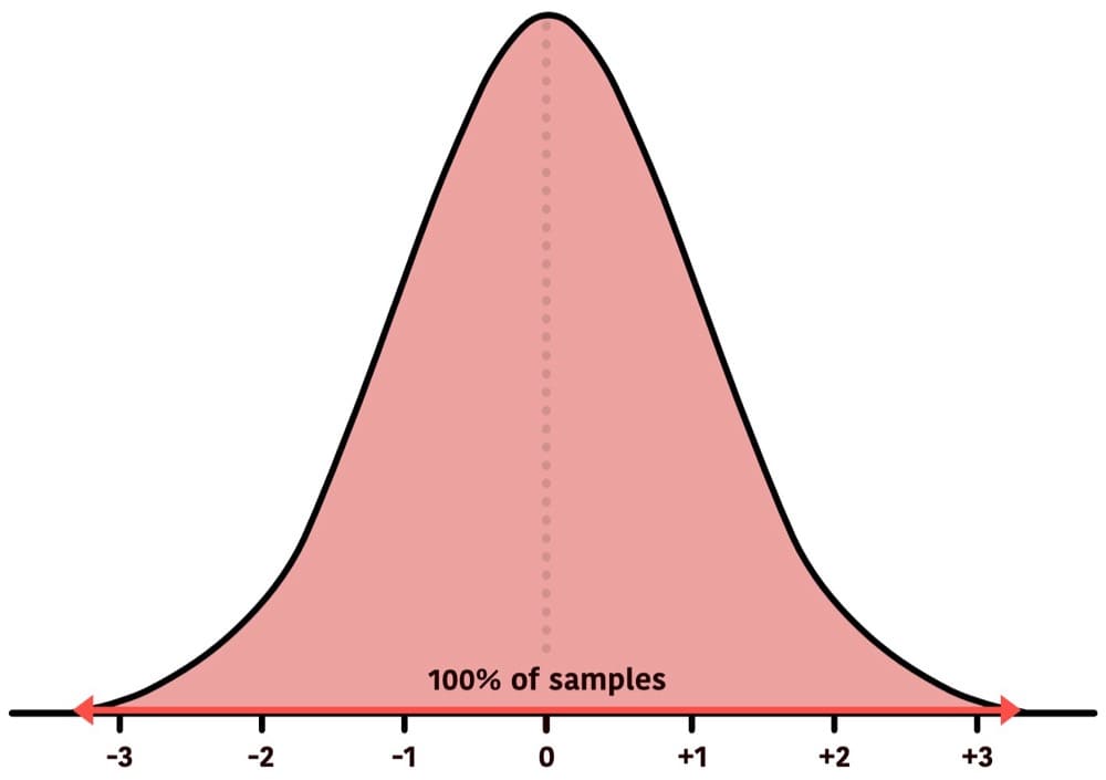
Before going any further, here’s a quick tour of probability density:
The above represents 100% of the data.
In reality, 100% certainty doesn’t exist, as the tails will never converge with the horizontal line, but we’ll put that aside for the purpose of demonstration.
And between -3 and +3 standard deviations represent about 99.7% of the data:
In fact, here is what the overall density of our sample conversion rate means looks like:
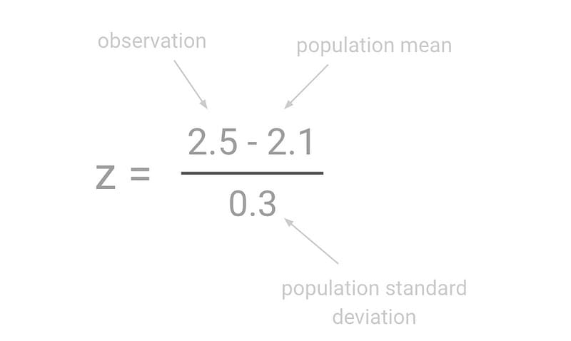
This is all control right now. We want to place our variation conversion rate (2.5%) on the curve. The calculation to convert any number to standard deviation units is the z formula:
To place our test result (2.5%) on this curve, we need to use the z-score formula to do this calculation:
This gives us a z result of +1.33, which we can place on the curve.
We can see from the chart that our variation is a distance of +1.33 from the mean when using standard deviations as units of measurement. This is our calculated z-score.

Shouldn’t the variant conversion rate have its own distribution curve?
It might seem logical that the variant group would have its own distribution curve, separate from the control group. However, in A/B testing, we’re not comparing two separate distributions directly. Instead, we’re working with a single distribution that represents the difference in conversion rates between the variant and the control.
This distribution is centred around zero, representing no difference.
To understand the variability of this difference, we calculate the standard deviation using data from both the control and the variant groups and chart it in a single distribution curve.
Okay, so now we see our z-score observation (also known as our test statistic) on the curve. But what does that actually mean? Let’s start shading some areas to find out.

From the above view, we can see that +1.33 is greater than 90.82% of the observed values (area shaded red) for our rand. In other words, it is about the 91st percentile of values.
Note: This is the typical view presented in most A/B testing tools, sometimes labelled as “significance”.
Now, we know the geometrical position of our variant. Let’s get a firmer understanding of what this position means.
Tour of the normal distribution
Remember our A/A test question earlier? Well, let’s assume we’re analysing an A/A test. As a reminder, an A/A test has no difference applied to our test groups.
We’ll name our two A/A groups to make it easier to refer to them.
- A1: Control group
- A2: Fake variant with no changes
So, assuming we’re dealing with an A/A, there’s an almost 100% chance that we’d observe A2 between -3.5 and +3.5 standard deviations from the mean.
There’s about a 99.7% likelihood that A2 will be between -3 and +3 standard deviations:
By the way, this means that it is 0.3% likely that we’d see A2 outside the area highlighted.
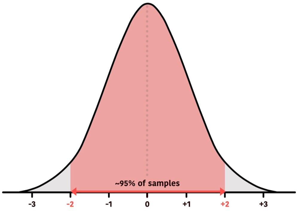
There’s about a 95% chance that A2 will fall between -2 and +2 standard deviations.
That means there’s about a 95% chance we’d see a result within this area and a 5% chance we’d see a result outside that area.
There is about a 68% likelihood that A2 will be between -1 and +1 standard deviations:
This means it’s about 68% likely that we’d see A2 within this area and about 32% likely to see a result outside that area.
Therefore, the further a value lies towards the tails, the rarer it is.
It’s important to note that z-scores can reach very high numbers:
These observations constitute a difference of a high magnitude. It would be extremely rare to see such changes by chance if there is no true effect. So, having the vocabulary of z-scores and understanding their relationship to the normal distribution curve and the mean is an important skill, as it allows us to understand statistical probabilities.
The null hypothesis
So, why have we been using A/A tests? Well, we can think of the null hypothesis as being sceptical that we’re running an A/B test.
In other words, the null hypothesis is the assumption that there is no difference between the two groups. This is useful to understand the chances of observing impacts purely due to random chance.
An A/A test is a practical representation of the null hypothesis in action. We can also use the null hypothesis to create a powerful decision-making framework.
Rejection regions
We start this by establishing a confidence interval. 95% is a common confidence level to use. This is what that looks like:
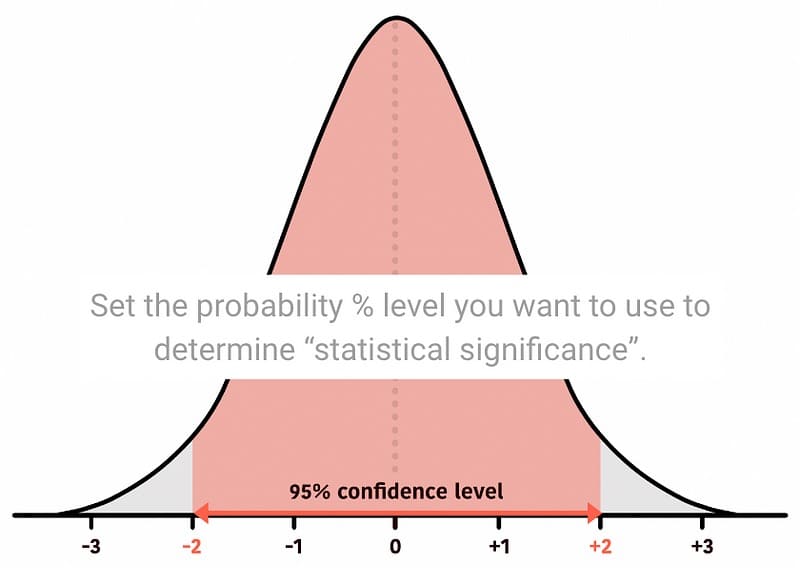
Remember, the confidence level (we chose 95%) is roughly between -2 and +2 standard deviations from the mean for a two-tailed test (I’ll talk more about this later).
Now that we have established confidence levels, we can establish rejection regions, which are pretty much the opposite of what we have decided.
Now, we can define a rule. If an observation falls in the rejection region, we reject the null hypothesis — i.e. we reject the status quo.
To place an observed conversion rate on the distribution curve, we use the standardisation formula and put it on the curve:

The above value falls below -2 or above +2, then it is inside the rejection region, and so we reject the null.
Two vs. one-tailed test
We’ve so far distributed our rejection regions across both tails of the distribution curve:
This is good to use if we’re looking for a change in either direction. That is if we’re open to detecting a change in any direction.
We can also move our rejection region to a single tail if we’re looking for a change in one direction.
This is called a one-tailed test. There are two types of one-tailed tests.
For a one-tailed (right-tailed), we shift the rejection region to the right as that’s where our focus is. In this example, we’re only looking for an improvement and would reject the null hypothesis if the observed z-score is above +1.6.
Alternatively, if we were only interested in detecting a negative impact, we would use a left-tailed test, like this:
Here, we’re specifically looking for a change in the negative direction. So, if our observed z-score is below -1.6, then it falls inside the rejection region, and we can reject the null.
Whether we use one-tailed (left or right tail) or two-tailed depends on our hypothesis.
A common misconception is that a one-tailed test makes it easier to reject the null. Here’s Georgi Georgiev’s view about this:
To get a more detailed and thorough explanation of this, you can check out Georgi’s article on this topic here. The following quote from his article really sums it up best:
The most important distinction between the two tests is our intentions: what one aims to find during the test and what actions would follow a statistically significant result. If our actions would be the same, regardless of the direction of the effect, then sure, use a two-tailed test. However, if you would act differently if the result is positive, compared to when it is negative, then a two-tailed test is of no use and you should use a one-tailed one.
Georgi Georgiev, “One-tailed vs Two-tailed Tests of Significance in A/B Testing”
When we experiment on our sites and apps, we usually aim to improve the control and launch a new winning variant. Therefore, it’s common to use a one-tailed (right-tail) test. This decision is typically made when planning the test.
Anyway, back to our experiment. We’re going to use a one-tailed test. The variation result of 2.5% has a z-score of +1.33 distance from the mean. And so it falls outside the rejection region.
Using this rejection region as a decision rule, we can say that we have failed to reject the null.
Note: We can’t say that the null is accepted. Only that we currently don’t have sufficient evidence to reject the null.
What about the p-value?
Ah, p-values. Let’s see if we can make using rejection regions easier. Using rejection regions is good, but it’s a little clunky. At the moment, we need to make sure we’re looking at the correct tail. Additionally, we need to check a test statistic against a range of values.
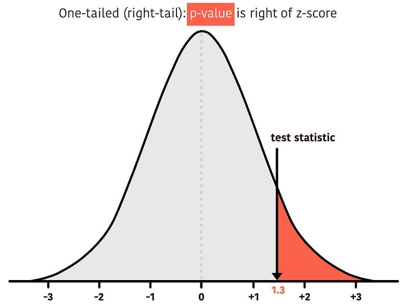
Enter the p-value. It helps us devise a much more direct rule. Visually, the p-value is always the area under the curve from the observed z-score directed towards the tail. So, this:

Or this:

What does the p-value represent?
If we assume the null hypothesis is true, then what is the probability of observing a result at least as extreme or more extreme than the one observed?
Typically, we use the p-values like this: First, we set a significance level. This is based on our rejection region. So, if we’ve set our rejection region to 5% (or 0.05), then we can have a single rule to reject the null hypothesis if the calculated p-value is less than 0.05 (5%).
A statistically significant result (e.g., p-value < 0.05) suggests a low likelihood of a result occurring due to random variability, should no true effect exist.
For example:
Two-Tailed Test
We split the 5% into two tails (2.5% in each tail) as per our previously defined rejection region rules.
Then, after placing our test statistic on the curve, the p-value is the combined area of both tails beyond the observed test statistic (a.k.a. our calculated z-score for the variation).

Since the two-tailed test looks at values on both sides of the normal distribution, we need to use positive and negative for our observed test statistic.
We can calculate the test statistic in Google Sheets or Excel using the formula:
The p-value for the 1.33 test statistic is 0.18. We reject the null if the p-value is less than 0.05. So, we cannot reject the null.
One-Tailed Test (Right-Tailed)
We are only interested in rejecting the null hypothesis if the evidence supports our alternative hypothesis of a positive effect. Then, the entire 5% significance level is towards the right tail, as per our previously defined rejection region.
Then, our p-value is the area under the curve to the right beyond the observed test statistic.
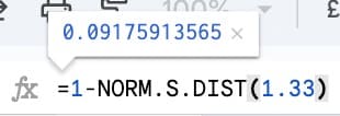
We can calculate the p-value in Excel or Google Sheets like this:
The p-value for the 1.33 test statistic is 0.09. We reject the null if the p-value is less than 0.05. So, we cannot reject the null.
One-Tailed Test (Left-Tailed)
If we are only interested in rejecting the null hypothesis if the evidence supports our alternative hypothesis of a negative effect. Then, the entire 5% is in the left tail, as per our previously defined rejection region.
The p-value, in this case, would be the area under the curve towards the left tail beyond your observed test statistic.
We can calculate the p-value in Excel or Google Sheets like this:
The p-value for 1.33 test statistic is 0.9. We reject the null if the p-value is less than 0.05. So, we cannot reject the null.
The main thing to remember is that we will always be looking to reject the null hypothesis if our p-value is less than or equal to the significance level (which, in our example, is 0.05 but it can be set lower or higher depending on how consequential it is to commit to a wrong decision following the test).
Conclusion
So, there you have it. I hope this article has helped communicate the core statistical fundamentals needed to interpret test results.
We learned about noise in our tests to understand the problem statistics sets out to solve.
We then learned about standard deviations and creating normal distribution curves so we could visualise probability densities. We also learned how to calculate z-scores for our test statistics.
After that, we defined some decision rules using rejection regions before simplifying using p-values instead.
Throughout the course, we learned why they’re used and their specific roles in making informed decisions from A/B tests.
Now, it’s crucial to remember that statistics isn’t about finding absolute truth but managing uncertainty. A p-value of 0.05 doesn’t mean there’s a 5% chance your test is wrong, but rather a 5% chance of seeing a result this extreme if there were indeed no difference between your groups. Using such a rule guarantees you will not err too often. In this particular case, in no more than 5% of cases.
Still, this foundational knowledge empowers you to ask the right questions, interpret results accurately, and ultimately make better choices for your product or business. Now, go forth and experiment!
This article has greatly benefited from the thorough feedback provided by Georgi Georgiev. I am grateful for his patience, clarity, and generosity. To further your understanding of these topics, consider picking up his book, Statistical Methods in Online A/B Testing: Statistics for data-driven business decisions and risk management in e-commerce”.

Written By
Iqbal Ali
Edited By
Carmen Apostu

