Convert More Customers with Multipage Experiments (An In-Depth Tutorial)
If you’re looking for a way to make your experimentation program even more effective, then multipage experiments (also called multipage tests or multipage experiences) might be just what you need. A multipage experiment provides a useful way to test elements across multiple pages or to redesign a website.
The benefit of using it is that you can maintain a consistent user experience, examine visitor behavior across various pages, and gain a deeper understanding of how your visitors interact with different sections of your website.
In this article, we’ll take a look at what multipage tests are, some of the most common use cases, and how to implement them with Convert Experiences.
What Are Multipage Experiments?
Multipage experiments are a type of experimentation that allows you to test changes to specific elements across different pages at the same time.
Typically, you’ll want to do one of the following:
- Recreate all of your funnel’s pages or build new versions. This new collection of pages becomes your variation funnel, which you then compare against the original funnel. This is referred to as multipage split URL testing or funnel testing.
- Alternatively, you may want to see how the presence or absence of recurrent elements, such as security badges, affects conversions along a funnel. This is what is known as “classic” multipage testing.
Some examples of multipage experiments you can try:
- Hide the “Subscribe to newsletter” box from all existing subscribers across the website.
- For visitors from a specific location, include a phone number in the footer of your website.
- For all visitors who arrived via an ad campaign, replace the “contact us” CTA in your navigation with a “request demo” CTA.
- For returning visitors, present a “20 percent discount” overlay on all product pages.
When Should You Consider Using Multipage Experiments?
Make the Users’ Journey Consistent
Let’s say you are testing out new CTA buttons.
A multipage experiment will ensure that visitors see the same CTAs across your entire site. If a visitor is included in an experiment and the original version is assigned to them, they will see the original CTA buttons on all pages; if they are bucketed into the variation, then they will see the new CTAs on all pages.
Providing a consistent user experience all throughout your website is crucial to preventing distrust or confusion among your visitors.
Over time, customers will be able to identify and get familiar with your CTA buttons if you maintain the same color and design scheme across different pages and screens, even in your tests.
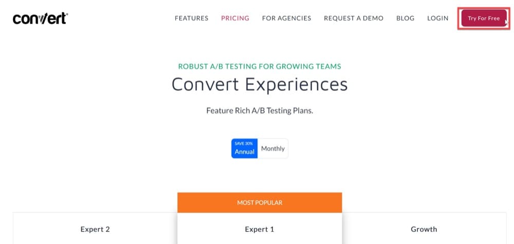
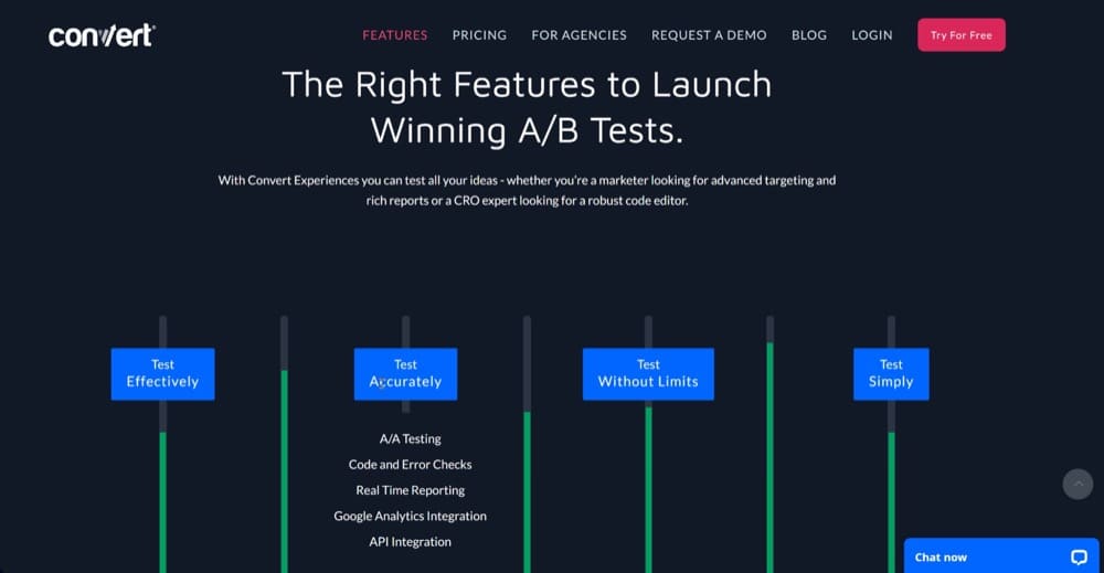
Take a quick look at the “Try for Free” CTA button color on Convert’s homepage and pricing page.
If we wanted to test new button colors, we would set up a multipage experiment that maintains the same color and design scheme across all pages to offer a consistent user experience.
And changing button colors isn’t the only time you’ll want to use this type of experiment.
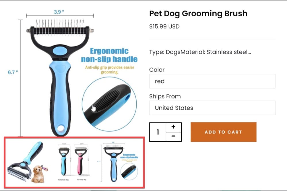
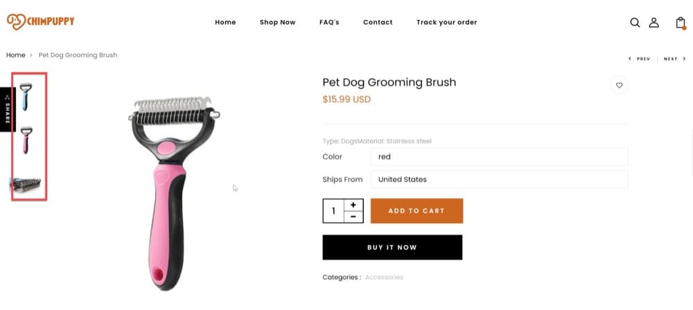
For instance, if you use vertically scrolling image galleries on most pages but use a less-obvious horizontal slider on another, visitors could struggle with the material or miss it entirely.
Let’s illustrate this using a hypothetical use case.
Look at how different the scrolling experience is on the Quickview versus the Product Page in the example below.
Sliders that are inconsistent on different pages will only confuse visitors and negatively impact conversions.
Redesign Your Website
Are you contemplating a website redesign?
You might want to perform a multipage experiment to compare a different design with the previous one before committing to the new version. Run a multipage experiment (and direct a small amount of traffic towards it first) to get a feeling of how it performs.
Take the case of an eCommerce company with a revenue of $8 million that is changing its entire website design. Since the website was created six years ago, only sections have been revised. Although sales have increased significantly, the website hasn’t been updated. It doesn’t have a modern design, the checkout process isn’t smooth, and it isn’t mobile-friendly. The company knows that it needs to update it and hires a high-end firm to remodel it completely. Are they doing the right thing?
No! Multipage experimentation should be considered before a major site overhaul to avoid wasting resources on the wrong things.
At Convert, we test our hypotheses before redesigning the website and implement the ideas that fit our evolving customer journey, brand, and strategy.
The last time we updated it, our working hypothesis for the features page redesign was that if we present clear benefits upfront and make it easy for users to identify the primary features, we would see more engagement. A reasonable assumption. We opted to test the first phase of the project while continuing to work on the overall solution rather than completely revamping the features page to find out.
Our preliminary findings indicated that we were on the right track, with visitors participating in the variation more actively. By testing the assumption first, we were able to make the changes with a relatively small budget. Our assumptions confirmed, we proceeded with the redesign, confident that the upgrade is worth the effort.
Of course, this was just one of many tests for one of our hypotheses. However, this example illustrates how testing for various elements of the web design and development process with tiny multipage tests is a wonderful approach to getting feedback.
Use Multipage Submission Forms
The term multipage form refers to a lengthy form that has multiple pages. It’s used to make extensive forms, such as shipping or registration forms, less daunting for users to fill in. You can improve conversions and create a positive user experience by allowing consumers and leads to fill out their information in smaller chunks.
Here are a few examples of form types that could benefit from becoming multipage:
- Forms for eCommerce
- Forms for Job Applications
- Forms for Event Registration
- Forms for User Registration
Designing and embedding multipage forms on your website is extremely easy thanks to multipage experiments.
Customers’ names and contact information can be collected on one page, shipping information on the next, and payment information on the third. By dividing it up into pages, you make the form easier to fill out, and you still get the same data as a single-page form. You might also be able to collect additional information if you ask for it later in the process.
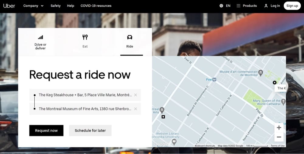
Take a look at how Uber uses multipage forms.
The first section is extremely simple to fill in. You need to pick between the Drive/Eat/Ride options. Then, if you chose Ride, for example, you move on to the next step, inputting your location. The 2 CTA buttons make it clear to visitors that the form has more pages.
Personalize Content Across Different Pages
If new visitors to your website regularly outnumber return visitors, your offer may not be convincing enough to visitors. One way to address this issue is by providing them with a unique experience through personalization.
Personalization has many faces. Here is a suggestion on how to combine a multipage experiment with personalized content.
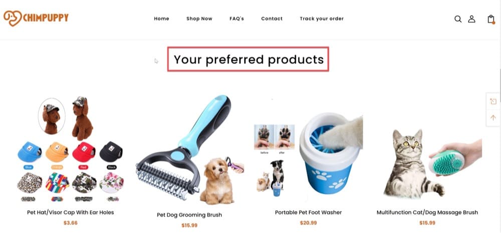
You are more likely to have users land on the homepage of your site if they recognize your brand. You can also display all of your promotions here. To appeal to a user’s specific interests and tastes, you can simplify or customize the categories/products shown based on their previous visit.
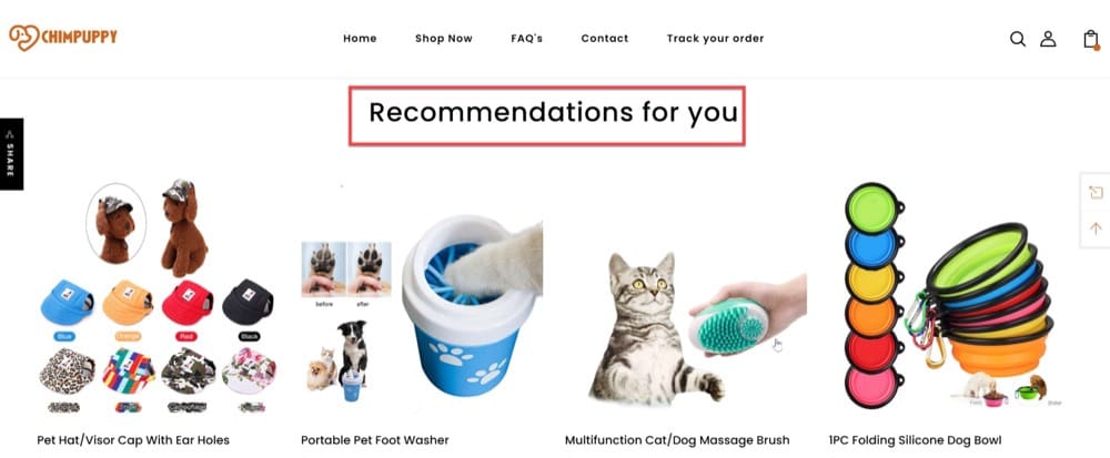
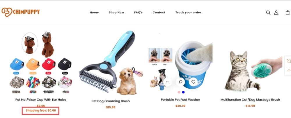
Note: The Chimpuppy website screenshots below are from a demo Shopify site created by the Convert team for illustrative purposes.
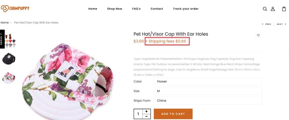
Once the visitor selects a product and navigates to the product page view, they can still see personalized items (added through the multipage experience) to be added to the cart:
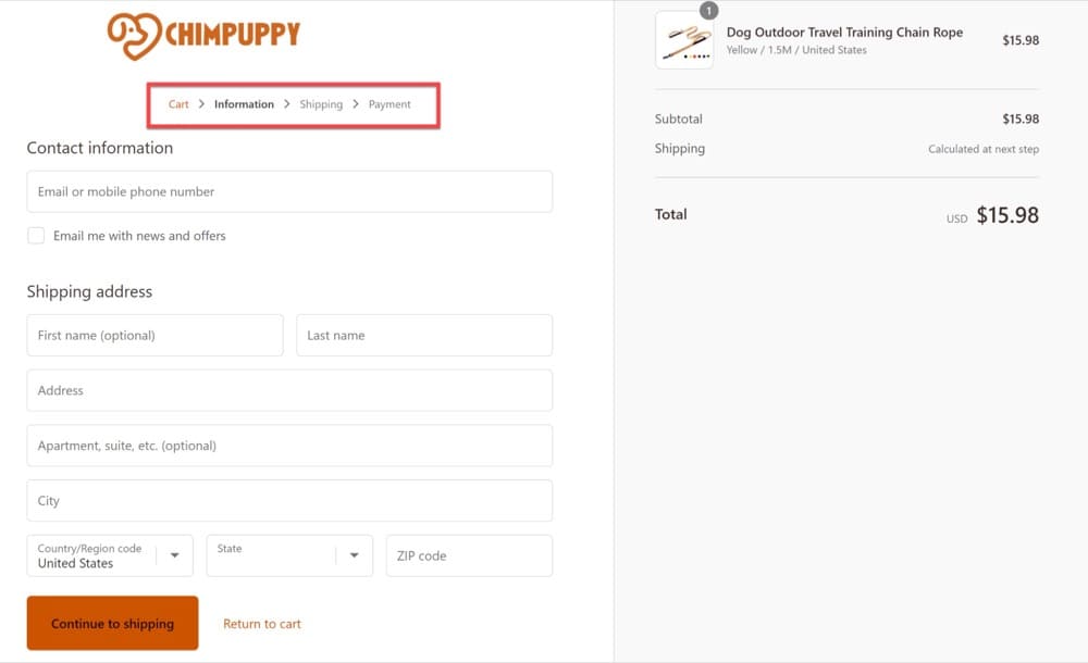
Offer a Multipage Checkout Experience
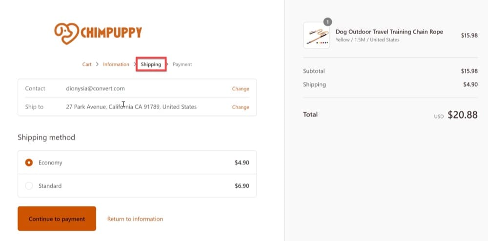
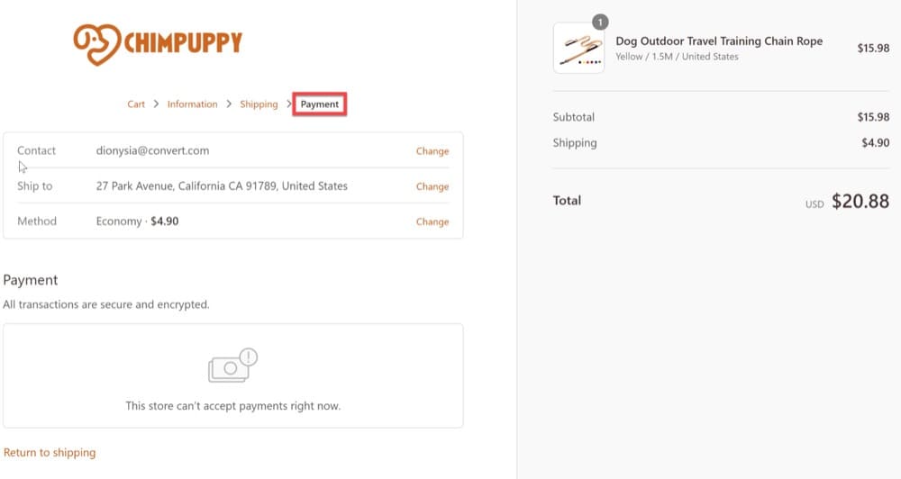
Multipage checkouts stretch out the checkout steps (usually between 3 and 5) over several pages rather than having everything on one screen. Shoppers must provide personal information, billing address, shipping method, payment information, and other details at each step.
Despite the fact that they are slower than one-page checkouts, some users prefer them since they have more time to double-check and confirm their information before placing an order.
Multipage checkout processes are best for more expensive purchases or items that require more consideration, as these tend to function better for these types of purchases. The convenience of being able to double-check all the information, including shipping address and pricing, before submitting a purchase, may make customers more at ease.
Implement a Simple Recommendation Engine
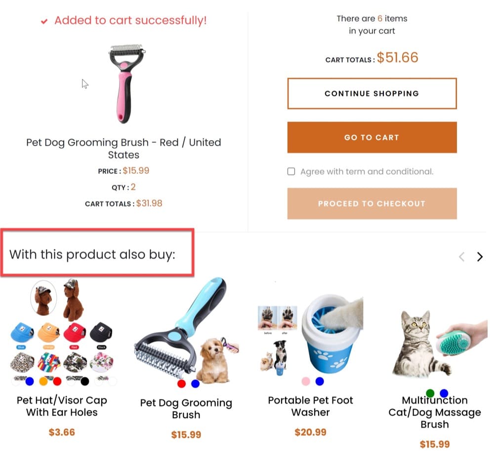
A recommendation engine is a fantastic way to offer your customers product recommendations based on their previously saved data history.
You can use this technique to upsell or cross-sell products.
Here are a few examples of recommendations:
- Products purchased together
- “You may also like” suggestions
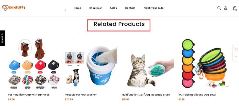
- Related products
With a multipage experience, you can also implement the product recommendation engine above to upsell.
Using this recommendation engine, customers can add more products to their baskets, resulting in an increase in revenue for your business.
What Are the Benefits of Multipage Experiments?
Multipage testing, like A/B testing, is simple to set up and perform, and it offers useful and trustworthy data in the least amount of time.
You’ll have real metrics to back up your hypotheses about what works well (and what doesn’t) with the results of your testing, and you’ll be able to improve in many areas. Let’s see some of them.
Improve your Conversion Rates
Multipage testing your eCommerce pages may also help you improve your conversion rate (CR).
Picture this scenario.
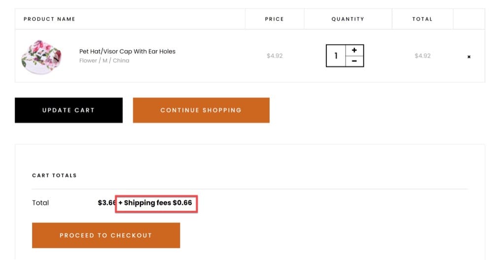
Several pages of your eCommerce site must show shipping costs. You come up with the hypothesis that if you add shipping fees across various pages, that will turn more site visitors into paid customers and improve your conversion rate.
You create a multipage test that changes the homepage, product page, and cart page, and leave the experiment running for a while (best to leave it for a minimum of 15 days) to analyze your data.
The case above is all about moving site visitors through a funnel, from the moment they see the homepage until the point of purchase. By adding shipping fees to different pages, you increase your chances of making your visitors click through to your cart page by hitting a different pain point for them.
Then, by changing the layout or page design, colors, and simplicity of the shipping fees displayed on your eCommerce pages, you’ll be able to discover which components of your current iteration are causing you to lose people before they convert.
CR is a significant indicator to determine whether or not your product or service has genuine interest and demand. If you run the multipage test above and discover that nothing is working, it’s more likely that your business model is at fault rather than your optimization.
Remove Customer Friction Points
Visitors leave your site without converting for a variety of reasons. Apparent roadblocks such as shipping or non-functional forms might be one cause, but there could also potentially be other less direct issues like usability problems on pages, poor positioning of CTA buttons, or chat functions.
Your goal should be to simplify the conversion process. Let your visitors show you what isn’t working using multipage experiments.
Imagine this scenario.
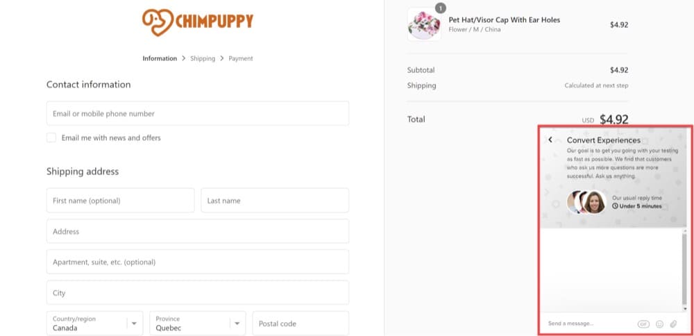
While shopping, a potential customer has a question about the product or delivery, and they want an answer immediately. To solve this, a chat feature on your website is essential.
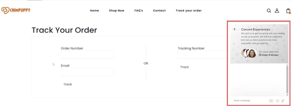
This functionality should allow customer service agents to provide individualized suggestions and exceptional service. With multipage testing, you can implement the chat functionality across multiple pages. Add the chat widget on the homepage, product pages, cart pages, checkout pages, and even thank-you pages to allow cross-sell or upsell opportunities.
Improve Your Copy
Copy can make or break your conversion rates. With multipage testing, you can refine your copy until you get it just right.
You can achieve huge gains in revenue for your organization just by changing the words your visitors read when they come to your site. And this becomes even more advantageous when combined with multipage experiments since you’ll almost certainly have to write and test a lot of material across various pages. You’ll not only gain a lot of practice, but you’ll also get near-instant feedback on what worked and what didn’t in your text.
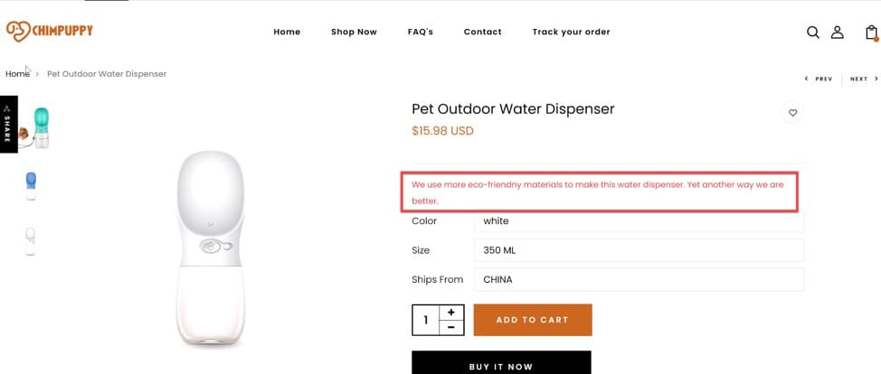
Here’s an example of how you can use a multipage test and improve your copywriting strategy on the homepage and product pages before describing the pet accessories.
In both cases, it makes your site seem like you’re at the top of your market. But in reality, it could actually mean you are just one of many companies with similar characteristics.
You’ve just discovered an eCommerce copywriting strategy combined with multipage experience that can boost your sales by double digits.
Remove the Risks of a Redesign
We’ve already touched on this above, but redesigning your website may require significant investment and may be risky.
Rather than blindly overhauling your site, use Multipage tests to measure small aspects of the user experience first. Over time, work toward a redesigned experience that is based on analyzed data and user feedback rather than gut instinct.
How to Set Up Robust Multipage Experiences Using Convert Experiences?
Within Convert Experiences, you can set up Multipage A/B tests (we call them “Multipage A/B Experiences”), Multipage Split URL Experiences (Split Testing), and Multipage Deployments, and below, we will show you how you can configure all of them.
Multipage A/B Experiences
Multipage experiences allow you to link together variations of different pages.
For example, visitors who saw the original version of Page 1 will also see the original version of Page 2, visitors who saw Variation 1 of Page 1 will also see Variation 1 of Page 2, and so on. This is particularly helpful for funnel testing.
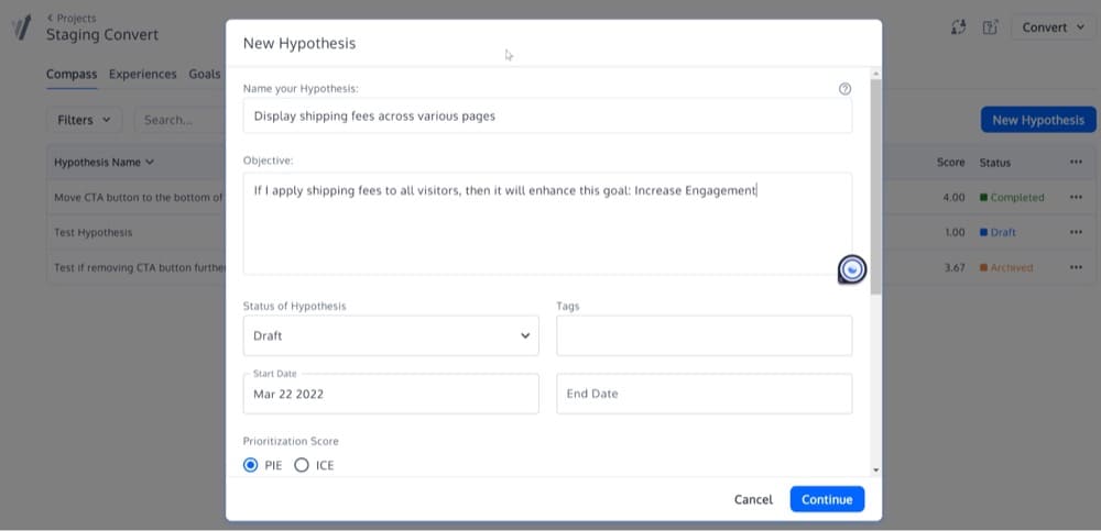
We recommend establishing a hypothesis for your test based on the following model:
If I apply [this change on my webpage] to [this audience], then it will enhance [this goal]
Add that to the “objective” field:
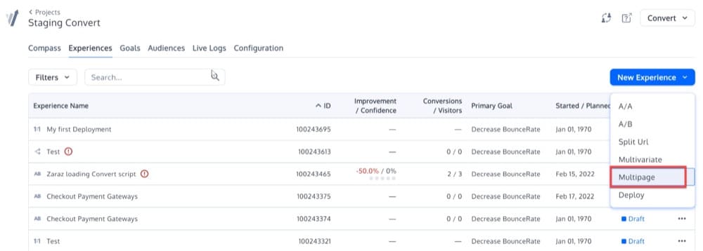
To create the multipage experience from your hypothesis, start the same way you would for creating a regular experience. Once in the “Experiences” screen, click “New Experience” and select “Multipage” as the Experience Type.
Add Pages
After you select it, you will see the + New Page option above the Variation Menus inside the Visual Editor.
In the Pages section, enter the URL you want to load in the Visual Editor for each page. Each page coincides with a part of the user’s journey you want to test. You need to include at least 2 pages that must be different (e.g. the homepage and integrations).
This allows you to add additional pages to your experiment so that you can create variations that change multiple elements along a funnel.
For example, you could create a multipage experiment that tests a 50% off promotion and makes changes to:
- Your landing page
- Your product pages
- Your cart page
- Your checkout page
In a multipage experiment, a visitor who sees a variation on any of these pages will continue to see that variation through the rest of the pages that are part of the multipage experiment.
Add a page by clicking the “New Page” button, then entering a URL.
You can change the name of the page by clicking on the pencil icon next to the page name and selecting Edit Page Name.
Visitors do not need to visit your pages in any particular sequence to be bucketed into a multipage experiment. Once they visit any pages in your multipage experiment, they will remain in that variation when visiting any other page in the experiment.
Add Variations
Next, you need to create a number of variations that you would like to test across your multipage experiment. These variations should apply to every page in your experiment.
In a multipage experiment, the pages you add will automatically have the same variation names that were included on the first page. This is because multipage experiments are intended to test a complete experience across multiple pages.
Remember, with a multipage experiment, visitors who saw the original version of Page 1 will also see the original version of Page 2, and visitors who saw Variation 1 of Page 1 will also see Variation 1 of Page 2, and so on.
Once you have finished setting up the variation changes, you can add goals and audiences, set the Site Area, and adjust your traffic allocation just as you would in a regular A/B test. And as a final step, you need to QA your multipage experience.
Let’s briefly see each of these settings.
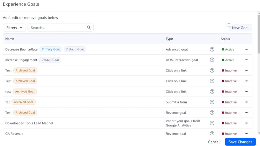
Add Goals
As the primary goal allows you to identify which variation amongst all is performing the best for multipage tests, exceptionally, your primary goal should be the result of the user’s journey. For example, for retention, the goal should be the number of viewed pages; for loyalty, it should be the revisit rate; and for conversion, it should be the transaction rate.
You should choose action tracking related to the element you redesigned or changed for testing for the secondary goals. Here user behavior has the highest chance of being affected because of the changes you made in the editor.
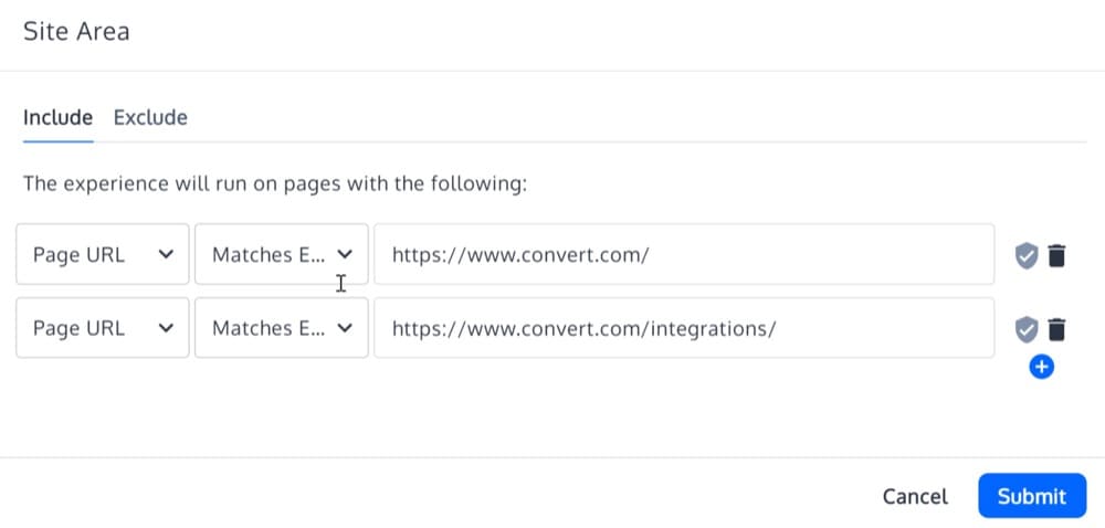
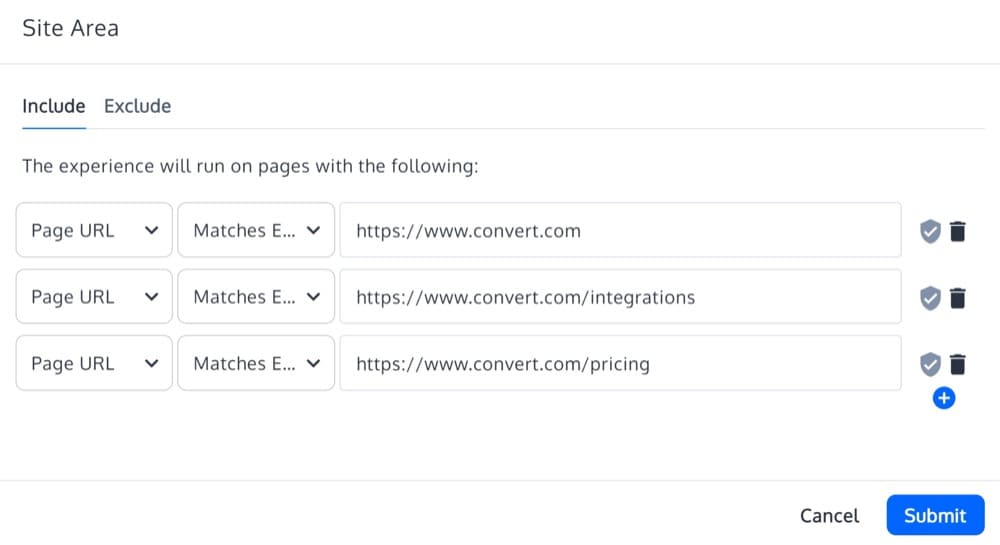
Configure the Site Area
Site Area lets you configure the target pages where the multipage experience will run, as they relate to a specific step in the user’s journey.
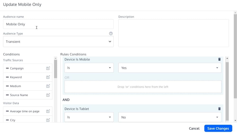
Define your Audiences
The audiences must be the same for each page of the multipage experience. These will denote for which visitors the experience will run.
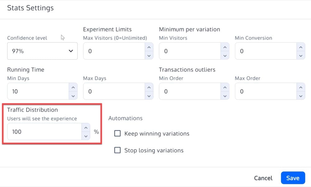
Set the Traffic Distribution
Traffic distribution must be identical for each variation.
QA Multipage Experiences
Before making the multipages live on the web, you may wish to test the variations, not only on the web page you added while creating the experiment but also on other pages included in it.
You can preview multiple variations or different versions of an experiment on any web page included in that experiment. The only condition here is that the URL of that web page must have been included in the “Site Area” of the experiment that is being tested.
To perform the preview, you need to add some parameters to the URL of the web page you want to test the variation on.
The parameters would be:
"?convert_action=convert_vpreview&convert_e=experiment_id&convert_v=variation_id"
You must replace the experiment_id with our experiment id and the variation_id with our actual validation id.
In the example above, we created an experiment in which we’ve added shipping charges visible on multiple pages.
Suppose we want to preview the variation on the URL https://www.convert.com/integrations.
So if the experiment id was 12345 and the variation id was 09876, then the URL needed to preview the experiment will be:
http://www.convert.com/integrations?convert_action=convert_vpreview&convert_e=12345&convert_v=09876
Multipage Split URL Experiences
In Convert Experiences, you can create simple to complex Split URL Experiments (Javascript redirected).
But here’s the thing– creating experiments that include several URLs required to redirect to corresponding URLs within the same experiment can be complicated to code with regex or configure in a single Convert Split URL Experiment.
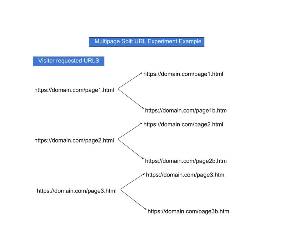
For solving this issue, we have created a recipe. But before proceeding with that, here’s a graphical representation of what the experiment entails:
Here, the configuration of this experiment will use the Convert convert.redirect() javascript function.
Follow these steps for configuring similar experiments:
- Start with creating a regular Convert A/B test. Once done with it, use any of the initial URLs to start the experiment’s configuration process. Do not opt for a Convert Split URL Experiment here. For example, https://domain.com/page1.html.
- When you start configuring this experiment, it will open the visual editor. In the visual editor, choose “Variation 1 > Custom Javascript” editor:
- Add the following code to the Editor. Once added, start configuring it according to your experiment requirements. Lastly, save your test and exit the editor.if (document.location.href.includes(“https://domain.com/page1.html”)) {convert.redirect(“https://domain.com/page1b.html”);else if (document.location.href.includes(“https://domain.com/page2.html”)) {convert.redirect(“https://domain.com/page2b.html”);else if (document.location.href.includes(“https://domain.com/page3.html”)) {convert.redirect(“https://domain.com/page3b.html”);if (document.location.href.includes(“https://domain.com/page1.html”)) { convert.redirect(“https://domain.com/page1b.html”); else if (document.location.href.includes(“https://domain.com/page2.html”)) { convert.redirect(“https://domain.com/page2b.html”); else if (document.location.href.includes(“https://domain.com/page3.html”)) { convert.redirect(“https://domain.com/page3b.html”);
- Now configure your Site Area by adding the Visited Requested URLs that will add them all into the experiment.
At last, it’s time to test your experiment. You can test it in a new incognito window or leverage Convert’s well-documented QA process.
Pass Parameters from Original to Variation URLs
If you want to pass parameters from original to variation URLs you can extend the above code with this:
var parameters = (new URL(document.location)).searchParams;
if (document.location.href.includes("convert")) {
convert.redirect("https://www.convert.com" + "?" + parameters);
}
Multipage Deployments
As we have seen so far, experiences have an Original and one or more Variations of the page. A Deploy/Deployment (formerly Personalization within Convert) does not have an original and variations. It only has one version of a page and has a defined audience. There is no Reporting Dashboard for Deployments.
Think of this example:
Your client has an eCommerce website that sells products across the US-Canadian border through the website. However, he wants to use different promotions to reach different markets. He wants to push these promotions using banner ads and putting them on the homepage of his eCommerce website.
Here you can leverage Convert Experiences to quickly and easily create various promotions for reaching different segments. In this case, the segments would-be visitors from the USA and visitors from Canada.
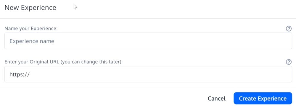
Click on the “New Experiences” on the upper right side of the page and choose Deploy.
Then, fill out the name field and the URL of the page where you’re planning to create the Deploy.
Create the deploy changes using the Visual Editor. To implement any changes across multiple pages, you can use the Browse mode and navigate to the subpages you want, make the required changes, and save them.
After you’re done and save the changes, click “Save & Continue” and exit the Visual Editor.
The remaining setup with page targeting and audiences is the same as we have shown above.
Wrapping up
Using the same experimentation methods as A/B testing, multipage testing compares multiple pages on a website in a live environment.
It breaks conventional scientific thinking by allowing multiple changes on different pages at once. A straightforward process, it can take some time and effort if you want to redesign the entire site, but it can give you a lot of information about how elements work together and what combinations work best.
Request a demo today to see how multipage testing may benefit your website. Or, get in the habit of experimenting and start A/B testing right away! Sign up for a free trial of Convert.
Written By
Dionysia Kontotasiou

Edited By
Carmen Apostu


